Announcing Online Store 2.0
Online Store 2.0 is an end-to-end overhaul of how themes are built at Shopify, launched June 2021. While the information in the following article is still correct, it doesn't account for Online Store 2.0 best practices, and may not include references to recent features or functionality. To learn more about how to build with Online Store 2.0, visit our updated documentation.
Visit docsWe all know first impressions are important. And even though you're not supposed to judge a book by its cover, we’re all guilty of doing that every once in awhile. That’s why it’s really important for businesses, big and small, to have an excellent online presence that showcases their unique brand.
At Shopify, there are over 50 themes for merchants to choose from when getting started with an online store. These themes strive to meet the needs of a wide range of merchants, who sell anything from temporary tattoos to South African biltong.

That’s why, when we discover an opportunity to help more merchants sell more effectively, we want to seize it. Our newest theme, Narrative, was born from the desire to solve a common merchant problem, and to give brands a place to tell their story.
Today, we here on the Shopify Themes Team will give you a behind the scenes look at how we built Narrative: from what research led us to this project, to how we approached the design and user testing, and what challenges we had to overcome.
Product photography is great, but we’re converting much higher online since we started including lifestyle images. We style our product on a model, in a real life setting, and it instantly becomes more appealing. The customer typically wants to emulate that. It’s our job to get them excited about it.
This article focuses on the homepage because it’s where Narrative’s key features live, but feel free to check out the rest of the theme in action. See how to build themes with Shopify Theme Kit, or, learn more about Shopify metafields to build for your clients.
You might also like: Introducing Slate: A Shopify Theme Scaffold and Command Line Tool.
Research and gaining context
At the beginning of the project, we looked at the available Shopify Themes, and one thing caught our attention: most homepage templates feature a few products and some quick links, or calls-to-action — all meant to drive sales.
These patterns are not unusual in ecommerce — used in the proper context, they are proven to work well in increasing conversion rates. But conversion is about more than just CTAs, it’s about connecting with a brand.
Think of a product that has never been seen before, one with unique innovative features, such as portable sound conditioner Snooze. The homepage features do more than showcase the product, they are the foundation of a brand story, using imagery and copy to communicate said story. This product deserves a homepage that gives these features the space to tell that story.
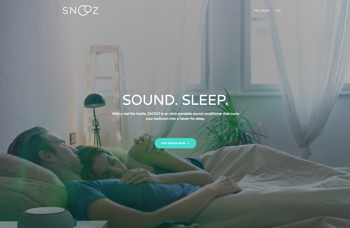
Many Shopify Theme homepages feature a grid, designed to showcase a large number of products. We wanted to allow merchants with smaller catalogues or single product stores to use the precious real estate on their homepage in a way that best suits their brand.
The stage was set. Part of our research began with benchmarking existing ecommerce websites that fit this category, to see what we could learn.
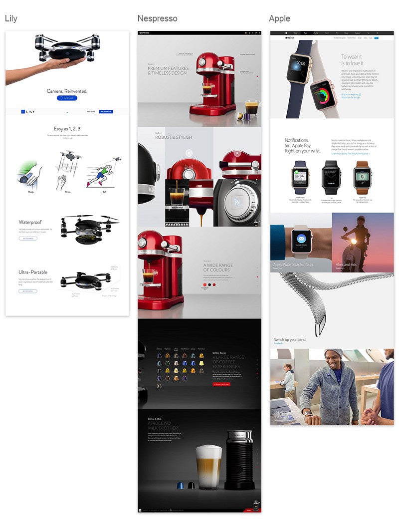
With high-end products, or brands such as Nespresso and Apple, what's often sold is a lifestyle rather than an actual product. The online shopping experience and content marketing both play a big role.
When we were thinking about the next theme our team would build, it became important to provide similar merchants with an online store layout that supported this kind of content. This research helped shape the project brief, and provided us with some key features and requirements to consider:
- A homepage designed to create a strong visual impact.
- A storytelling structure, crafted to convey the appeal of the brand/product.
- A product shown in the best possible light, to make it desirable through rich content and full-screen imagery.
- A delightful experience to engage the user.
In short, we wanted to create a highly-refined theme that made it easy for merchants to tell their brand or product story. This emotional connection is one of the most powerful tools a merchant can use.
Sections and wireframing
Narrative’s homepage has been designed for the Shopify Online Store’s new Theme Sections. Theme Sections are layout elements, like slideshows and product images, that can be easily added, ordered, and deleted. Put together in a logical linear path, these sections enable merchants to create their own story.
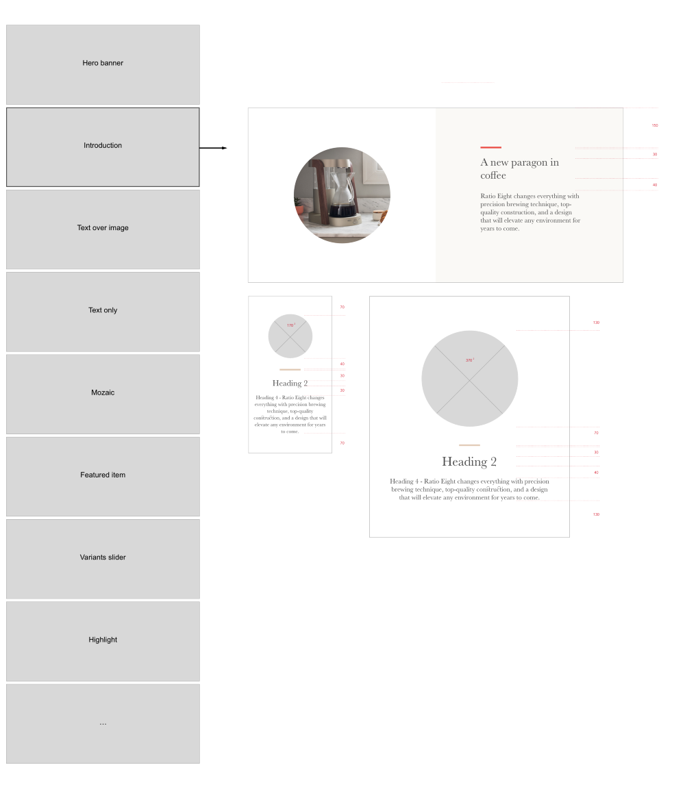
We created different demo stores to ensure the scalability of this theme, and to test the design in different styles. Content from three merchants —Ratio, No. 22, and Upton— was used. These merchants have the following in common:
- High-end products
- Small inventories or single products with variants
- Strong branding, visual design, and photography
Below is Narrative’s homepage featuring No. 22's fantastic photography. This company carefully hand crafts high-quality titanium bicycles. To ensure brand engagement with its customers, the company’s values and the product’s uniqueness need to be at the heart of the shopping experience.
We believe Narrative will help merchants whose customers need insight into a product’s specific value before they make a confident purchase.

You might also like: A Beginner's Guide to Building Shopify Themes with Sass — Part 1: Getting Started With Sass.
Form and function: Narrative’s challenges
We wanted to move away from the traditional hero slideshow, and instead include a special featured slideshow, which gives Narrative a distinctive touch. Both the hero section and the featured slider section proved difficult to design on a responsive scale.
The hero section
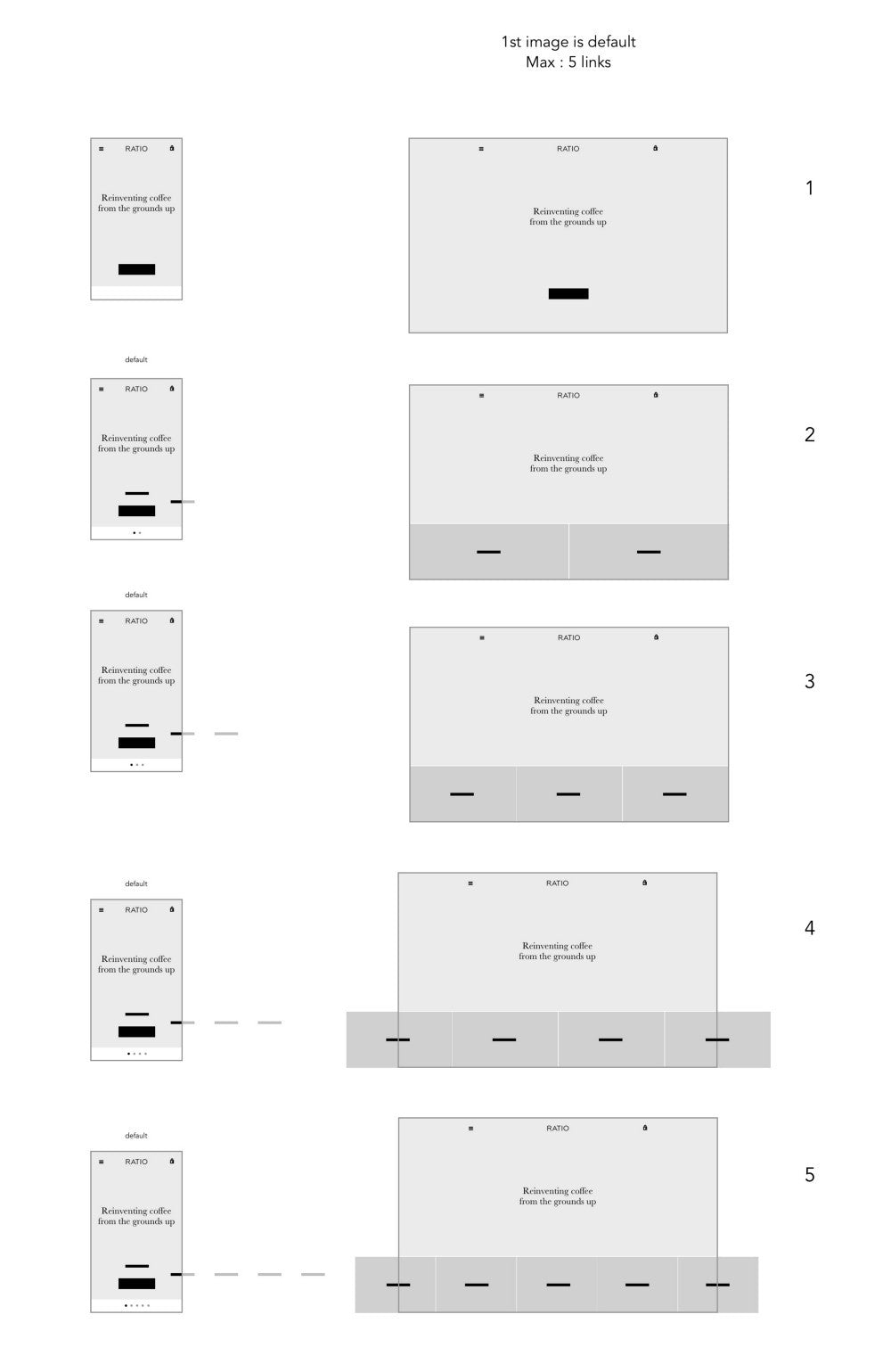
Unsurprisingly, the top hero section is important. Our goal was to create a layout with visual impact; not only to give our merchants a great way to showcase products, but also to stand out from more conventional homepage sliders. Here, transitioning seamlessly from desktop to mobile was the biggest challenge.
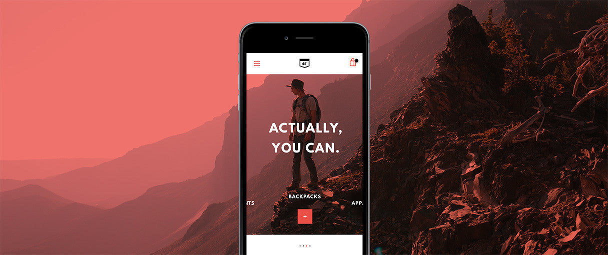
Moving the cursor sideways changes the position of the quick-links, and gives visual feedback on hover state. Such an experience can’t be replicated on a touchscreen, so several versions had to be iterated on. Because this section will be customizable (with options for a video background, a single image, multi-images, a single link, and multi-links), every scenario had to be explored.

Principle came in handy when creating dynamic mockups that we could play with on our mobile devices, like the one above. Fast and easy to use, we were able to test and compare real interactions early in the process, without having to write a single line of code.
The featured slider section

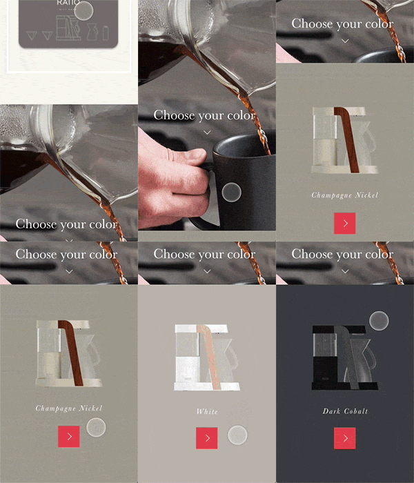
A nice element of surprise in the ‘story,’ this section is meant to seamlessly showcase a second layer of product information, without the customer having to leave the homepage. One interesting use of this feature is the ability to display a range of variants, such as the available colors of a product (like in the Ratio example below). It could also provide shortcuts to other products, or even give customers a preview of products from an upcoming flash sale.

The first Narrative mobile design attempt looked great, but proved to be impossible for technical reasons: the variants panel was triggered by a scroll action, which caused the page to lag. We had to find a way to translate the experience from the Principle mockups into a live version, without using a scroll hack.
All the attention invested in creating an extraordinary experience falls apart if the execution is less than flawless. Performance and browser compatibility cannot be sacrificed.
The success of this project relied heavily on front end developers being obsessed with performance. Especially Thomas Kelly, who wrote a very detailed article on the topic.
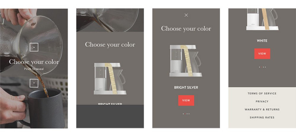
For this feature, we explored a number of solutions: pinch gesture to invoke the section, which also makes the section easily skippable if desired. However, responsive design isn’t just about making things smaller, it’s also about making good use of a shifting context. A simple tap button would have been a good standard proposition. But coupled with delightful animation, the pinch-to-reveal action seemed like a clever use of the touch screen capabilities.
User testing
It was important for us to validate our assumptions with real merchants as early as possible, and before going too far in what could be a wrong direction.
We conducted a series of interviews with merchants, during which we discussed the proposed designs for tablet, desktop, and mobile. The idea was to gauge whether the overall message of the design was clear, whether the layout helps communicate a strong story, and how likely merchants would be to use this theme, which would help us determine whether we were headed in the right.
Using InVision, each of the participating merchants was exposed to interactive mockups for various devices, all presented in alternating order so as to balance out learning effects. The goal of this research was to explore the following questions:
- Filling the gap: How well are we capturing the needs of merchants with one or a handful of products? How well are we meeting their expectations? How well does the theme communicate the story of a product?
- Assessing the gap: How well did we identify the gap in our current theme offerings? How well are we addressing that gap? How well is the whole approach of designing themes, based on gaps, working?
- Conveying the story: How clearly are we communicating the goal of the theme? What do merchants perceive to be the goal?
Some features of the theme that scored high in user testing were:
- The full-bleed image setup on the homepage.
- The prominence of the first image/video.
- Before the theme presents the product, it presents the why and how.
- The theme walks you through selling points, right up front.
On the other hand, the level of customization necessary of Narrative appeared to confuse a lot of people, and what users revealed about Narrative gave us lots of insight into a broader feature level.
This project’s feedback confirmed that some improvements to the Shopify Theme Store and the onboarding process could potentially improve the overall merchant experience. We want to help our merchants choose the right theme and educate them on how to take advantage of its features.
You might also like: How to Submit a Theme to the Shopify Theme Store.
Falling in love with the problem
The Themes Team’s goal isn’t to simply create as many themes as possible for the sake of a diversity in styles — it’s to offer merchants the best user experiences for their customers. We do this by staying connected with our merchants; we keep challenging our assumptions, identifying markets, and investigating strategies and marketing techniques. Our design thinking is a direct result of this relationship with our merchants.
The Themes Team’s goal isn’t to simply create as many themes as possible for the sake of a diversity in styles — it’s to offer merchants the best user experiences for their customers.
It’s no surprise that the next project I’m working on addresses a completely opposite merchant problem, bridging another gap entirely — and that’s what I find most exciting in my job! I’m looking forward to telling you all about it when it’s publicly revealed.
Have you worked with Narrative in any recent projects? Let us know what you think in the comments section below.
