Every industry has its myths, and design is no exception. Sometimes, these myths are especially dangerous, because they change the perception of existing practices and muddle the benefits of following them.
Prototypes are one such victim. These are essential design artifacts that contribute to rapid feedback and user insights. However, they are unfortunately often a hard sell due to several rampant myths about them. In this article, we will focus on busting 10 of the most common myths about prototyping.
Myth 1: There’s no value in prototyping when you have clear product requirements
Many product designers fall into the trap of thinking they know exactly what their users want. Inspired by product requirements, they skip the prototyping phase and invest significant resources into building a real product.
Reality: You still need to validate your ideas
No matter how good our product requirements are, there is always a chance that some of our ideas are bad. Every idea needs to be validated, and the best way to validate product ideas is to make them tangible and put them in the hands of our users.
"No matter how good our product requirements are, there is always a chance that some of our ideas are bad."
Prototypes can help translate text requirements into visual ideas. You can also explore prototypes with stakeholders and users, and correct mistakes early—before they get too deeply embedded in the designs.
Myth 2: You can get the same results with wireframes
Wireframes are design artifacts that demonstrate the basic information architecture of a product and the visual hierarchy of individual screens and/or pages. They help product teams understand how content should fit into space. Many product teams believe that wireframes are a universal tool for finding answers to all design questions.
Reality: Prototypes have different goals
This myth is a result of a misunderstanding of the purpose of prototyping, since it is often used interchangeably with other terms, like wireframing. The critical difference between wireframes and prototypes is that wireframes are static design artifacts, while prototypes are all about interaction. Prototyping allows designers to present their designs and see them in action.

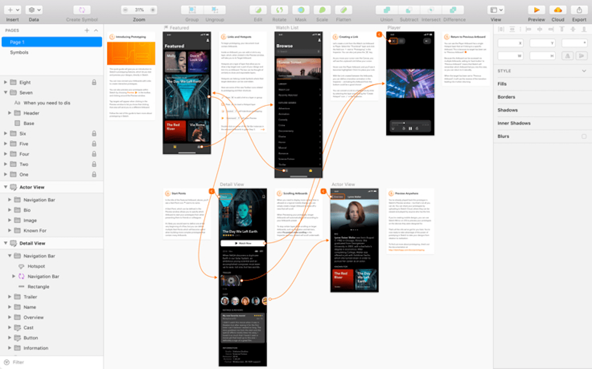
Wireframes are like the blueprint of a building, while a prototype is a simulation of that building. Using wireframes, it’s difficult (or nearly impossible) to explain complex user interactions such as scrolling, zooming, or spatial transitions between screens. A verbal or textual explanation of interactions can be confusing or misleading.
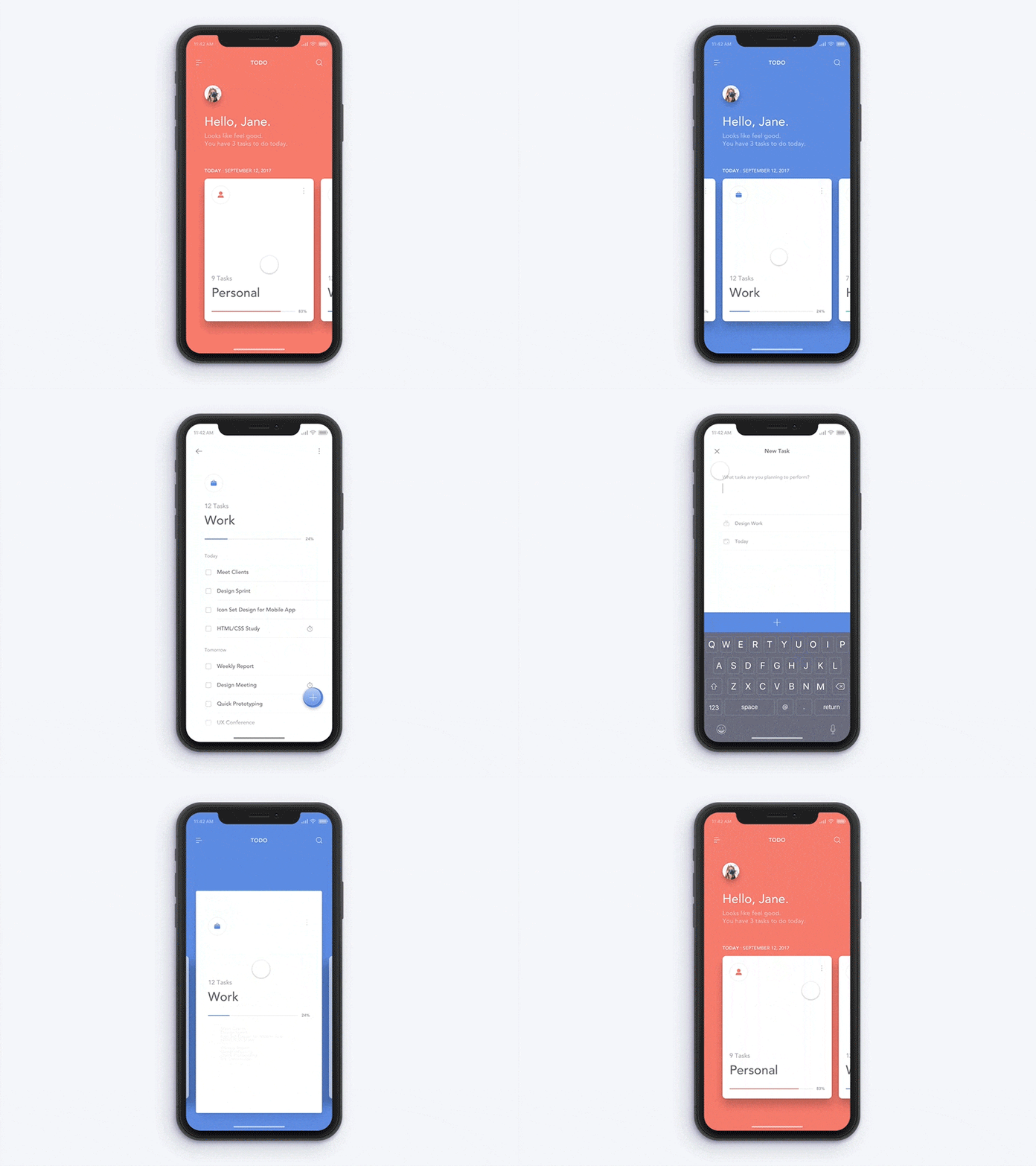
Prototypes, on the other hand, allow designers to follow the approach of "show, don’t tell" and simulate the final interaction between the user and the interface.
You might also like: 5 of the Best Prototyping Tools to Test Out Your Web and Mobile Designs.
Myth 3: Prototypes are exclusively a design tool
Some design teams treat prototypes exclusively as a design tool. As a result, prototypes act more like canvases for experimentation, rather than design artifacts that inform the design process and provide value to all people working on a product.
Reality: Prototypes allow collaboration between teams
It’s a mistake to think that prototypes provide value only for the design team. A good product design process is participatory and collaborative, and prototypes play a crucial role in allowing that collaboration.
"A good product design process is participatory and collaborative, and prototypes play a crucial role in allowing that collaboration."
Prototypes can promote collaboration in many ways, including:
- Getting buy-in from stakeholders. Prototypes can act as visual expressions of business requirements and help stakeholders understand the design.
- Conducting better ideation sessions. Design is a team sport, and it’s essential to involve engineering, research, and marketing teams in the design process. Prototypes facilitate collaboration and communication between teams by allowing them to view the design in advance and provide feedback.
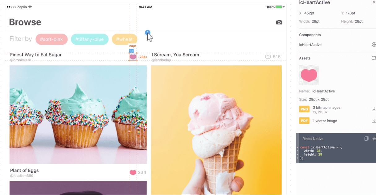
- Creating better design handoff. Developers can use prototypes to better understand product requirements. Prototyping tools like Zeplin or Sympli can create a design specification based on the prototype.

Myth 4: Prototypes are expensive and time consuming
Time is often cited as a reason teams avoid prototyping. Many organizations have tight budgets, and it can be hard to convince management to bake prototyping into the design process. A typical argument against prototyping is questioning why extra money should be spent on something that might be discarded. And that situation gets worse when the product team believes they need to create everything from scratch.
Reality: Prototypes protect you from losing money
Skimping on the prototype phase is a false economy. While a team saves money by jumping straight to development, they risk losing money when they face poor user engagement or, even worse, zero interest in the market.
Furthermore, when prototyping, a team doesn’t need to start from a blank canvas. Modern prototyping tools come with pre-built components and even ready-to-use UI kits that make the design process as simple as dragging and dropping required UI elements. The team can even reuse parts from previous designs when working on a new project.
You might also like: Everything You Always Wanted to Know About Rapid Prototyping.
Myth 5: Prototypes must be lifelike
Many product teams avoid creating prototypes because they think that prototypes should look and work like the finished products.
Reality: Prototypes are a work in progress
Prototypes don't necessarily look like final products—they can have different fidelity. Prototypes range anywhere between the following two extremes:
- Low fidelity prototypes (lo-fi): These prototypes display just some of the properties of the future product. The first and most important role of low fidelity prototypes is to check and test functionality rather than the visual appearance of the product. Low fidelity prototypes can be created in five to 10 minutes, using just pen and paper. Simply draw individual screens/pages on the paper, create a digital version of the design using a tool like Marvel Pop, and test it with real users.
- High fidelity prototypes (hi-fi): High-fidelity prototypes look and function as much as possible like the actual product that will eventually ship. Generally, these prototypes take longer to create, as so are created only when product teams have a solid understanding of what they are going to build. High fidelity prototypes allow teams to either test the final design with real users, or show the design to stakeholders to get approval.
Before creating a prototype, it’s important to understand the goal of prototyping. What do you want to achieve with this prototype, and why?
Product teams should always choose a prototype’s fidelity based on the goals of prototyping, completeness of design, and available resources.
For example, if your team is at the beginning of the design process and you need to validate design decisions, it doesn’t make much sense to invest time in creating a high fidelity prototype. Likely, it’s enough to create a basic representation of your future design on paper and validate it with your target audience.
Myth 6: Hi-fi prototypes should be pixel-perfect and have motion design
Elevating aesthetics over functionality is a typical design pitfall. Designers tend to spend hours nudging pixels to get pixel-perfect layouts. This polishing of visual details takes a lot of time and comes at a high cost.
"Elevating aesthetics over functionality is a typical design pitfall."
Reality: Prototypes don’t need to be pretty
The focus on creating pretty prototypes is one of the biggest obstacles to overcome when prototyping. If the goal of prototyping is to showcase a nice-looking design on Dribbble or Behance, then you should polish pixels. But if your goal is to create a product that other people will use, focus your time on usability instead.
Great design isn’t decided by what is most viewed on Dribble or Behance. Great design is more about excellent user experience. Invest time in the validation of critical elements of your user flow and in ensuring that users don’t face friction along the way, rather than on creating layouts and transitions that will impress the design community.
Myth 7: Prototyping requires technical skills
Just a decade ago, you had to have solid programming skills to create a high fidelity prototype. Even today, the belief that you need to be a developer to prototype prevents many people from starting.
Reality: Prototyping doesn’t require special skills
Coding skills are an excellent complement to the many other skills UX designers have, but they are not necessary. There are plenty of prototyping tools that allow you to create prototypes without writing a single line of code. Sketch, Adobe XD, Figma, and InVision, to name a few, are great places to start.
Since prototyping with these tools doesn’t require special skills, more people can be involved in the design process. Even non-designers can play an active part in the idea-formulation process.

When you want to prototype complex interactions like animated transitions, tools like Framer X or ProtoPie are excellent. Both have pre-built interactive patterns like a scroll, to make the prototyping process even easier.

Myth 8: Prototyping is unnecessary when you follow the Agile/Lean process
As more teams adopt Agile and Lean methodologies, they tend to skip writing documentation and forgo prototypes in favor of quick development. They believe that they can build a real solution fast, and test it with their users.
Reality: Prototyping saves you time in the long run
The primary goal of building a prototype is to test designs and product ideas before creating real products. No matter how quickly you move in the development process, you still need to validate design decisions—and it’s easier and less expensive to do it using the prototype than a finished product.
"No matter how quickly you move in the development process, you still need to validate design decisions."
Why? When you build an actual product, you of course try to get it right the first time. But even with perfect requirements, you will still sometimes face situations where something simply doesn’t work for your users. It’s always better to collect feedback before public release.
Another problem of focusing too intensely on building a single solution is that this approach locks the team’s creativity. Team effort gets focused on building a specific thing, instead of exploring the best ways to make something work. That’s the opposite of innovation.
As more teams adopt Agile and Lean methodologies, it makes sense to make prototyping a key component of the design process. Prototyping should contribute to product requirements and user stories, and in some cases, even drive the requirements.
You might also like: What Are Design Sprints and Should You Be Running Them.
Myth 9: Prototyping is only for products
Some product teams believe that prototyping is necessary only for products like websites or mobile apps.
Reality: Prototyping works for all design
The key idea of prototyping is validating design decisions. No matter how small or big a design decision is, it’s still a hypothesis that needs to be validated. You can prototype basically everything—from a large product to a small interaction within that product.
Myth 10: Users behave differently with a prototype than with a real product
This myth suggests that prototypes aren’t suitable for testing with users because users will behave differently when they interact with a real system.
Reality: Choosing the right fidelity will reflect real-world experiences
This myth is partially true. When test participants interact with an unfinished design, it might be unclear to them what is supposed to work and what isn’t.
This is particularly true for low fidelity prototypes—they require a lot of imagination from the user, limiting the outcome of user testing.
However, this doesn’t mean that you can’t get valuable insights from usability testing sessions—it just means that testing with prototypes requires more preparation than testing with real products.
When it comes to validating design decisions with a target audience, it’s essential to select the right fidelity for your design. For many products, a paper prototype is more than enough to validate the overall product direction and answer the question of whether or not the product provides value for users. On the other hand, testing with high fidelity prototypes will help you find any major usability issues.
Prototypes are a mandatory part of the process
If delivering a good user experience is a goal of your project, then prototyping must be a part of your design process. It’s important to be familiar with the common prototyping myths, and be ready to defend this practice by busting those key misconceptions.
Read more
- Top Ecommerce Resources for December
- Top Ecommerce Resources for July
- Top 13 Web Design Conferences You Should Attend in 2016
- Top Ecommerce Web Design Trends for March
- Top Ecommerce Web Design Trends from January
- 7 Inspiring Stores Built by Shopify Partners to Get You Through the Winter
- Top Ecommerce Resources for October
How do you use prototypes? Share your experience in the comments below!

