Mobile-first design is the practice of building your site for mobile before building your desktop version.
Sounds simple enough, right? Instead of planning for desktop and then cutting half your ideas to make it mobile friendly, you start creating your site with mobile in mind. This means focusing on the user, their needs, and the best way to show off your client’s content.
However, mobile-first design brings its own set of challenges, which web designers must face in order to deliver great UX for their clients’ mobile users.
I’m not going to lie to you—mobile-first design can seem like a major hassle when you first approach it. It presents a lot of problems that need solutions—the size of the screen being the most obvious—but if you’re up for a bit of creative thinking and problem solving, the rewards can be huge.
Let’s see how you can tackle mobile-first design together.
Why is mobile-first design important?
All websites need to rank well in Google’s search results. You know it, your client knows it, and online shoppers prove it by continually favoring high ranking sites. Whether you’re creating a blog, a portfolio, or of course, an online store, it’s a race to that number one spot, so you need to optimize your client’s site from day one.
Google has made it very clear that mobile is important, going as far back as 2010, when CEO Eric Schmidt famously announced Google’s developers were working on mobile-first design. We know that mobile friendly sites stand a better chance of ranking in Google, so it makes sense to optimize for mobile as much as possible, rather than leave it as an afterthought or last minute addition.
Mobile in 2019: the stats
It’s easy to see why Google is making such steps towards a mobile-friendly internet. In 2019 there are 5.11 billion unique mobile users worldwide, and mobile phones now account for almost half the time people spend on the internet (48 percent, to be exact). These stats beg the question: can you afford not to prioritize mobile?
Statistics surrounding ecommerce and mobile suggest not. In the first quarter of 2019, mobile ecommerce spending reached almost $39 billion in the US alone, showing mobile can be a lucrative platform to tap into.
People seem more attached to their phones now than ever before, meaning it’s now easier than ever to quickly buy a new outfit, sign up to an online course, or book an appointment on the go. Ecommerce and mobile look like the perfect partnership—deals snapped up on lunch breaks, new collections browsed on the commute into work, broken heels replaced before you’ve even hobbled home.
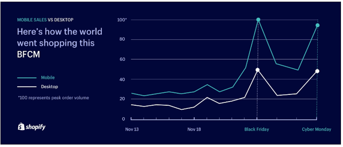
Shopify’s analysis of Black Friday/Cyber Monday 2018 confirms this rise in mobile. Customers no longer need to be sat comfortably at a computer to hand over their money—indeed, Shopify revealed that mobile accounted for 66 percent of sales over the Black Friday weekend. Only 34 percent of sales took place on desktop!
Mobile responsive vs mobile-first design: what’s the difference?
Nobody is under the illusion that mobile doesn’t matter—nowadays, any web designer or website builder worth their salt will at least create mobile responsive websites. But is that enough?
The issue with mobile responsive design is that it’s not properly optimized for mobile—it simply reformats the same content to fit any type of screen. While this is undeniably useful, it can result in an imbalance of powerful desktop sites and clunky mobile versions. That’s because with mobile responsive design, you usually start by creating the desktop version, and then fitting that to other devices.
Mobile-first design is different. It’s a form of progressive enhancement, which is where you design a product for the more basic browse, such as mobile, first.
This means your initial product is a lean, mean, mobile design that provides amazing user experience. Only then do you start to enhance that design for desktop, adding scroll effects, large images, fancy effects, and hover buttons galore to make it well-rounded.
Progressive enhancement is in direct contrast with the alternative concept, called graceful degradation. This is the more common method of starting with the advanced desktop version, then cutting functions to make it suitable for more basic browsers, such as mobile.
With mobile growing ever stronger, it seems sensible to follow the path of progressive enhancement and commit to mobile-first design. But where’s the best place to begin? Let’s find out.
You might also like: Mobile Design Trends in 2019.
Mobile first, content first
The very first thing to think about when approaching mobile-first design is content. Because mobile is more limited, you need to prioritize content so that the most important information and actions are clearly visible.
You need to know exactly what users are looking for when they visit the site, and which content is most valuable to your client. By creating a content-focused site, you’re also putting the user first by giving them exactly what they’re looking for.
Be ruthless—don’t water the homepage down with unnecessary, confusing, or distracting content. This can be as simple as leaving out adverts, or cutting a welcome message in favor of a booking form.
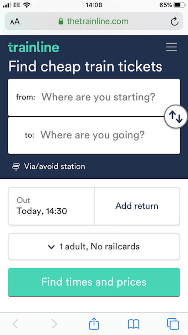
This example from Trainline.com, a European travel site, gives mobile users a simple, full-screen form to make booking journeys easy. It recognizes the users’ main aim of visiting the site, and provides a quick way to satisfy their needs. You can see the difference between the mobile and desktop versions below:

When it comes to creating content for mobile, less is more. Simple enough in theory, but you’ll be surprised how hard it can be to cut back to the bare necessities.
The main aim of designing mobile first is to deliver clear, concise content that helps users make decisions, then take action, fast. Speed is always of the essence, but this is more important than ever on mobile.
10 easy-to-action mobile-first design tips
Once you’ve determined the users’ aims and your client’s needs, then decided on the most important content, you can get to the really fun part: making it the best-looking ecommerce site around.
You’ll already know some of these, but hopefully the following tips will help you get started designing the best mobile store possible. Providing a great user experience is always the endgame—smooth journeys result in happy customers and more conversions!
1. Use visual hierarchy
To really make your content pack a punch, put it in order of importance, and then use this to help structure the layout of the page. Examples of high priority content include featured products, sale items, new collections, discount codes, forms, and call to action buttons.
Shopify-built store Biko does this well, using large, bright pink CTAs and capitalized headings to draw the user down the page.
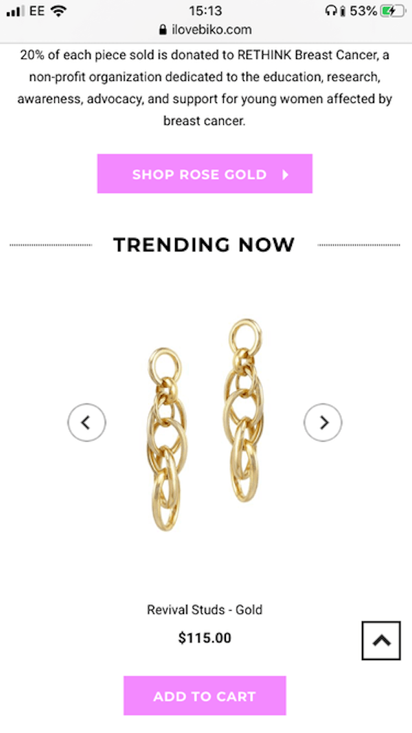
All the usual suspects still apply: headings, different sized elements, bolding, and more help to catch the user’s eye and guide them through the site. On mobile, this also has extra benefit. Making CTAs large on mobile draws attention, but also makes it super easy to click on with a thumb or finger.
2. Avoid large chunks of content
Whether it’s a huge body of text, a massive image, or a mile-long form, any type of content that goes on too long is going to be a major turn-off for mobile shoppers.
We’ve become extremely impatient creatures, and this is amplified on mobile—people are on the go, in a rush, or doing some quick browsing between meetings at work. Anything that feels like a drag, from excessive scrolling to heavy reading, will have users skipping elsewhere.
Instead, think about how you can get the same message across in fewer words, or add an interactive element to make the information more manageable.
A great example of this is UX designer Adrian Zumbrunnen’s website, azumbrunnen.me, where he uses text-like chat bubbles to introduce himself. The user has responses to choose from that direct the flow of “conversation.” This fully embraces the mobile experience, and feels very natural when you’re holding it in your hand.

3. Make elements clickable
Have you ever been on a mobile site and kept having to zoom in to make buttons large enough to click? Frustrating, isn’t it? Don’t be like this British supermarket, Waitrose, where you have to zoom right in to read or click on anything, making it difficult to navigate.
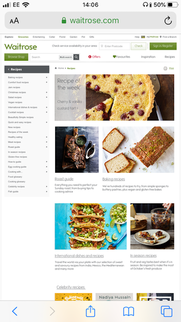
It’s vital that when designing for mobile, you make elements such as menus, buttons, images, and navigation arrows large enough to be easily clicked using a thumb or finger. They should be clear, uncluttered, and isolated too, to avoid pressing on the wrong thing by accident.
Use white space to surround any interactive elements, spread out any in-text hyperlinks, and be generous with button size. This lies in contrast with designing for desktop, where the visitor will most likely be using a mouse cursor to navigate the website.
Another thing to consider is that usually, menus and navigation buttons are located at the top of the page. However, because of the way most people hold their phones, this can be awkward to reach, especially if you’ve only got one hand free and are crammed onto the subway at rush hour!
Make life easier for users, and think about locating menus and important buttons at the bottom of the screen instead. Online music magazine Pitchfork does this, and it makes total sense. I know, pretty revolutionary, right?

4. Forget hover control and scroll effects
While these are great to have on desktop, the lack of a mouse cursor removes any of the benefits offered by hover control or scroll effects.
Hover control is particularly useful in ecommerce for product images—showing basket options, alternative color choices, back views of products, and product zoom—and even for activating dropdown menus. But of course, this isn’t an option on mobile, because “hovering” literally means the user isn’t actually touching their phone screen.
If you usually rely on effects like these to create good UX, you’ll need to rethink how to display this information, and how to make it clear to the user. Directional messages, such as “tap to zoom” or “swipe for back view” can be useful in creating a clear pathway for the user.
You might also like: 15 Myths That Can Ruin Your Mobile UX.
5. Strip it back and avoid extra digital weight
As we already mentioned, speed is make or break when it comes to selling via mobile. This is further complicated by the fact that mobile comes with limited bandwidth.
To work around this, leave behind unnecessary code, try to avoid heavy media files, optimize images, and make every picture count. Activate AMP (Accelerated Mobile Pages). There are plenty of AMP apps in the Shopify App Store which you can install to increase mobile loading speeds. Run mobile site speed tests, and then run them again.
6. Harness the power of white space
Even on desktop, clutter is nobody’s friend—but on mobile, it’s your worst enemy. Keep things minimalist, clean, and separate.
By using lots of white space in mobile design, you can direct the user by emphasizing important elements. Mix up micro and macro white space, and actively plan your white space rather than leave it to chance. Google is a famous example of using macro white space, while micro white space can be commonly found between paragraphs, images, and lines of text.
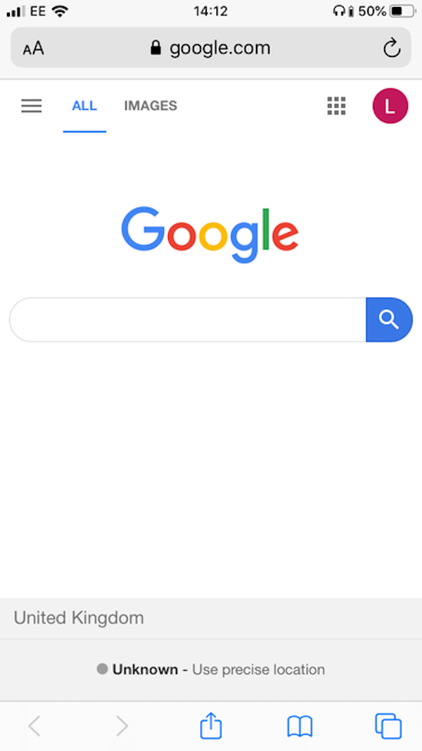
Mobile also lends itself to bright, bold colors, clear graphics, and strong shapes. These work hand in hand with white space to draw the user’s eye and stand out against the rest of the page (again, think of that bold and colorful Google logo).
Not only will the site look better, but it’ll be easier for mobile users to navigate, making them more likely to stay on your client’s site and convert.
You might also like: How to Use White Space in Your Mobile Designs.
7. Choose breakpoints based on content
A common approach in web design has been to determine breakpoints based on the device being used.
In simple terms, a breakpoint is where you make a change to your design layout in order to make your content look its best. The general rule is that when your content starts to look bad, you add a breakpoint.
You can see the thinking behind designing for device, but it gets pretty complicated very quickly. Defining breakpoints by device just isn’t sustainable due to the sheer number of different devices and screen sizes around today, and with more being released all the time.
Instead, your breakpoints should depend on the content of the site, not the device being used. As a designer, this will save you a lot of headaches.
8. Make communication mobile-friendly
Mobile users want easy ways to reach out and communicate. On mobile, you’re used to texting, messaging, and sending quick-fire communication via Snapchat, Instagram, or WhatsApp.
Make reaching out easy. Live chat is an excellent feature to have, because it mirrors the style of communication mobile users are used to having in their hands. It also provides instant gratification, which is always a big win.
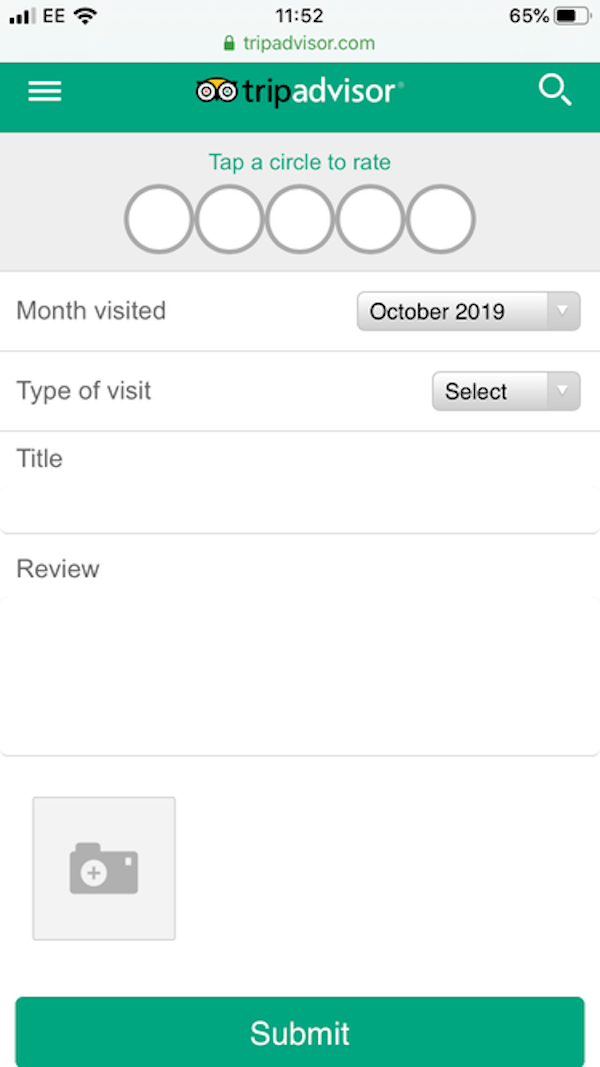
Also, think about how users can submit star ratings, leave comments and reviews, or even like and save their favorite products. These are all forms of communication, and need to be quick and easy.
TripAdvisor is a great example of making it as seamless as possible to leave a review, fitting the whole form onto the phone screen without any scrolling necessary.
9. Think about the user journey
Mobile-first design is all about creating smooth user journeys and giving people what they want, quickly. If your client is busy promoting products on social media, it’s likely a fair portion of traffic is visiting on mobile.
Hitting a non-optimized page straight from a platform like Instagram, for example, is jarring and frustrating. Mobile-first design removes this “bump” and creates a more seamless journey.
And remember, the journey doesn’t end once the user has reached the website.
Think about where the user is going to end up. Are the basket and checkout pages mobile-friendly? You don’t always have control over the payment page, but if you do, it’s vital to keep it as straightforward as possible. Enabling Apple Pay, for example, can be a huge time saver for shoppers.
If you can save shoppers from entering the same details more than once, that will also help to smooth the checkout process and reduce frustration caused by clunky checkouts.
10. Test, test, test
It seems obvious, but make sure you try the site out on mobile. And not just your mobile—view it on Apple, Android, tablets, old and new versions, and make sure your design looks its best on all of them.
You might also like: Frictionless Experience: How to Create Smooth User Flows.
The first steps towards mobile-first design
Mobile-first design makes sense—it produces better mobile sites, and paves the way to better desktop design as well. It puts the user’s needs at the forefront of design in order to fuel conversions, and integrates seamlessly with apps and social media.
The first step to take is to talk with your client, and make sure you’re on the same page in terms of conversion goals and content priority. Once you’re clear on the action the user should be taking on the site, you can use the tips we’ve provided to begin designing a beautiful, user-friendly store that’ll have shoppers buying like mad as they rush around their daily lives.
When there’s so much to think about, it’s easy to get caught up in every idea and try to throw everything at your design. Our last tip is to keep things simple—remember, the most important part of designing for mobile first is that you create a lean, concise, killer website that’s not weighed down by any of the excess stuff that comes with desktop.
Give the users what they need as quickly and smoothly as possible, while guiding them through your client’s most important content.
Once you’ve got this perfected, then you can start adding more advanced and traditional elements for the desktop design.
How do you build for mobile first? Share your experience in the comments below!


