Hunters. They’re the visitors you’ve been waiting for.
They don’t come to mindlessly stumble around. They’re not here to return something.
Hunters come in with one urgent desire: to buy.
But be cool ... and don’t get ahead of yourself.
Remember, your ecommerce site still has a job to do. If dead-end searches, low-converting product pages, and abandoned carts teach us anything, it’s that sites are often the very things that get in the way.
In fact, the hunter is a fickle creature, easily deterred by needless friction … with zero loyalty to your brand or products.
Last week we looked at first-time ecommerce visitors: the stumblers. Today, we’re taking one step deeper into your online funnel and examining another of the most profitable -- and problematic -- ecommerce segments.To set your site up for success, you need to answer these three questions:
To set your site up for success, you need to answer these three questions:
- Identity: Who are they and where do they come from?
- Intent: What do they want?
- Action: How do you drive them forward?
1. Identity: Who Are High-Intent Visitors and Where Do They Come From?
You can see who hunters are when you look at the two sources they come from: paid search and referrals.
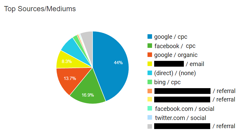
The vast majority of hunters will arrive through paid search.
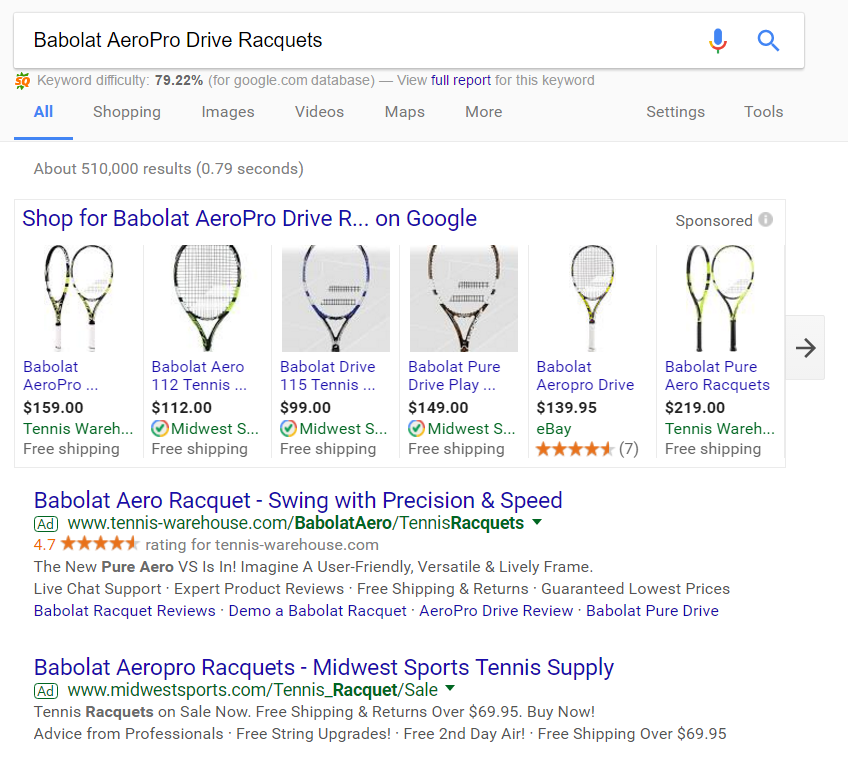
This is through Google CPC: namely, Google’s Product Listing Ads (PLAs) and AdWords (display or banner ads) both inside and outside the Display Network. It can also be through social ad strategies (although these play a much larger role with returning visitors through retargeting).
With search, think along the lines of high-intent queries like “Babolat AeroPro Drive Racquets” as opposed to more general phrases like “tennis rackets” or even “best tennis racket reviews.”
The second major source is direct traffic.
Often these hunters will come looking for a gift or because someone “told them to.” This is especially true of demographics outside your core market. The worst thing you can do is get in their way. That’s why making your search bar both prominent and intuitive are musts (i.e., using autocomplete suggestions, tagging products by common names that aren’t technically associated with their proper titles, and enabling natural language processing).
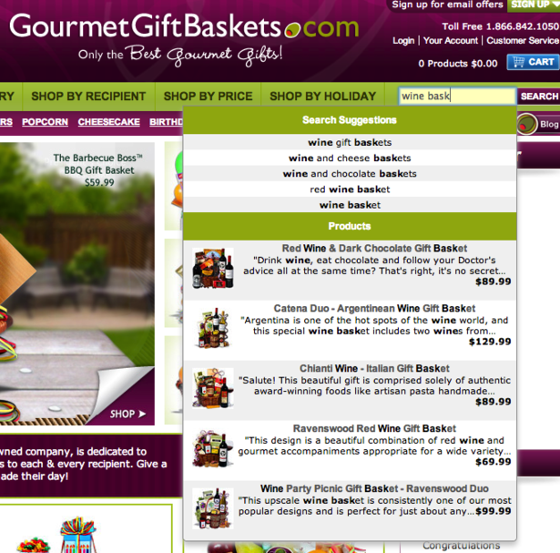
IMAGE VIA ECONSULTANCY.COM
Given the role intent plays in the hunter’s identity and arrival, the next question might sound obvious. Unfortunately, that’s exactly where a strictly transactional mindset can spoil an otherwise ripe opportunity.
2. Intent: What Do High-Intent Visitors Want?
With most online traffic, determining desire can be like pulling teeth. Not so with the hunter.
However, that doesn’t mean they don’t have a few questions first. While the hunter comes with high-intent to buy, they also want to make sure they can trust the business they’re buying from and that they’re getting a good deal.
This means zeroing in on your product page, product image, and product copy.
Your Product Page: How to Give Hunters What They Want
The first goal is to establish trust. If the hunter arrives on a sketchy product page that, even for a moment, indicates a lack of reliability, they’re gone.
Trust happens in the blink of an eye -- about 50 milliseconds -- and is determined by the eye. As Peep Laja explains:
“The data showed that the average consumer paid far more attention to the superficial aspects of a site, such as visual cues, than to its content. For example, nearly half of all consumers (or 46.1%) in the study assessed the credibility of sites based in part on the appeal of the overall visual design of a site, including layout, typography, font size and color schemes."
Keeping your product pages clean is a good start. But two factors impact trust the most.
Number one: reviews. To start, reviews should be prominent factors in your search ads:
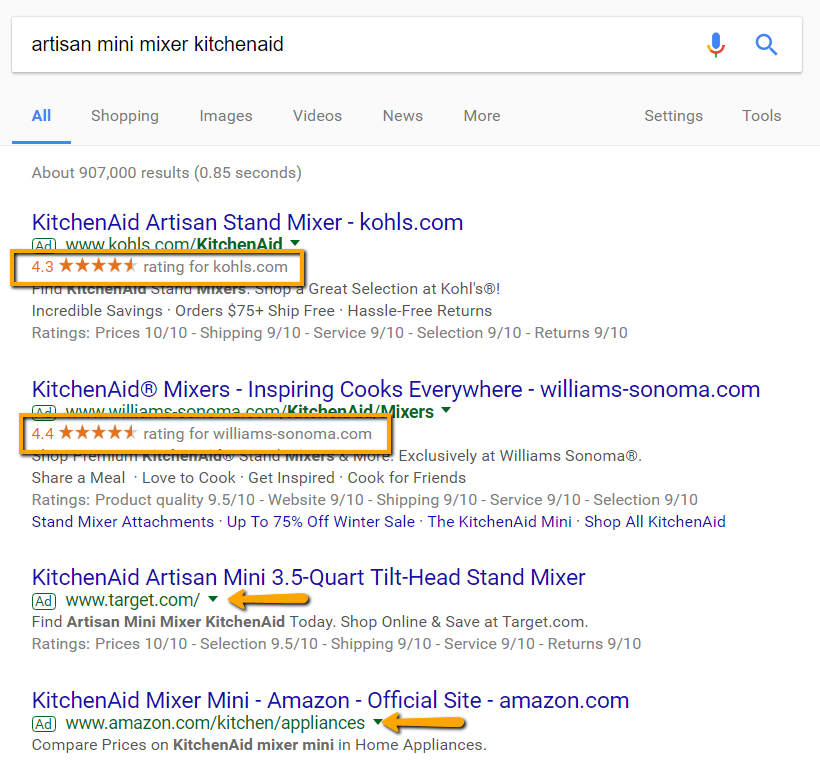
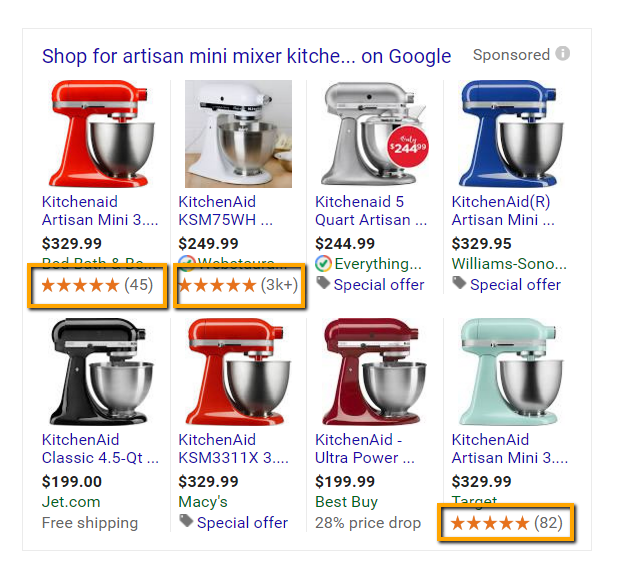
Once a hunter arrives, reviews should again be prominent; however, there are a few other trust-building elements to prioritize:
- High-quality and “action” images of your product(s): Imagery plays such a major role in successful product pages we’ll deal with them separately below.
- Quantitative and qualitative reviews: This includes ratings (as above) but should also include direct customer testimonials about your product(s). Yotpo is by far the easiest and best user-generated content platform to do this.
- Questions and answers: These can build off of your reviews, but should address the common objections to your product(s).
- Contact options: Being available to hunters means more than just making your contact page highly visible. It extends into live chat options and the surrounding microcopy.
- Trust seals: These can include guarantees, payment options, security certifications, or the logos of trust-inducing organizations. While seals play a major role in reducing cart abandonment during checkout, they also drive hunters forward (especially when they’re presented around the “Buy” button).
To put all that into perspective, let’s look briefly at two examples.
Bed, Bath & Beyond’s KitchenAid product page is middle-of-the-road: there’s nothing glaringly wrong with it … but that’s exactly the point. In particular, pay attention to the pricing, the lack of shipping specificity, and the “Feedback” button on the bottom right:
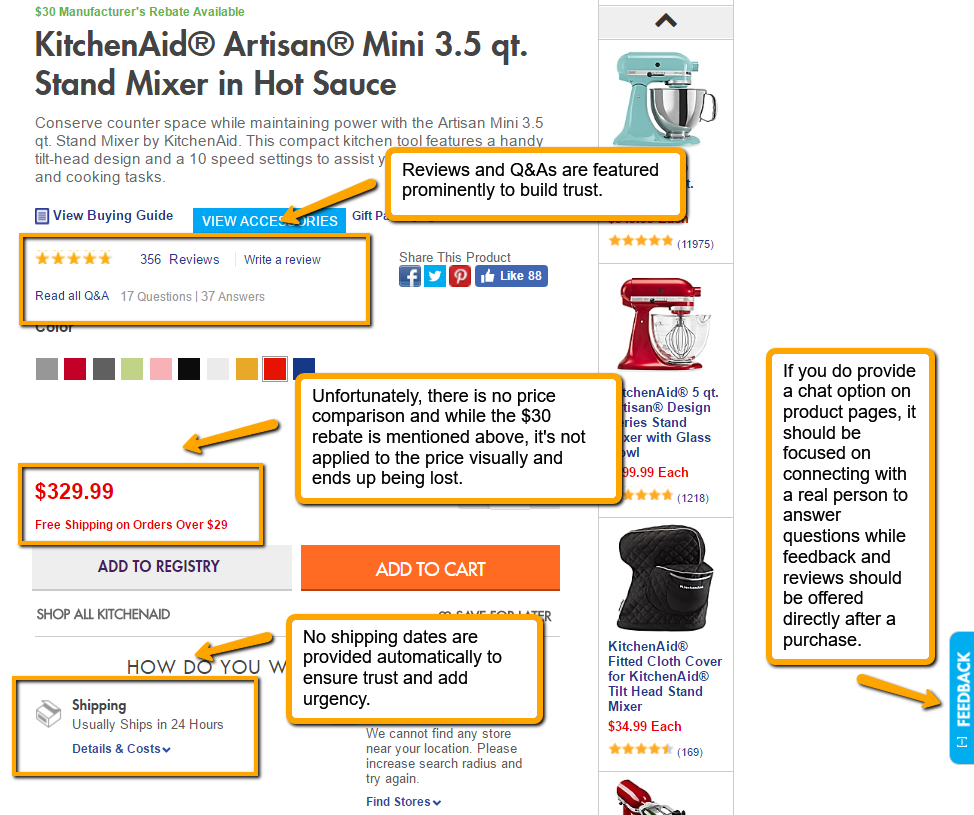
Image Via Bed, Bath & Beyond
Now let’s look at a shining example using a search for “friendship bracelet packs”:

Clicking through Pura Vida’s PLA, you arrive on this product page. Notice how many of the above principles are at work:
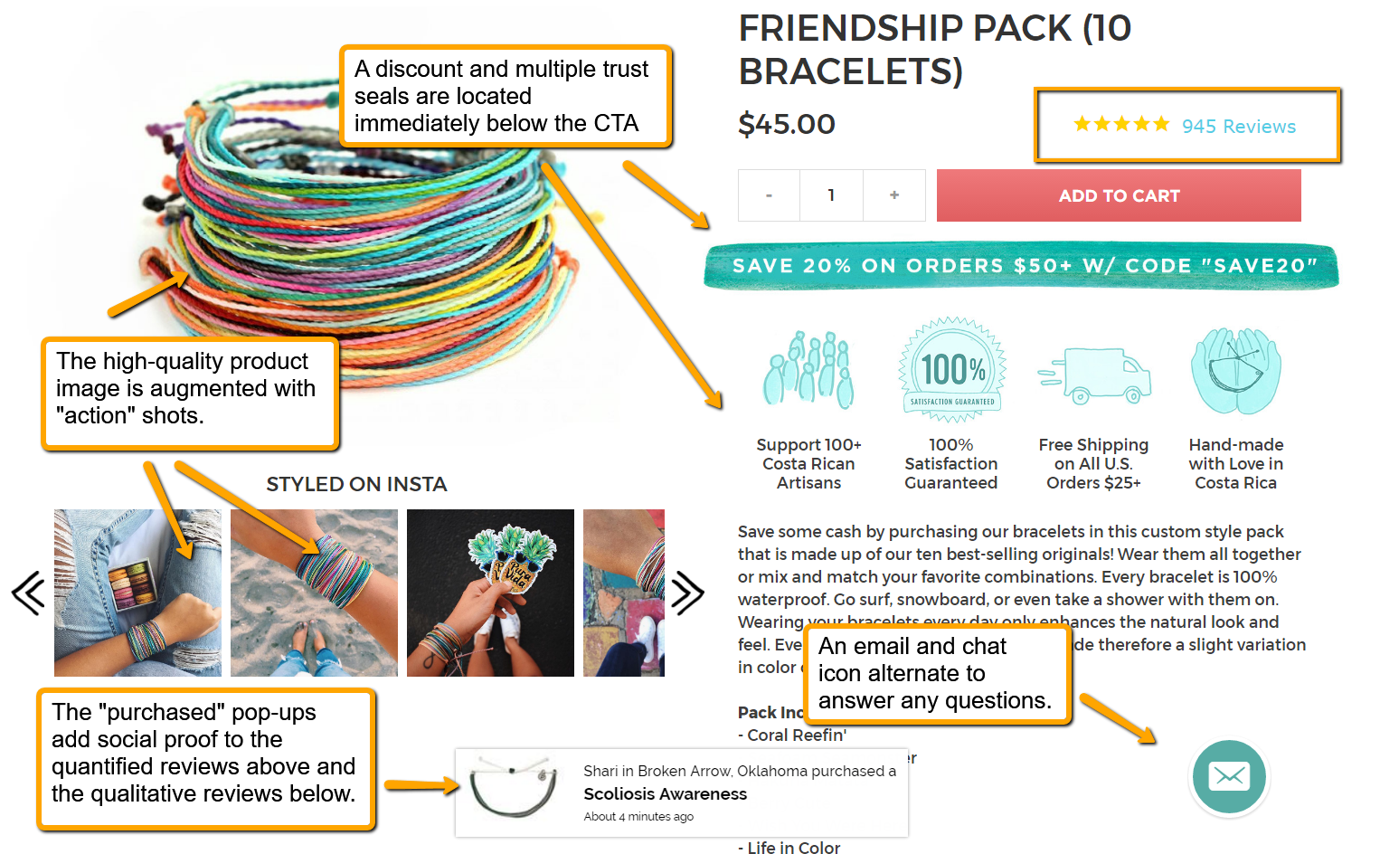
Image Via Pura Vida
Your Product Images: How to Give Hunters What They Want
The right images on a product page aren’t just about quality, but size as well. Despite what you may have heard, bigger doesn’t necessarily mean better.
After a series of original research experiments, ConversionXL discovered that image size depends on what you’re selling. Here are the different shirts they showed customers in their original study:
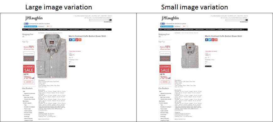
Image Via ConversionXL
And here are the results:
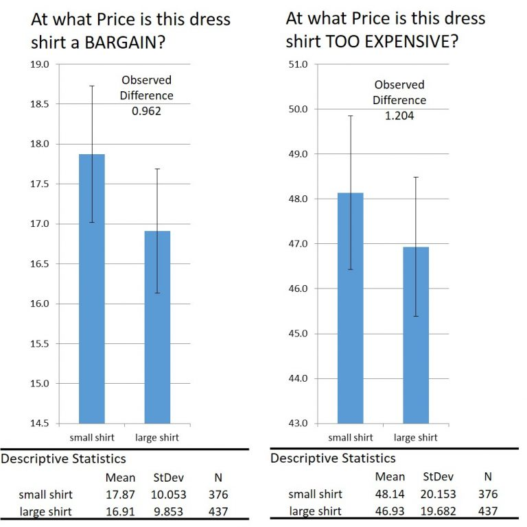
Image Via ConversionXL
When viewing clothing, it turns out that small images equate higher value.
On the other hand, if you’re in the business of selling electronic goods -- hard-drives in ConversionXL’s study -- the opposite is true.
The test pages look incredibly similar to the ones above:
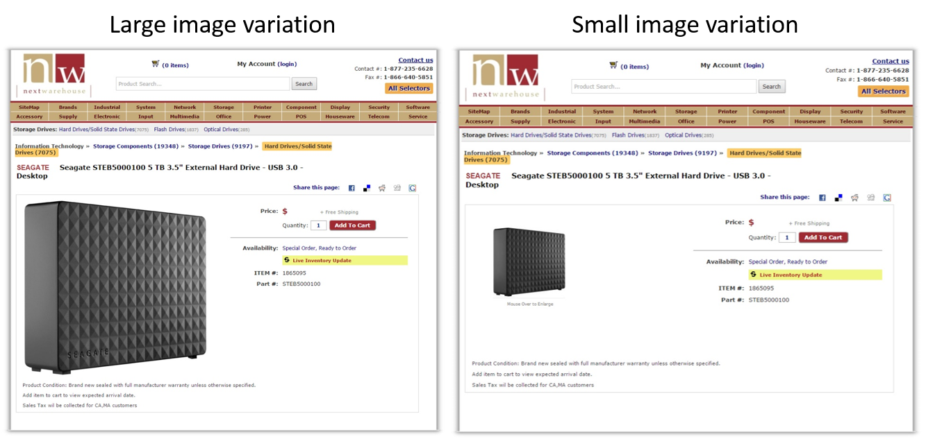
Image Via ConversionXL
The results, however, were quite different.
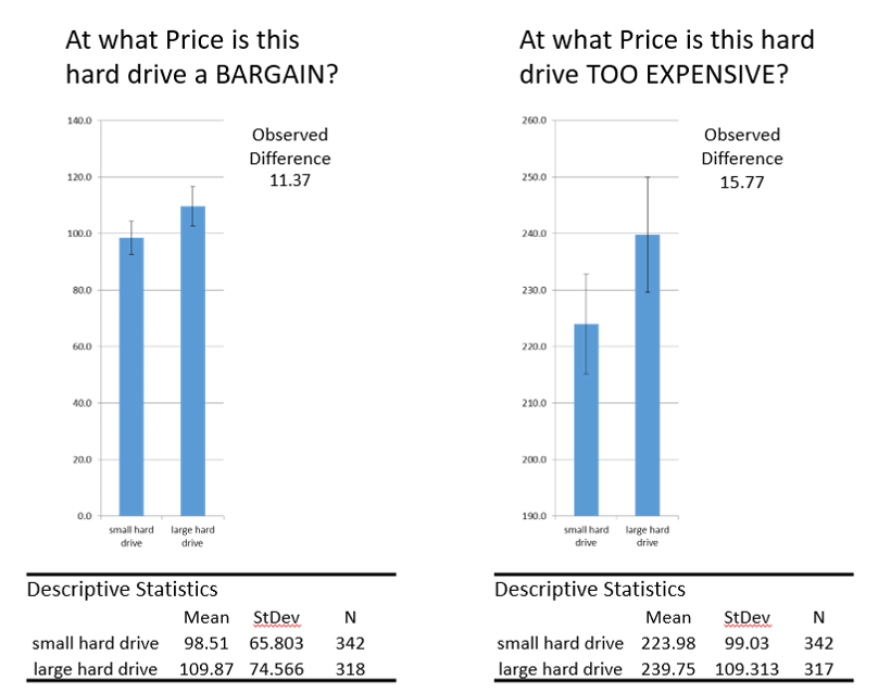
Image Via ConversionXL
Unlike clothing, when it comes to hard drives -- and presumably other electronics -- bigger is better: upward of 7%-11.5% better in perceived value (e.g., price).
The takeaway?
With product-page images, consider the context. These two studies present a compelling case not so much for blindly following them, but instead to make testing your image sizes a frontline concern.
Everything from reviews to price-tags to images helps establish trust with the hunter and thus, lead them toward conversion. Optimizing these to the same degree that you optimize your homepage is critical in the hunter’s book.
So what about written content?
Your Product-Page Copy: How to Give Hunters What They Want
When it comes to product descriptions, the hunter wants you to keep it short and relevant. While a leisurely visitor might be willing to read through a lengthy, well-written description, the hunter isn’t as interested. They want to see the relevant specs listed next to the product itself. This is especially helpful if the hunter is tracking other big game (you’re likely not the only store they’re looking at).
An effective way to cater both to hunters, as well as more leisurely visitors, is to break your product description page into pieces that essentially contains (1) a no-nonsense introduction and (2) a lengthier walk-through of additional details.
While Smarter Coffee’s page breaks many of the above rules above -- names, a lack of reviews for social proof, far too many “Related Products” vying for attention, and zero trust seals -- what they do well is this division:
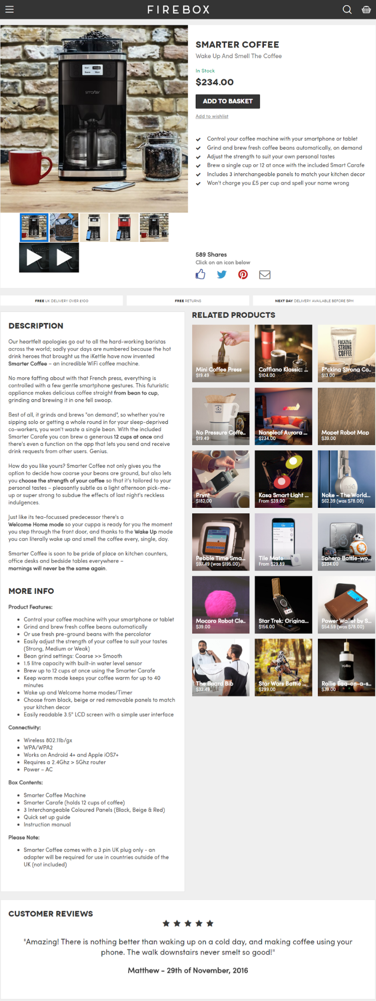
Image Via Firebox
Immediately you know what the coffee maker is capable of … from how stylish it will be in your kitchen to controlling it with your smartphone. The second half of the page then moves on to a relaxed tone.
3. Action: How Do You Drive High-Intent Visitors Forward?
Much of what we’ve looked at already is designed to drive the hunter forward: namely, toward “Add to Cart.” You can intensify the action with two additional tactics.
Number one: product-page-specific overlays.
On their homepage, Pura Vida utilizes a general overlay by testing two offers:
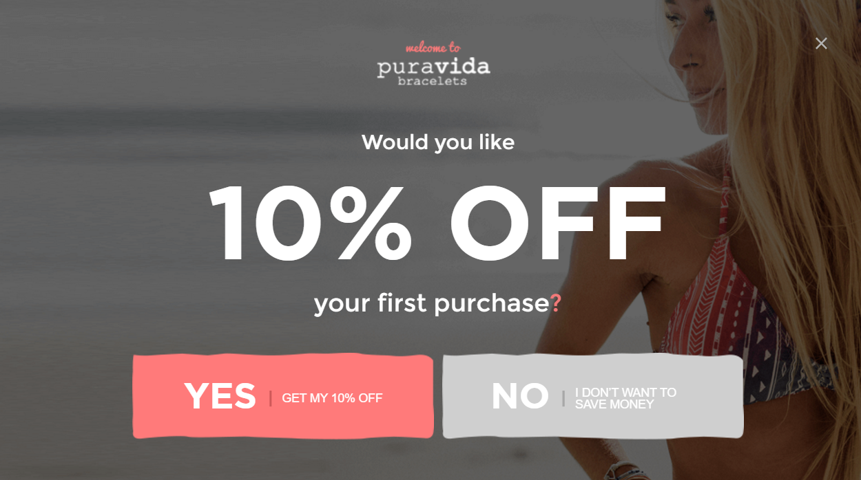

However, when you arrive on the product page we looked at above, this overlay appears:

Image Via Pura Vida
The change not only intensifies what behavioral economists call perceived utility -- people love getting a deal -- it also ensures variety for anyone who’s been to the homepage already and will only be bothered by the same offer they’ve already opted out of.
Number two: out-of-stock triggers.
If the hunter makes it all way through your product page only to find the product or their size is out of stock … don’t let that be a dead end.
Because they’re primed, this is one of your best opportunities to grab an email. Explain that if they’ll enter their email, you’ll be sure to send a notification when the product is back in stock.

Image Via Jules Smith
This is an all-too-often overlooked opportunity -- especially if you go above and beyond the plain, microcopy in the Jules Smith picture. In essence, this approach turns the hunter into the hunted.
The Hunter Is Ready to Buy ... But Don’t Just Let Them Buy
Naturally, you want the hunter to be able to make a purchase quickly and easily; otherwise, they’ll go elsewhere.
To cater to the hunter, keep in mind the three questions…
- Identity: Who are they and where do they come from?
- Intent: What do they want?
- Action: How do you drive them forward?
Next week we’re going to dig into the “Returner.” No, this isn’t someone looking to send back a purchase. These are non-customers who keep coming back as well as first-time customers who’ve already made a purchase.
The key is transforming both groups into lifelong customers so that they don’t just buy … but buy again and again. After all, that’s where enduring ecommerce success comes from.
(Note: This article is the second in a three-part series. Be sure to check out the first installment -- New Ecommerce Visitors: How to Serve Up Their Hidden Desires and Pull 'Em into Your Online Funnel -- as well as the last -- Returning Ecommerce Visitors: How to ‘Nudge’ Non-Buyers into Taking the Customer Leap.)
Read more
- How to Reduce Post-Holiday Returns
- Shopify Flow Templates you can use During COVID-19
- How to Create a Customer Journey in Ecommerce (With Examples)
- How to Create a Brand People Can’t Forget: Purple Mattress on Product, Voice, and Culture
- Supply Chain Optimization: How to Develop a World-Class Logistics Network
- New Ecommerce Visitors: How to Serve Up Their Hidden Desires and Pull 'Em into Your Online Funnel
- Why Leading Indicators in Ecommerce Are the Key to Success & How to Find Them
- The Science of Impulse Purchases: How to Encourage Your Customers to Buy More on the Fly
- How to Strengthen Your Marketing Using Emotional Intelligence

