This is the second post in our series on migrating our Shopify Apps to Shopify’s Polaris framework. If you haven’t read our earlier post on the factors that led us to considering Polaris, we’d encourage you to start there.
This post will focus on the implementation details of incorporating Polaris into our UI workflows, starting from mockups and wireframing all the way to writing code and creating reusable components. While Polaris provides guidance on component-wise usage and the APIs to use for it, the job of building large-scale applications with several moving parts has a lot more to it than that.
You might also like: What Led us to Consider Polaris, Shopify’s Design System.
Should you migrate to Polaris?
Before we dive into each phase of the process, let’s go over the general prerequisites and considerations that can help you decide if migrating to Polaris is feasible and if so, how the process can be streamlined.
- Availability of reusable markup : Polaris offers two ways to incorporate it in your project — using the React components, or using the CSS library and adding the classes to your own view layer. In either case, it helps to have reusable markup that can be altered without having to change too many things in various places. For example, if you already have a button component that is referred across the app from that one central location, only that component will need to be modified to incorporate Polaris.
- Use of an API layer : Relevant more to the React way of doing things, it helps if the data is fetched using standardized back-end APIs that are fairly decoupled from the view layer.
- Form controls: It is important to ensure that the form controls provided out of the box work for your use case. Given that Polaris lays a lot of importance in getting this right with its exhaustive list of form components, you should be covered.
- Reporting/tables: Polaris has
ResourceListandDataTablefor structured representation of datasets. While they do cater to the general use-cases of resource representation (ResourceList) and tabular presentation of numerical data (DataTable), they might not cover full-blown reporting scenarios.
- Data visualization : This is another area where Polaris doesn’t dictate any rigid rules as far as the actual implementation goes. There are general guidelines, but other than that, the onus is on you to adopt the same color scheme and look and feel in the charts as the rest of your Polaris app. More context about this can be found on GitHub.
- Limitations in control : As far as the Polaris React components go, as should be expected from components that are supposed to behave in a particular way, one might feel that there is certain rigidity in the availability of options. For example, there were points in time when we wanted the
Cardcomponent to accept markup in the ‘title’ prop. Standardization inevitably leads to such situations. Also, what appears as a limitation might be a design rule that enforces consistency.
Do you have a design that isn’t currently possible on Polaris? Follow the button below to open an issue for the Polaris team, and we may open the API to support it.
Open an issueNow that we have the general considerations out of the way, let’s take each phase in the front-end development process and go over how using Polaris impacts that phase.
Phase 1: Mapping UI elements to Polaris components
This is an area that required significant tweaking and rethinking to accommodate the Polaris way of doing things. It is important to bear in mind that you will likely have lots of existing customers currently using your app. Those customers have navigated the learning curve and gotten themselves familiarized with your app’s way of functioning, and so, the implications of any significant design changes should be thought through.
Some of the important questions that came up for us were:
- Should a certain layout in our existing implementation be left as is with just a change in implementation, or should it be rebuilt with a fresh layout?
- What colors should be used? Should we reconsider all colors used across the app?
- How do we account for the components used in the previous screens that simply aren’t available in Polaris (eg. responsive sidebars, or
daterangepickerwith presets)?
- Do we need to use Polaris components even when they don’t completely fit the use-case? Where should we draw the line?
- How closely should the guidelines be followed? What if the guideline doesn’t allow a particular usage but there isn’t any other way of doing it (or, what if there’s no easy way)?
Answering these questions requires a fair bit of research on the Polaris documentation, but the good news is that it’s extremely well organized. It isn’t exactly a surprise that the folks defining a design language for the entire Shopify ecosystem did a good job of designing their own documentation portal, but it definitely needs to be recognized. Our research would have been much, much harder had those resources not been intuitively organized.
Comparing our existing implementation to what-might-be with Polaris meant moving to and fro between components, testing out the interactions/flows, and involved a lot of white-boarding, data crunching, and playing out what-if scenarios. Below are some general pointers based on our experience that you might consider using in your decision-making process.
Migrating to React
Almost all layouts will require some rework if one is migrating to React. The good news is, if you follow component-driven development or use something like Vue.js or Angular 2, components will already be a part of your workflow. Plugging out your old components and replacing them with Polaris equivalents should be good enough.
If you haven’t been using components, which we found ourselves to be doing in at least some places in our app, the Shopify Admin console is a great destination to get help on which component is a good fit for a given use-case. For example, inspecting the datepicker in the Shopify Dashboard will help reveal how Polaris components are structured to create it.
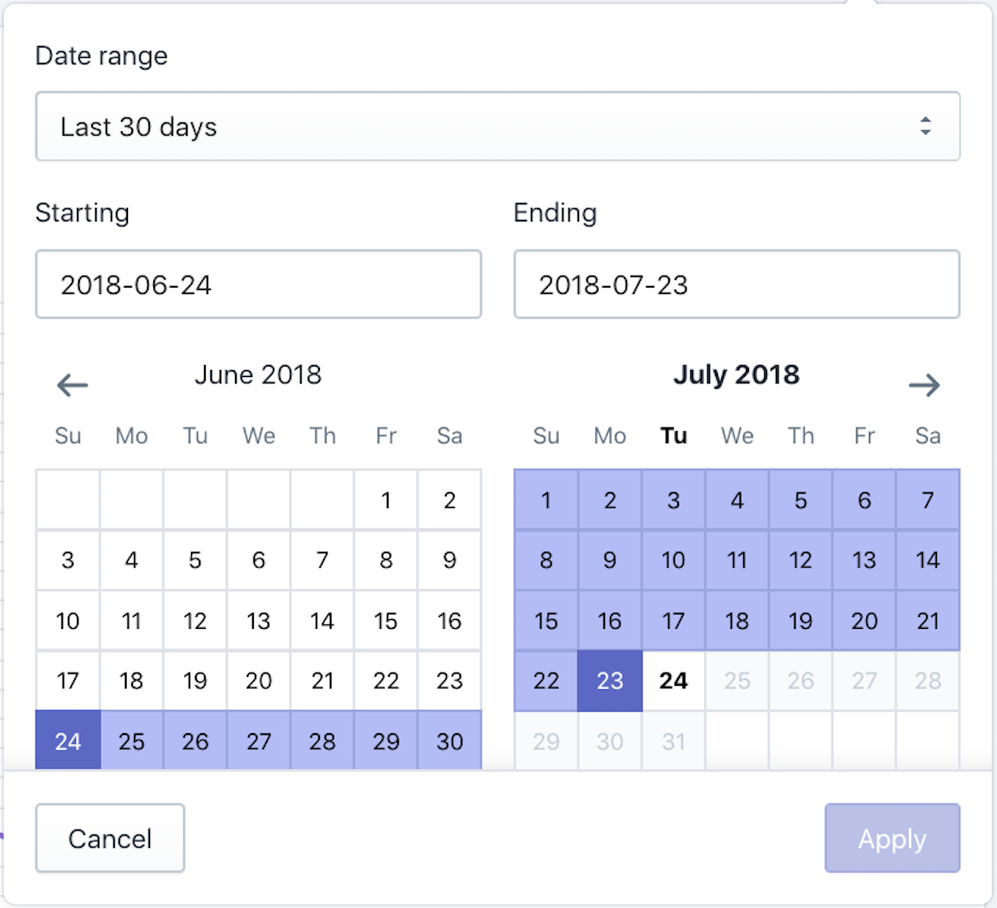
datepicker component in the Shopify Dashboard.Below is the HTML snippet that corresponds to the date-picker control:
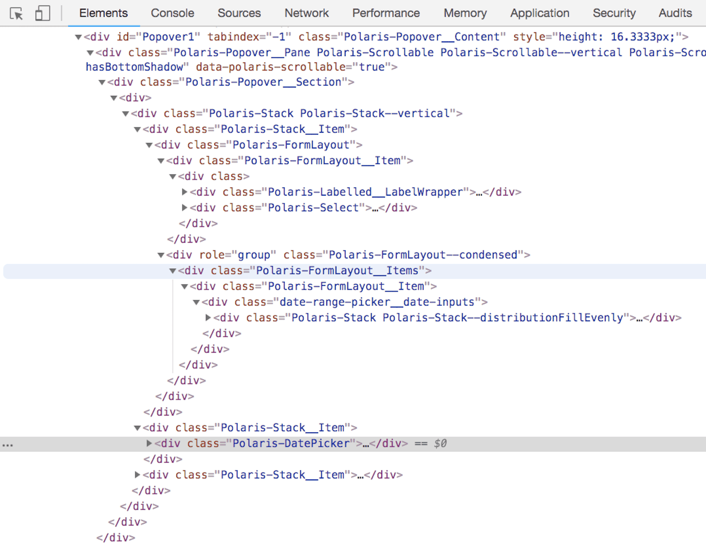
datepicker found using Chrome Inspector. See how it uses Popover, Stack, FormLayout and the Polaris datepicker components.Reconsidering color
Every color should be reconsidered. This is one of the principles Polaris specifically advocates, as stated in its documentation: “Our use of color should be purposeful, rational, and should serve to support the purpose of the content.”
Pick one color as the primary color from the palette and use it for backgrounds. More guidelines on color are available on the same page.
This is an area where following the guidelines as closely as possible can be extremely rewarding, since it’s what makes interfaces look consistent and polished.
Unavailable components
For the components unavailable in Polaris, a decision needs to be made — either you invest time and build them from the ground up using Polaris CSS guidelines, or you go around them by replacing them with Polaris components that still do the job.
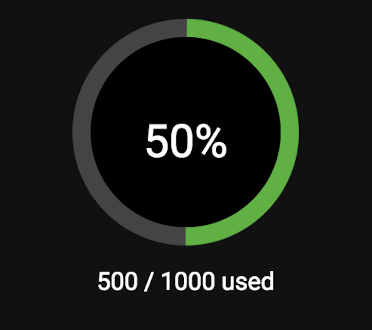
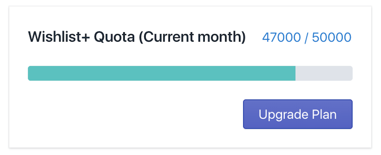
We built on top of the Polaris datepicker component to include presets along with some more features we needed, since it was an important part of the experience. On the other hand, we changed the quota widget, which used to be a Percircle, to a Polaris ProgressBar. This ended up being a more succinct representation of the quota usage.
Look for ways to save effort
Specifically, look out for the Layout, Card, Page, FormLayout and Stack components. They are likely to become the backbone of your app layout. Using them wisely can save you a ton of time and effort.
Take a look at the newly added pattern section on the Polaris website for more strategies to lay out content with Polaris components.
Turning a setting on and off
You might need a switch form component that allows users to turn a setting on or off. Use the SettingToggle component to turn on or off some important settings, and checkboxes for lower precedence settings.
You might also like: Introducing New Updates to Polaris: More Ways to Build a Great App UI.
Phase 2 : Scaffolding your app with Polaris
This step is required only if you are migrating from a non-React framework to React. If you already have a React project, adding Polaris is a matter of just installing its NPM package.
For scaffolding, Polaris provides many examples for the most common React scaffolders.
Using Polaris doesn’t change this step as much, since all we need to do is run npm install for it. At the end of this post are some more resources that might guide you in initiating your project, what libraries you might need, and how to create a scalable directory structure.
You might also like: Introducing Shopify Developer Tools for macOS.
Phase 3 : Writing code and debugging
If the first and second phases are done well, this should be a breeze. Each UI component should be created as an independent and reusable block that is simply repeated across the app (think of Lego blocks).
We spent a good amount of time building these core lower-level components that were designed to be as general as possible. Once they were in place, pages and layouts were just wrappers on top of those base structures.
Below are some implementation notes that might come in handy.
- If you are using react-router, its
Linkcomponent will clash with Polaris’sLinkcomponent. To solve this, use theAppProvidercomponent (linkComponentprop) to pass the component that should be used for all Polaris links. If you have external links in addition to this, using an anchor tag with theexternalattribute works just fine.
You can also build anExternalLinkcomponent based on the plain Polaris Link component:jsx
import {Link} from '@shopify/polaris';
export default function ExternalLink(props) {
return <Link {...props} external="true" />;
} - Polaris components don’t accept a class prop. If you need to apply custom CSS (say, extra padding) to a Polaris component, wrap it in a container
div, add a class to thatdiv, and use that to create CSS selectors. It might not be overkill to create a wrapper around all Polaris components. The wrapper should accept class names or styling objects.
- The
ButtonandTextFieldcomponents have a super robust and exhaustive API. Before exploring custom implementations, look carefully through all the options that this API supports. Chances are, yours will be covered in it.
- The
ColorPickercomponent has this weird thing that it accepts and returns color only in HSB. We built a wrapper that allows data exchange in HEX format.
- For some reason, in the
SettingTogglecomponent, the ‘enabled’ prop changes the color of theSettingToggleCTA to the non-primary color. This might help when this component is being used on a page where some other CTA is primary— say ‘Save Settings’. This isn’t really intuitive and might get fixed in future versions but that’s how it is today.
- The Stack component is almost as good as the CSS flexbox (and actually uses it internally). Use
Stack.Itemto control distribution of space and nest items if you need fine-grained control.
- Use the React Developer Tools Chrome extension to see how data is flowing between your components. This can help you debug Polaris components as well since you can see if all the props are getting passed correctly to them.
What’s new in Polaris v2
Shopify launched updates to Polaris back in May. Below are some of the major additions that came with that launch.
-
Dropzone: In v2, theDropzonecomponent takes care of the file upload UI and offers a clean API to use the file input.
-
AccountConnection: The layout for connecting various accounts with your app is standardized using this component.
-
DataTable: Responding to popular demand, Polaris v2 has a table implementation, allowing merchants to analyze numerical data.
-
Form: In conjunction with theFormLayoutcomponent, we will now have theFormcomponent, which provides support for form submission.
-
Modal: We will be able to use theModalcomponent in Polaris v2 for events that require the merchant to be blocked until some action is taken. A word of caution from the documentation, though—this should be used thoughtfully and sparingly.
You might also like: How to Get the Most Out of Shopify’s New Design System Polaris.
Links for scaffolding
Here are some links that can help setup your project with React and Polaris.
Looking forward
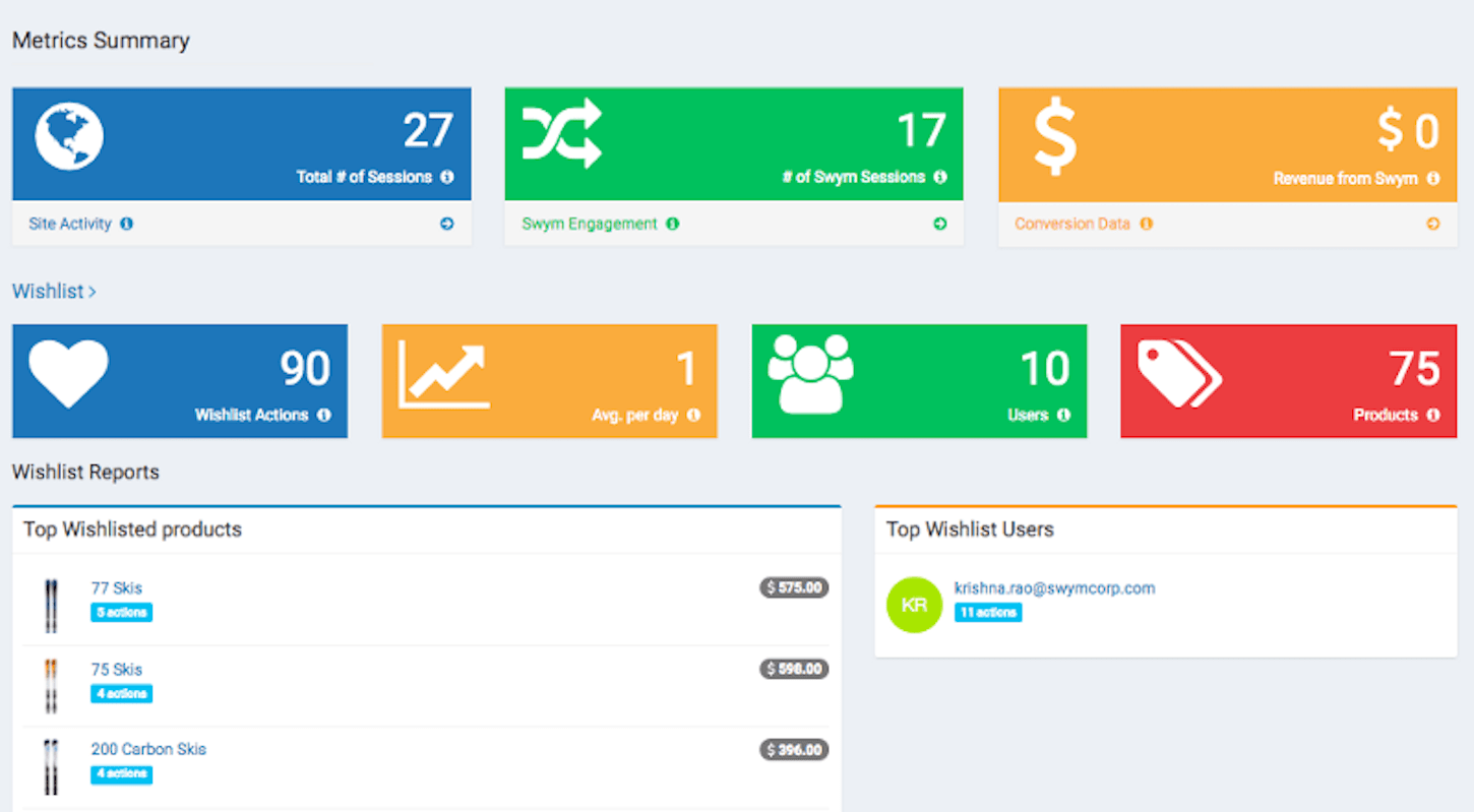
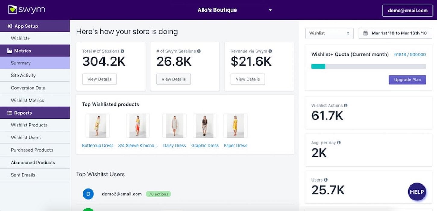
We hope our experience implementing Polaris will help you through the process with your apps. The before and after shots of our admin dashboard clearly show how following a repeatable framework can help you build a stronger user interface. Sure, there are a lot of things that we can improve on, and we will get there, but the foundation now looks solid.
In our next and final post in the series, we’ll address the topic of building our reporting module with Polaris—it was enough work that it warranted its own post!
It’s interesting that Polaris doesn’t quite cover reports or metrics in as much detail as you’d expect from a guidelines and components perspective, but we expect this will come in the future given how reports are such a core requirement of virtually every Shopify App.
In our case, we ended up figuring out a migration strategy for our reporting module to make it Polaris ready. We’ll share all the details in part 3 of this series.
Read more
- How to Upload Files with the Shopify GraphQL API and React
- Shopify App Challenge Past Participants: Where Are They Now?
- 10 Things we Learned Building Our First Shopify App
- Three Types of Trending Apps in 2017 and What You Can Learn for 2018
- Learn About Shopify App Development at React Summit 2021
- An Introduction to Rate Limits
- How to Level Up Your App with Theme App Extensions
- How We’re Improving Discoverability On The Shopify App Store
- Persistence Matters: 6 Lessons From My First 6 Months on the Shopify App Store
What steps have you taken to migrate to Polaris? Share your experience in the comments below!


