Adding holiday-specific customizations to your client’s website design is a great way to encourage sales and spice up the site. It demonstrates your attention to detail — something critical in the world of ecommerce, where the competition is limitless. And it also helps your client’s store stand out from the crowd, especially amongst merchants selling similar products.
With that being said, Valentine’s Day is a great example of a holiday ripe with colors and symbols any designer can draw inspiration from.
Below, I’ve highlighted eight stores built on Shopify that show the best of what this romantic holiday has to offer. Find a little inspiration in the Valentine’s Day touches each store has implemented. Enjoy!
You might also like: 10 Places to Find Design Inspiration Online.
1. Bluebella
When you first enter Bluebella’s website, designed by Shopify Plus Partner We Make Websites you come across a large carousel featuring various images of the lingerie merchant’s products. Each image displayed is customized to Valentine’s Day — either promoting a Valentine’s Day collection, an all-red collection, or Valentine’s-themed blog content they’ve released.
All of the images seamlessly tie in the theme of Valentine’s Day, while prompting the user to explore different areas of the website (e.g. social media channels, blog, curated collections).
2. Doritos Ketchup Roses
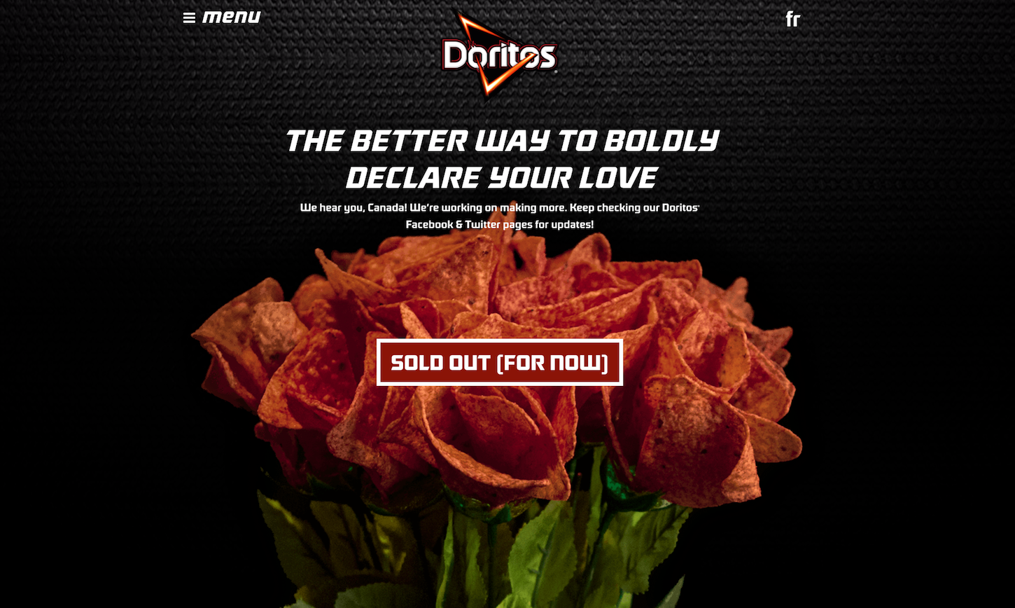
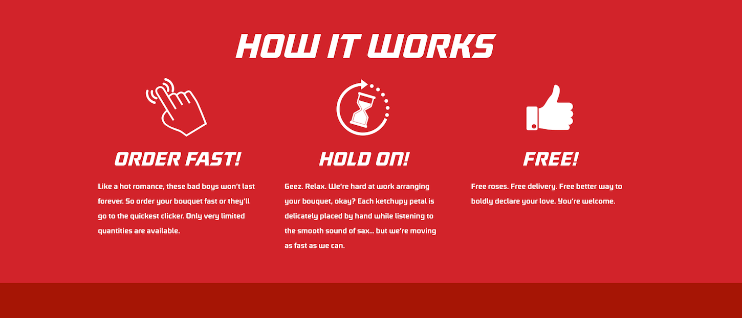
Shopify Plus Partner SOVI Creative created an ecommerce website specifically for this clever Doritos Valentine's Day marketing campaign, which creatively uses the brand's signature product to promote the holiday.
The site is designed with an emphasis on simple imagery and uses minimal text. The website catches the user’s attention with bright colors and unique visuals, and holds attention by making the site easily readable, with short and concise messaging. They even provide a video on how to make Doritos Ketchup Roses if you’re unable to order them. Simple, user-friendly, and fun!
3. Olivia Rose
With its elegant product photography and soft hues of pink and white, this online children's clothing store is not only pretty design-wise, but adds a sweet seasonal twist. Truly getting into the Valentine’s Day spirit with red hearts falling over the homepage and its large feature images, the Olivia Rose site uses the technique to capture the more kid-friendly side of the holiday.

4. Bellabeat
Bellabeat is a smart jewelry brand that is devoted to using innovative technology to track women’s health and wellness, encouraging them to take better care of themselves. Their site pairs great product imagery and short text to clearly communicate key product features.

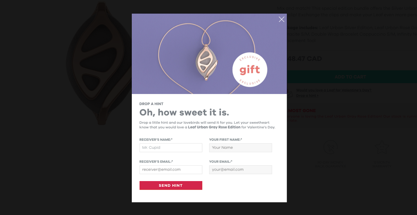
A neat feature that Bellabeat implemented specifically for Valentine’s Day, is a pop-up window that allows users to send a gift-hint, via email, to someone who may be shopping for them. Buyers will definitely appreciate any feature that helps them avoid the frustration of having to return or exchange not-so-sweet gifts.
You might also like: 4 Trendy Visual Design Techniques.
5. Oat & Mill
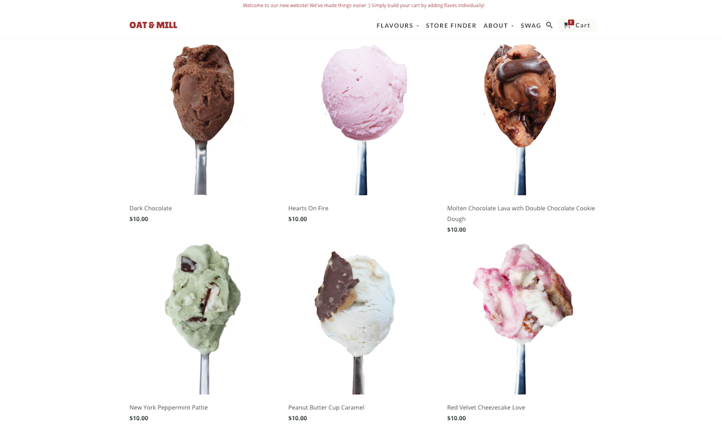
This vegan ice cream shop has my mouth watering every time I visit. A straightforward way to tie-in the day of love online, Oat & Mill features some special Valentine’s Day flavors, including ‘Hearts on Fire’ and ‘Red Velvet Cheezecake Love.’ This shop even includes fun illustration, complete with hearts and smiles to signal holiday-specific products.

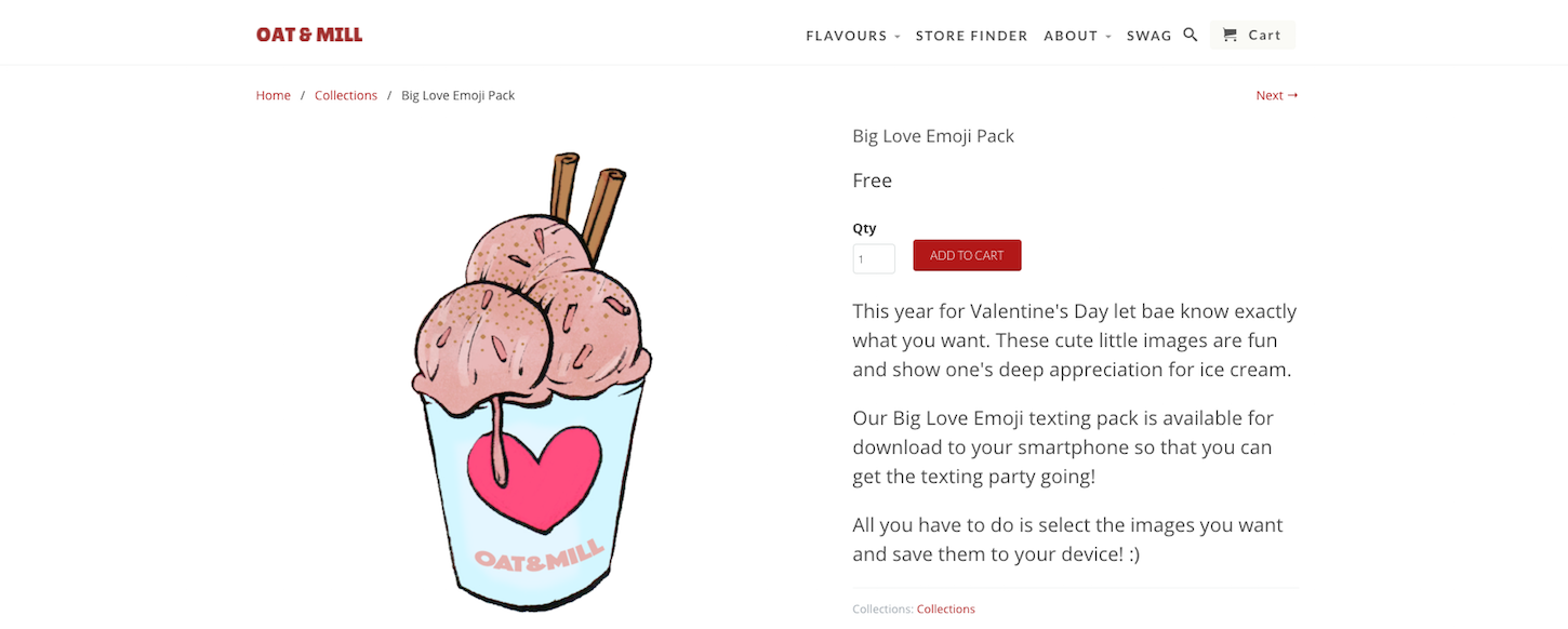
Similarly to Bellabeat, Oat & Mill also offers shoppers the option to send someone a Valentine’s gift-hint.
However, instead of sending a hint via email, Oat & Mill offers a set of Valentine’s Day emojis that shoppers can save and send via text or instant message. A fun design element that differentiates their brand well.
6. STRIPPD
STRIPPD was designed by Shopify Partner The Big Webowski, who received an honorable mention in last year’s Shopify Ecommerce Design Awards. The natural supplement site is beautifully executed and soothing to the eye, with its minimalist design, appealing product photos, and easy navigation.
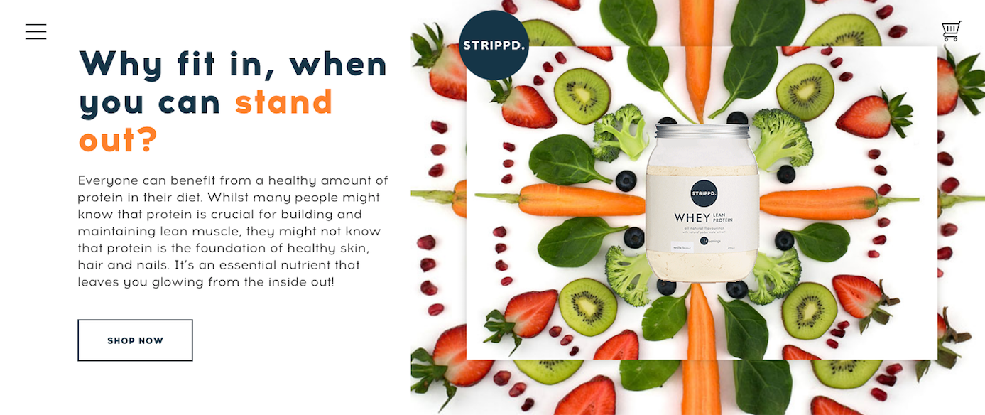
Along with it’s clean design, STRIPPD is also a good example of a website that subtly highlights Valentine’s Day. As you can see below, STRIPPD uses a simple email subscription pop-up, complete with red accents and hearts, to signal the holiday. Just because it’s the holiday of pink and red, doesn’t mean websites have to go-big-or-go-home in order to weave in some of the love online.

7. Bespoke Verse
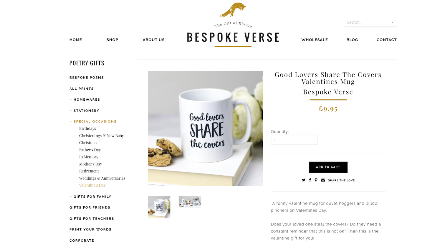
This poetry-themed ecommerce site uses simple design and color schemes to their advantage, as many of their products feature a lot of text.
Bespoke Verse targets the hopeless romantics among us, by offering shoppers a curated Valentine’s Day section. Grouping products into collections or sections can help organize your site, and makes the shopping experience easier for users, especially when they’re looking for something for that special someone.
8. Woops!
To finish off this roundup of beautiful ecommerce stores with special Valentine’s Day design touches, we have Woops! — a specialty macaroon shop. Woops! is a great example of a store that has subtly customized their homepage to acknowledge that it’s Valentine’s Day.

They have a rotating banner with messaging tailored to the theme of love — not Valentine’s Day explicitly. They have also implemented a consistent color scheme throughout the homepage (including their product photography), using only hues of pink and chocolate.
Have you come across any stores with a Valentine’s themed website design? Let us know in the comments section below!
Read more
- 10 Halloween Graphics to Make Your Client’s Website Spooktacular
- 8 Conferences to Save Your New Year's Resolution
- 8 Development Trends You Need to Know to Successfully Build for Shopify in 2022
- Back to School Gifts for Programmers and Developers
- 10 Sustainable Holiday Gifts For Designers and Developers in 2018
- 10 Podcasts to Help You Get Creative
You might also like: 10 Stunning Ecommerce Websites to Inspire You in the New Year.

