First mentioned as a tiny trend at the beginning of the year, non-rectangular headers were picked out by Jon Moore on UX Power Tools as being something to watch out for. In his article, he showed several examples, and people in the web community quickly agreed that they were also seeing this trend around the web. We’ve even used non-rectangular headers here at Shopify on some of our properties, like Shopify Plus.
In this article I’ll cover what a non-rectangular header is, and review a few resources related to the subject. I’ll also go over some examples of how you can get started implementing these dynamic headers using a website builder.
What is a non-rectangular header?
A non-rectangular header is a way to break the parallelled structure we’ve become accustomed to online. Rectangular shapes are inherent in web design, probably because web layouts are really just made up of visible and invisible boxes. With non-rectangular headers, designers and developers are experimenting with ways of breaking those horizontal lines, creating more dynamic and visually interesting work.
"A non-rectangular header is a way to break the parallelled structure we’ve become accustomed to online."
In many cases these non-rectangular patterns — whether they are sweeping horizontals, waves, zigzags, or subtle curves — often add a z-level depth to the designs and move the eye down a page with ease. Here are some examples to give you an idea of what I’m talking about, and if you want even more check out Jon’s article.
1. Shopify Plus

The Shopify Plus website uses non-rectangular headers in a diagonal zigzag fashion, to give the feeling of a subtle graph.
2. Mike Sattler
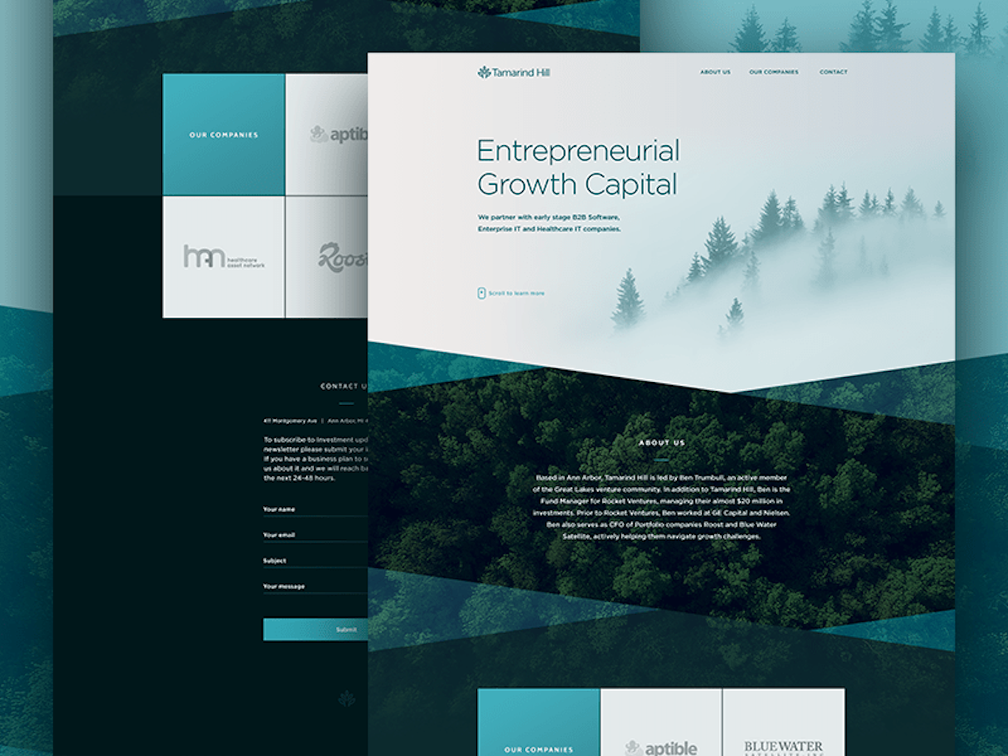
Mike Sattler designed this homepage with a couple of overlapping diagonals, which help pull the viewer’s eye down the page.
3. Stripe
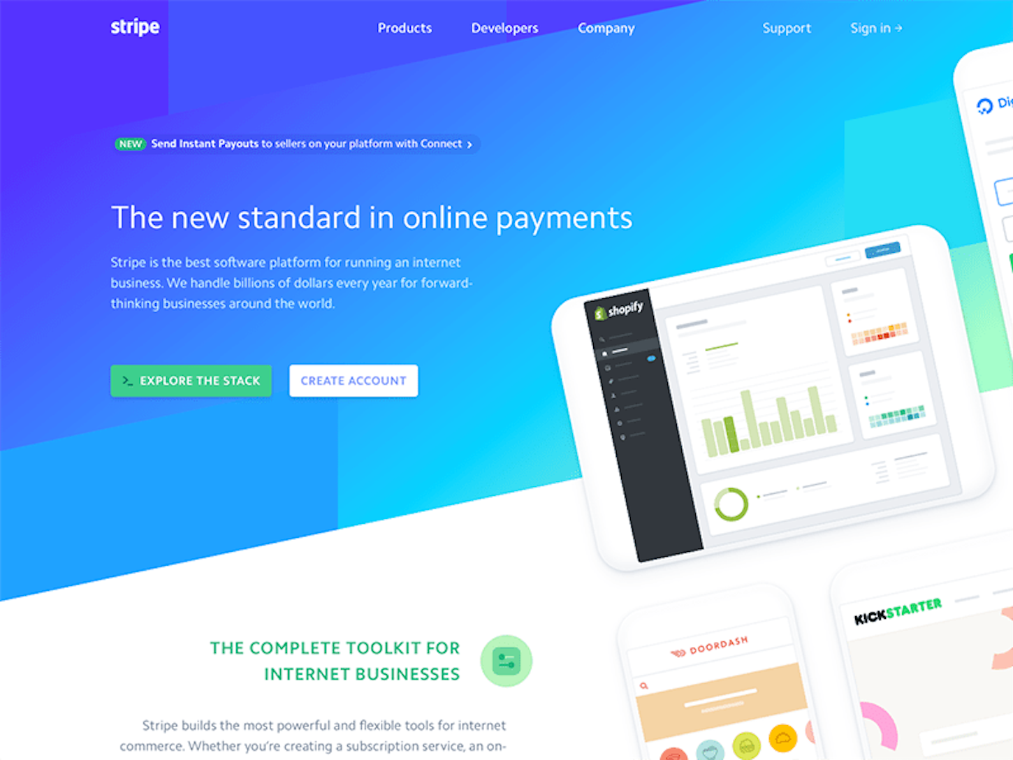
Stripe’s homepage design by Benjamin De Cock uses a series of gradient based rectangles that have been skewed to create a sweeping diagonal, drawing your eye across the page.
Building non-rectangular headers
In my opinion, the trickiest part to building non-rectangular headers is figuring out the best way to code these designs. Because there are a multitude of ways to achieve similar effects, I’ve found Ahmad Nassri’s Ultimate Guide to Non-Rectangular Headers super helpful in determining the best approach for a particular design.
More specifically, I really enjoy how he breaks each type of non-rectangular form down into four categories: simple CSS, generated content, cross browser support, and performance.
At the end of the day, it really depends on your specific situation. For example, what browsers you need to support
will determine if you can use an SVG mask, CSS shapes, or 2D transforms. That being said, if you take a progressively
enhanced approach, these design flourishes don’t need to render for everyone — those with an up-to-date browser can
experience the gorgeous design, while those with an outdated one might just get a regular rectangular header. If you have a better browser, you should get a better experience . Just
note that all Shopify theme layouts should work in IE9+, and the latest versions of Safari, Firefox, and Chrome, as
per our
guidelines.
With my examples below, I’ll break down why I chose to use a particular technique and address that technique’s limitations.
Diagonal header with background image
Using Ahmad Nassri’s guide, and knowing what browsers we need to support with Shopify, I think the best choice when using diagonal header with background image is to use CSS gradients. The only category that this doesn’t score top points in is browser support, as Opera mini doesn’t support the feature. Otherwise, the choice is simple to implement, supports both solid colors and background images, and it has one of the fastest paint times.
However, if you are looking to implement box-shadows, this option is limiting and you might want to consider using an SVG background image instead — which for any complicated shapes is generally the best way to go.
The markup is super straightforward, the first section is your header, which
contains a background-image. You have a separator section in between, which is
what creates the diagonal header itself using a CSS gradient. And finally, the section below which contains the
content for the next section of your site.
The separator element is where the key CSS takes place:

So what’s actually happening here? The separator sits on top of the header
element. I’ve set the separator top-color to transparent grey (it would normally be set to transparent) to show you
where the gradient breaks, and sits on the header.
You might also like: How to Create a Compelling Web Design Portfolio.
Product cards with diagonal headers
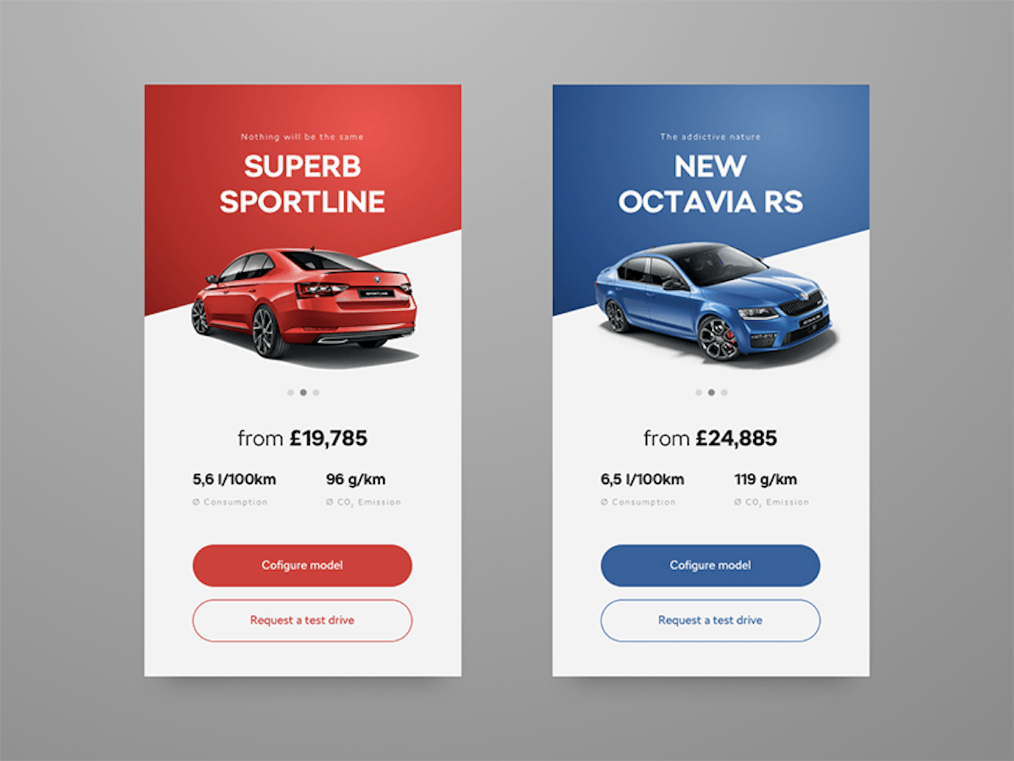
Product cards by Patrick Kantor use diagonal headers to draw the eye past the car and towards the copy below it.
Inspired by the above product card design, I wanted to use what we’ve already done and extend it by adding a product image into the mix. How can we use this technique on product cards?
To extend what we’ve already done, simply add your image inside a wrapper in the bottom section, and add the following CSS:
.product-wrapper{
 width: 100px; /* width of the image to center */
 margin: auto;
 position: relative;
}

.product-image{
 height: 100px; /* height of the image */
 width: 100px; /* width of the image */
 position: absolute;
 top: -100px;
}
Where the top value is set to the negative height of your image, to pull it up
onto the diagonal separator. This technique will have it stay centered no matter the screen size, and it’s relative to
the second section so depending on if your header, .separator, and section are in their own div, it will still work. What’s nice about this design is that it brings attention to
specific products without taking away from the product itself. Note that to do this, the product image should be a
transparent PNG with the background dropped out to get the same desired effect.
Also, I would only recommend doing this for a few featured products on your client’s site, and not for every product (especially if you have a large inventory).
You might also like: Web Design Experts Share Their Advice for Attracting Your Next Client.
In the wild
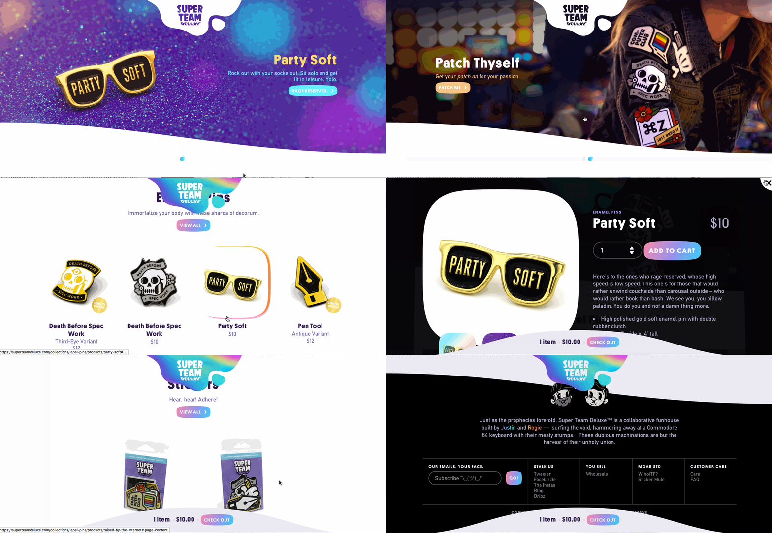
I want to end this post with a great example of non-rectangular headers being used on a Shopify store. Not only does Super Team Deluxe use non-rectangular headers. But they go a step further and employ similar shapes throughout their site, such as in their header logo, cart popup and footer. It adds a playfulness that fits their brand and their products.
Try something new
One thing to keep in mind when using non-rectangular headers is that there are so many applications and techniques.
There is no “one way” or “right way” of implementing non-rectangular
headers .
.
Depending on your design, you have to do your research and testing. As developers, we should always be thinking about performance and browser compatibility whenever implementing flourishes like this in projects.
Don’t be afraid to use @supports statements either, if what you want to achieve isn’t possible in older
browsers, you can scope your beautiful designs to appear in only the newest browsers if you want.
Don’t forget Black Friday Cyber Monday is coming up, why not try something fun and wow customers! In the end, it’s up to you as the designer or developer to try new things and push your designs, the possibilities are endless!
Thirsty for more knowledge on non-rectangular headers? Check out these additional resources:
- Ultimate Guide to Non-Rectangular Headers — Ahmad Nassri
- Accompanying repository with performance tests and breakdown of techniques
- Creating Non-Rectangular Headers — Erik Kennedy, CSS Tricks
Read more
- How to Create Your First Shopify Theme Section
- A Modern Approach to CSS Pt. 2: Building Resources
- Free Webinar] Developing with Shopify: Using JavaScript to Add Ecommerce to Any Website
- How to Refactor a Shopify Site for Javascript Performance
- Getting the Most Out of Chrome Developer Tools: 4 Modern Features You Need to Know
- 5 Easy-to-Implement Website Maintenance Tips for Your Client's Ecommerce Business
- Free Webinar] Getting Started with Sass and Shopify
What do you think about non-rectangular headers? Tell us your thoughts in the comments section below!


