Building for the unknown can be tricky, and clients or merchants always want some level of control when it comes to their websites. You might be building a custom theme for a client, or building a theme to be distributed on the Shopify Theme Store; in both cases there are a lot of things a merchant will want to customize and be able to change.
So how do we make our themes dynamic for clients?
That’s when theme options are your best friend. They allow you to configure theme settings, which merchants can access using the Theme Editor.
In this article, I’ll explain how to create dynamic color schemes using the settings_schema.json file. More specifically, I’ll cover how to change color schemes based on theme settings, and how you can create preset options with the settings_data.json file and allow clients to choose a curated preset option that you define, so they can choose their ideal ecommerce color palette.
Tip: If you haven’t used theme options before, you will want to read this introduction to theme options.
You might also like: 3 Simple Steps for Setting Up a Local Shopify Theme Development Environment.
What are theme options?
Like I mentioned above, theme options allow a merchant to customize the look and feel of their website. It’s important to note that the theme options that are available to a merchant, are predetermined by the theme developer who builds the theme.
Then, using theme options, Liquid objects in your CSS or Sass, and rules in your Liquid templates, you can build dynamic themes that allow merchants to customize the look and feel of their online store, while still maintaining some control. You can view a theme’s options by going to the Online Store tab, selecting Customize theme, and going to the General settings tab.

Creating dynamic color schemes
Creating dynamic color schemes might be less important when building a custom theme for a single client (where the theme matches designs already discussed), but what if you plan on creating a theme that might be used by many different merchants? A custom color scheme is something that a merchant will want and expect to customize with their new store.
To customize and control the theme options found in the Shopify Theme Editor, you’ll need to dig into the settings_schema.json file. settings_schema.json is located in the config/ directory of your theme.
1. Setting up the settings_schema.json file for your theme
First we want to define a few properties about our theme itself. Add the following code to your settings_scheme.json file:
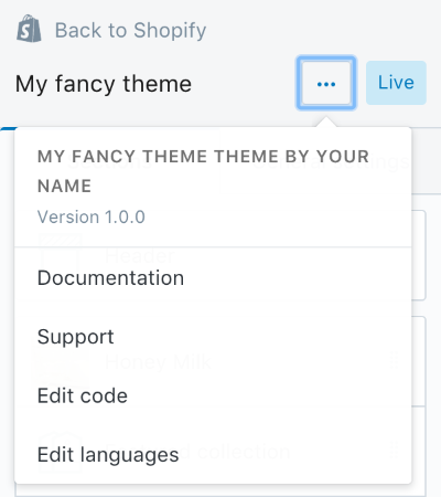
This sets up some theme information and links for custom themes through the Theme Editor panel, behind the ... button. Name must be set to theme_info for this section to create the appropriate mappings for your theme options.
Theme_name refers to the readable name that appears in the popup. Theme_author should be the author of the theme, often the freelancer or agency creating the theme. Theme_version refers to the version of the theme; this is necessary if you plan on distributing your theme, and will most likely make updates in the future.
Theme_documentation_url references the help URL or documentation for your theme, and displays as the Documentation link for your theme. Theme_support is the url to contact a support team for your theme, and displays as the Support link. Make sure to escape / characters using a \ in urls.

2. Adding a theme options section
To get started, we’ll need to define a section for our color settings. This goes directly after our theme_info section. Make sure to separate the two sections using a , and place the following code before the parent closing ] bracket:
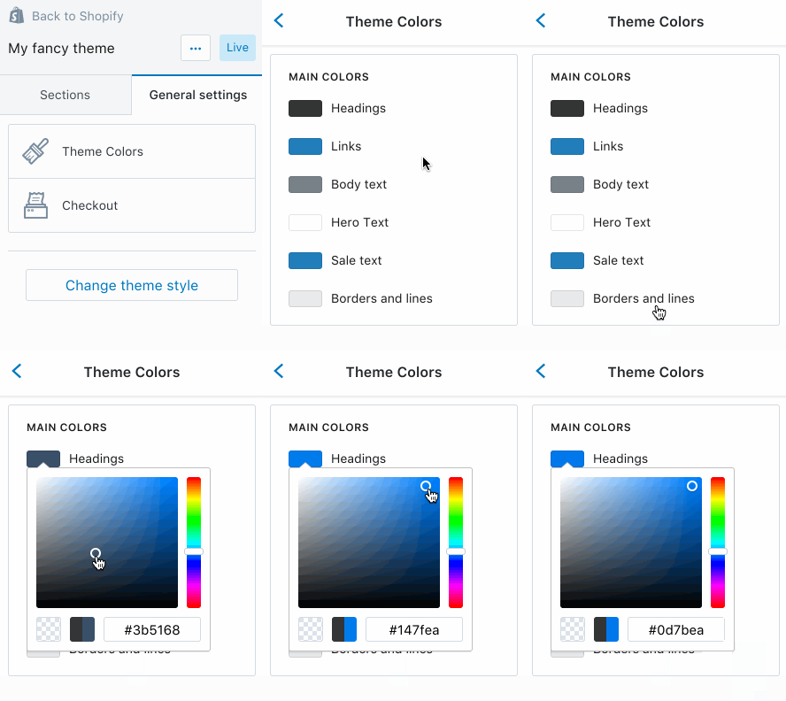
Here, name refers to the readable title for the section we’re creating. Settings sets up where we’ll place the rest of our theme options for this section. You should see the following added to the Theme Editor once you save and refresh:

3. Adding a theme options headings and settings for colors
Once we’ve added our section for Theme Colors, we can now create a subsection using the option of type header, with the content set to the title of that subsection, followed by theme options for various colors. The following theme options should be added inside the settings square brackets:
Each theme option is found within an open { and a closing }. I’ve created several examples in the code above. When building out a color theme option, it requires three mandatory properties. Type, which defines which property to be rendered; in the example above we have a header type and several color types. ID, which is referenced in your theme templates, CSS, or Sass files, and generates the output/value. Label, which creates a title in the theme options to clearly describe the settings’ function.
Default creates a default value for the color theme option. It’s not mandatory, however without it, the color value is blank. This can be problematic if you’re using theme options in your CSS or Sass as a property value, which we’ll be doing next. If no default is set, certain declarations won’t render properly because the output of the settings object will render as empty or blank. Therefore it’s important to also specify a default color value for each of our theme options.
The final settings_schema.json file should look something like this:
4. Using theme settings in CSS or SCSS
Now that we’ve created a bunch of theme options, we can use them in our CSS. Because Shopify renders .liquid files on our servers, you can simply append the .liquid extension to your CSS or SCSS files, and our servers will compile the Liquid found in them first, then compile the next prefixed extension (if that’s SCSS) to CSS. With the .liquid extension you’ll have automatic access to the theme’s settings object within a CSS or SCSS file.
CSS
Create a theme.css.liquid file in your assets folder. Once created, make sure to add it into the <head> element of your theme.liquid template using the following:
{{ 'theme.css' | asset_url | stylesheet_tag }}Where theme.css is the name of your stylesheet, | asset_url returns the URL of the file in the assets folder, and the | stylesheet_tag generates a link element with the source as the full URL of your theme.css from that directory.
<link href"=//cdn.shopify.com/s/files/1/0087/0462/t/394/assets/theme.css?28178" rel="stylesheet" type="text/css" media="all">Within your CSS file, you can access any of the theme options colors by simply accessing the property in the settings object inside {{ and }}. For example:
h1, h2, h3, h4, h5, h6 {
  color: {{ settings.color_heading }};
}
In the example above, color_heading is the ID we specified in settings_schema.json. It only changes our heading color if we set up our CSS to reference the theme option.
SCSS
Create a theme.scss.liquid file in your assets folder. Once created, make sure to add it into the <head> element of your theme.liquid template using the following:
{{ 'theme.scss.css' | asset_url | stylesheet_tag }}Where theme.scss.css is the name of your stylesheet compiled to CSS, | asset_url returns the URL of the file in the assets folder, and the | stylesheet_tag again, generates a link element with the source as the full URL of your theme.css from that directory.
<link href"=//cdn.shopify.com/s/files/1/0087/0462/t/394/assets/theme.scss.css?28178" rel="stylesheet" type="text/css" media="all">settings object the same way you would within a CSS file. The bonus, however, is with SCSS you can use these theme options strategically with variables.
$color-link: {{ settings.color_link }};

a {
  color: $color-link;
  text-decoration: none;

  &:hover,
  &:focus {
    color: darken($color-link, 20%);
    text-decoration: underline;
  }
}
In the example above, color_link is the ID we specified in settings_schema.json. We’ve assigned it to a variable called $color-link and then used that variable in our SCSS file. Using native SCSS functions like darken() or lighten() we can create dynamic color schemes based off only a few main colors.
Being strategic with color variables
If you’re building a theme to be used by the masses, it’s important to think about how specific colors might be linked or play off of one another. For example you could have a spot color used for both links and buttons across the site, and everything else might be quite neutral in your initial design. You have the creative control to limit and to extend what can be changed easily by a merchant, and that may be as simple as limiting color theme options to a single spot color, and then using variations of that color through Sass functions and mixins. In some cases a single spot color with neutral backgrounds could save a merchant time, instead of having to make many choices and giving too much control.
Alternatively, that might limit who will want to purchase your theme, because a merchant might want “all the things!” In the end it comes down to intent; what do you want a merchant to be able to customize, and which design elements do you believe you need to control.
You might also like: Developing Shopify Themes with Accessibility in Mind.
Presets and schema_data.json
So now that we know how use the {{settings}} object in our CSS and SCSS files, how can we specify certain presets or color schemes for our clients?
For example, you might want to create both a light and dark version of your theme. The light version might be the default values set in the settings_schema.json file. However, if a merchant changes any of these values there is no way for them to “go back” to the original default settings, unless we create a “preset”.
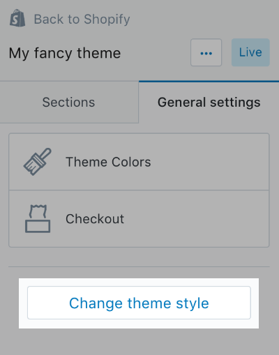
A merchant can find presets by going to Customize theme, clicking on the General settings tab, and clicking on the Change theme style button. The Change theme style button won’t appear if the theme doesn’t have any presets built in.
Read more
- Four Smart Reasons to Embed a Shopify Store in Your Client Websites
- Introducing Online Store 2.0: What it Means For Developers
- Building the World’s Best Commerce Apps with Built for Shopify
- How to Build a Shopify App as a Front End Developer
- How to Manipulate Images with the img_url Filter
- Top 10 Color Palette Generators for Website Colors
- How to Use Liquid to Create Custom Landing Page Templates
- 4 Lesser Known but Powerful Web Developer Tools that Increase Productivity
- How Open Graph Tags can Optimize Social Media Experiences

Creating presets is quite simple. Inside the config directory of your theme there is a file called schema_data.json. If you haven’t created it, it will automatically be generated by Shopify for you once you upload your theme. In schema_data.json you will find the current values for all theme options, specified in your theme for the store it’s enabled on. Mine looks something like this:
You can see that the ”current” object’s properties consist of theme option ID mapped to a set value; if nothing has been altered through the Customize Theme editor then these values should match the defaults specified in your settings_schema.json file. Section theme settings follow the theme options in another object called ”sections”.
Creating custom presets
To create a custom preset, you simply need to copy the existing “current” object and all it’s properties, then paste it into a ”presets” object, just below “current”. Make sure to separate the two with a comma, and give your new preset a name. In the example below, the name of my preset is “Default”. To create more than one preset, you simply need to duplicate the “Default” object inside ”presets”, and give it a new name.
Possibilities are endless
Now that you know how easy it is to use theme options inside your CSS and SCSS files, as well as create custom presets for merchants, the possibilities are limitless!
Theme options allow you to expose so many easy-to-customize settings for merchants, which enables merchants to feel a sense of ownership over their online store. Using presets allows you to create many different variations of a single theme, which can be a way of creating a lot of options for a merchant with a little curation built in 😉.
If you have the imagination and time, you can create some pretty amazing things.


