Email remains a crucial part of many ecommerce marketing campaigns. The channel alone has demonstrated a return on investment of $36 for every dollar spent. But to make that a reality for your own brand, you need to acquire the email addresses of your target audiences. Email popups are one of the most sustainable ways to do that.
Email popups appear on a user’s screen when they visit your website. They usually offer an incentive for someone to hand over their email address—be that a discount code, gift card, or lure of exclusive products.
To be successful in your quest at building an email list to retarget potential customers, you’ll need to treat the form as you would any other form: by optimizing it. This guide shares how, complete with email popup examples from brands that have run successful email subscription popup campaigns.
What is an email popup?
An email popup is a window that appears on a user’s screen that incentivizes them to subscribe to your mailing list. They can take up the entire page (known as a lightbox popup) or just a small section elsewhere on the screen.
Email signup popups can be configured to appear when a certain trigger happens. For example:
- Time delay popups display when a user has been on your site for a certain length of time.
- Scroll-based popups appear when a user scrolls to a specific part of the webpage.
- On-click popups display when someone clicks an element on the page, such as a button.
- An exit intent popup appears when a user moves their cursor over to the “Exit” button in their browser.
Are email popups effective?
Email popups are an effective way to build your email list and capture the information of shoppers who aren’t yet ready to buy yet.
Studies estimate that the average conversion rate of an email signup popup form is 4.01%, though the top campaigns can capture as much as 21% of their target visitors. In contrast, just 1.4% of online shoppers will buy during their first session, so popups are an effective way to bridge the gap and capture otherwise-lost visitors.
Once you’ve captured a visitor’s email address through a popup form, you can retarget potential with retargeting campaigns like cart recovery emails. And if you’re collecting extra data on your customers during the email signup process, you could fine-tune your approach by recommending products they’d most likely to be interested in.

Why use email popups?
Consumers’ growing concerns around privacy have made it more difficult than ever to collect data about your potential customers. Apple restricted third-party cookies, and Google soon followed suit. There’s now a major block in the traditional strategies surrounding reaching your target audience, generating traffic, and measuring the effectiveness of your campaigns.
This lack of insight into what your potential customers are doing has caused a shift toward zero- or first-party data—information that prospects have willingly volunteered.
Email popups are the ideal vehicle to do that for your ecommerce site. You can collect information about new visitors for future retargeting with email popups, so even if they visit your site and exit during their first session, you can use ecommerce automation to follow prospects around and convince them to buy.
The popup is that first step. You’ll get explicit permission from your customers to enroll them in SMS, email marketing, or a tool like Shop Campaigns. The latter allows you to create retargeting campaigns, which have been proven to gain as much as two times more orders for every dollar spent on retargeting compared to the next-best tactic.
Email popup best practices
Target the right audience
Not everyone visiting your website will fit the same mold. They’ll have different reasons to buy, pain points they want to solve, and experiences with your brand. A one-size-fits-all approach won’t be as effective as personalizing the contents of your popup based on data you’ve already collected about the visitor.
Custom targeting allows you to change the popup—including its design, messaging, and incentive—based on custom properties. These personalized campaigns convert 49% better than generic ones, per Wisepop.
In the case of an ecommerce store, that might mean segmenting website visitors into the following groups:
- Visitors in a specific country: People visiting from the UK could see an image of your bestselling items in that territory and GBP pricing for their £5 off coupon code.
- People who’ve visited a specific product or collection page: If someone’s browsing your phone case category, offer them an exclusive case bundle if they opt into your email list (as opposed to a generic 10% off sitewide code).
- Customers who’ve made a purchase before: Ditch the “first order” messaging and give repeat visitors a more personalized message, such as “Welcome back! Here’s $5 to spend on your favorite products.”
Offer an incentive
Your mailing list isn’t a channel that should be solely used to talk about your business. Company news and product announcements can have their place, but in most cases, “Read our latest news” isn’t a compelling enough incentive for someone to join your email list. And even if someone does join based on this messaging, they’re not primed to buy.
Instead, use an incentive that encourages people to not only opt in, but also to buy once they see all of the incredible products you have on offer. A discount popup does exactly that: they release oxytocin and make people twice as likely to buy.
Wisepop’s study found that this concept is true for email popups: discounts drive 123% more signups, so when designing yours, experiment with discounting strategies like:
- A percentage off their first order
- The chance to win a free gift card or product
- Exclusive bundles
- Early access to new products
Pro tip: If you’re going the percentage discount route: instead of using a generic code like “FIRSTORDER” which can easily be shared or guessed by non-subscribers at checkout, use email automation tools like Klaviyo to create unique Shopify codes for each new subscriber.
Capture attention with a good headline
There’s a lot to digest when someone lands on your ecommerce site for the first time. Even though your popup will naturally grab a visitor’s attention (because it becomes the focal point of the page by blurring out everything else), don’t skip over the heading. This could make the difference between someone completing the form or closing the popup.
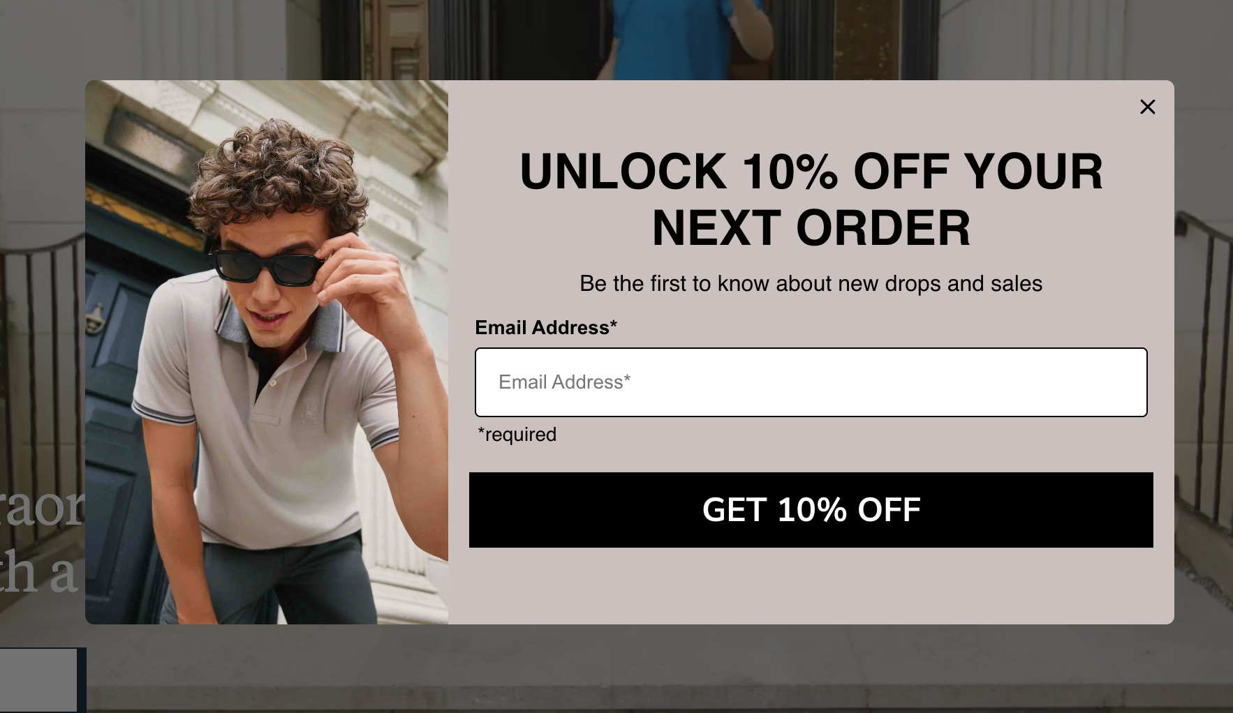
A good headline is subjective—it depends on your target audience and the language they’re most likely to engage with. But generally speaking, you should make the incentive clear and use powerful words like unlock or exclusive.
Here are some great examples to draw inspiration from:
- Astrid & Miyu: “Enjoy 10% off when you sign up to email & SMS”
- The Woobles: “Want a free tin for your wee woobly bits?”
- Scotts Flowers NYC: “Deals up to 30% off”

Ask for extra context for future personalization
Earlier, we touched on how email popups help brands navigate third-party cookie limitations. That’s especially true if you’re using the form as a way to collect extra data about your website visitors, aside from just their email addresses.
Interestingly, users don’t behave the same on popups as they do traditional forms or checkout processes. Baymard reports that 22% of potential customers have abandoned a shopping cart because the checkout process was too long or cumbersome. In contrast, popups—which traditionally have just one field—still have impressive opt-in rates when up to four fields are present.
This openness to complete multi-step forms gives you extra space and room to play around with. Use them to paint the bigger picture on what your newsletter subscribers want. That might mean checkboxes that ask:
- Who they’re shopping for
- How old they are
- The products they’re interested in
- Their date of birth for a special birthday gift
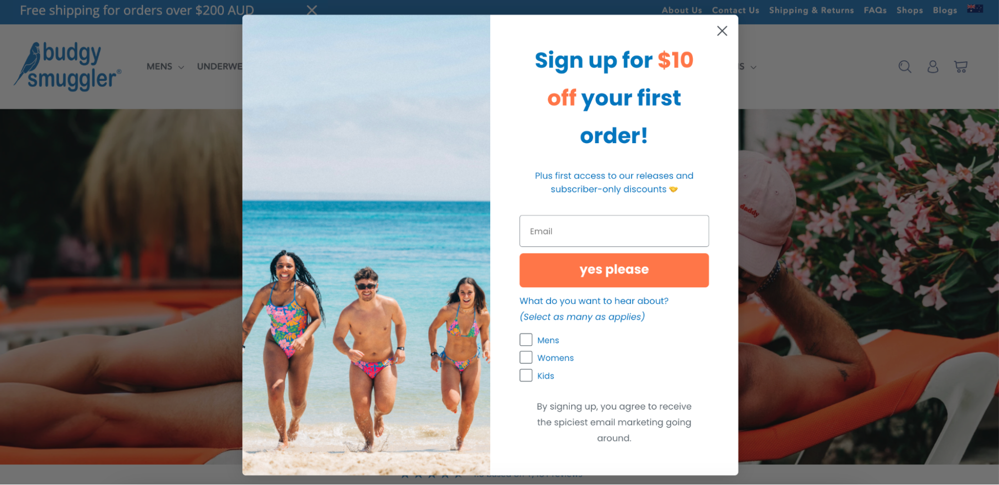
Take this email popup example from Budgy Smuggler. The only required field is the customer’s email address, but it asks which type of products they want to hear about: men’s, women’s, or children’s swimwear. Answers give the marketing automation tool more to feed on.
If someone’s interested in women’s swimwear, the extra field instantly shortlists the product recommendations in upcoming emails to only suggest items each customer would genuinely like.
Use eye-catching designs
An email popup should draw attention to the special offer you’re promoting. The simplest way to do that is through design.
Most design tools, including Shopify Forms and Klaviyo, have free email popup templates to customize the appearance of your forms. Use the drag-and-drop builder to experiment with visual elements like:
- Alignment: Play around with left, center, and right alignment for your popup headline and description copy. Minor changes like this can keep the popup visually appealing, even if the visitor has seen it before.
- Color scheme: Stick with a color scheme that compliments your existing website design but still stands out. That might mean blurring the outskirts of your popup box to be a muted version of your brand color, or adding your brand logo to reinforce consistency.
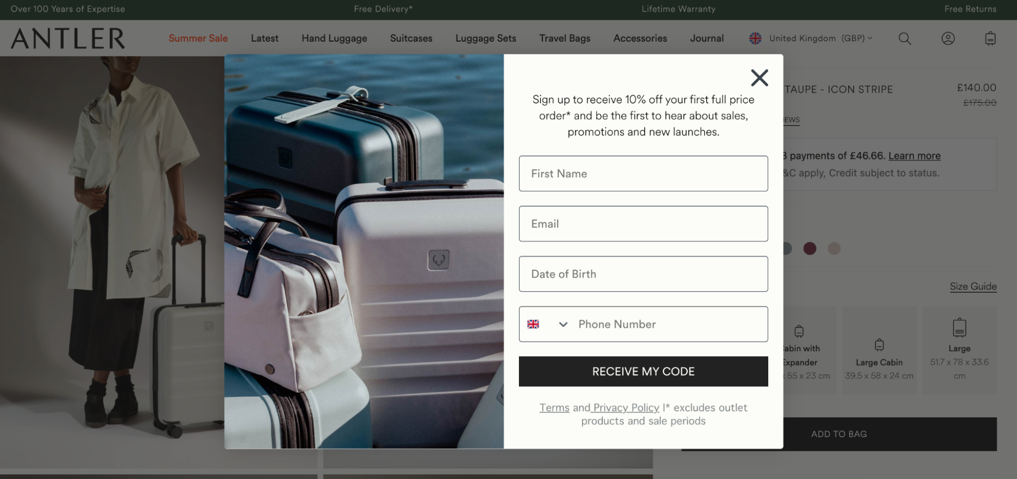
- Images: Wisepop found that popups that contain images have an average conversion rate of 4.74%, compared to just 2.55% with no image. This could be your best selling products (like the example here from Antler), a photo of the gift card on offer, or an Instagram post shared by a happy customer.
Don't always take over the whole page
Email popups have a reputation for annoying visitors. It’s common to see overly enthusiastic animations that pop up on the screen, which can be incredibly frustrating to potential customers, particularly those who’re interested in a product. The last thing you want is to interfere and deter them from purchasing.
Instead of blurring out the entire page, experiment with the size and placement of your email popup design alongside custom targeting. You could personalize your design on each page, like using a smaller time-based popup that appears 10 seconds after landing on a page, then save the blurred background and high-contrast designs for when somebody shows an intent to leave your site.
Take this email popup from nutrition brand Huel. Instead of dominating the entire page, the popup appears at the bottom of the screen when you land on the homepage—conveniently beneath the main section that explains the brand’s unique selling point, social proof, and call-to-action button to shop their entire product range. All of these elements still remain visible when the popup appears.

Monitor email popup performance
The first version of your email popup likely won’t be the one that gathers the most data. Different audiences respond best to different designs, copy, and messaging. The only way to figure out what works for your brand is to test.
Run A/B tests that compare conversion rates between popups with slight differences. Your goal is to collect data that helps you confidently (and accurately) answer questions like:
- Does using emoji in your popup get more conversions?
- Are people more likely to complete the popup when you offer a 10% discount code versus $10 in store credit?
- Do opt-ins increase if you change the button copy to “Get my discount” rather than “Sign up”?
- How do signups differ between popups that appear within 2 or 10 seconds?
Remember that a “successful” popup isn’t solely determined by how many subscribers you accumulate. In the case of ecommerce, the end goal is usually to turn that email subscriber into a paying customer. Integrating your email marketing platform with your ecommerce solution can highlight which popups result in the most paid conversions.
How to create an email popup
At Shopify, we have our own form builder so that anyone can customize their own email popup forms from the Shopify admin. Enable it by installing the Shopify Forms app, then choosing popup from the list of options.
You'll then get to customize everything from the design of the form to custom metafields you want to collect for each customer. Once it's live on your store, customers who are already using the Shop app will also see the option to complete their signup with their Shop account. Anyone who completes the popup will be added to your customer list in Shopify, join any segments they're eligible for, and receive any marketing automations you've set up in Shopify, like a welcome email series for new subscribers.

If you’re operating a more advanced popup or email marketing strategy, consider a third-party automation app like Klaviyo. Repeat the same process: install the app in your Shopify admin and create an account. Then find the Klaviyo tab in your dashboard and choose a popup template from the Sign up forms tab.
Klaviyo will store any collected data in its email marketing tool. And because it integrates directly with Shopify, you can use the platform to run automated campaigns based on triggers that occur in either platform. For example, if someone signs up through your Klaviyo form, you could:
- Send them cart recovery emails based on activity data that happens in the Shopify checkout
- Schedule check-in emails if someone opts into marketing emails but hasn’t made a purchase within 21 days
- Ask people who’ve made a purchase to leave a review 5 days after their order is marked as delivered in Shopify
Three examples of email popups
MORI
MORI shows how multi-step email popups can help you collect extra data about new subscribers. The first step prompts a visitor to tell the brand about themselves (i.e., who they’re buying for) in exchange for 10% off their first order.

Once they’ve clicked the most appropriate option, visitors are prompted to enter their email address. In the case of MORI’s biggest persona (expecting parents), they’re asked to enter their due date, which allows MORI to run time-sensitive email marketing campaigns like discounts shortly before and after their baby’s arrival.

Kinfield
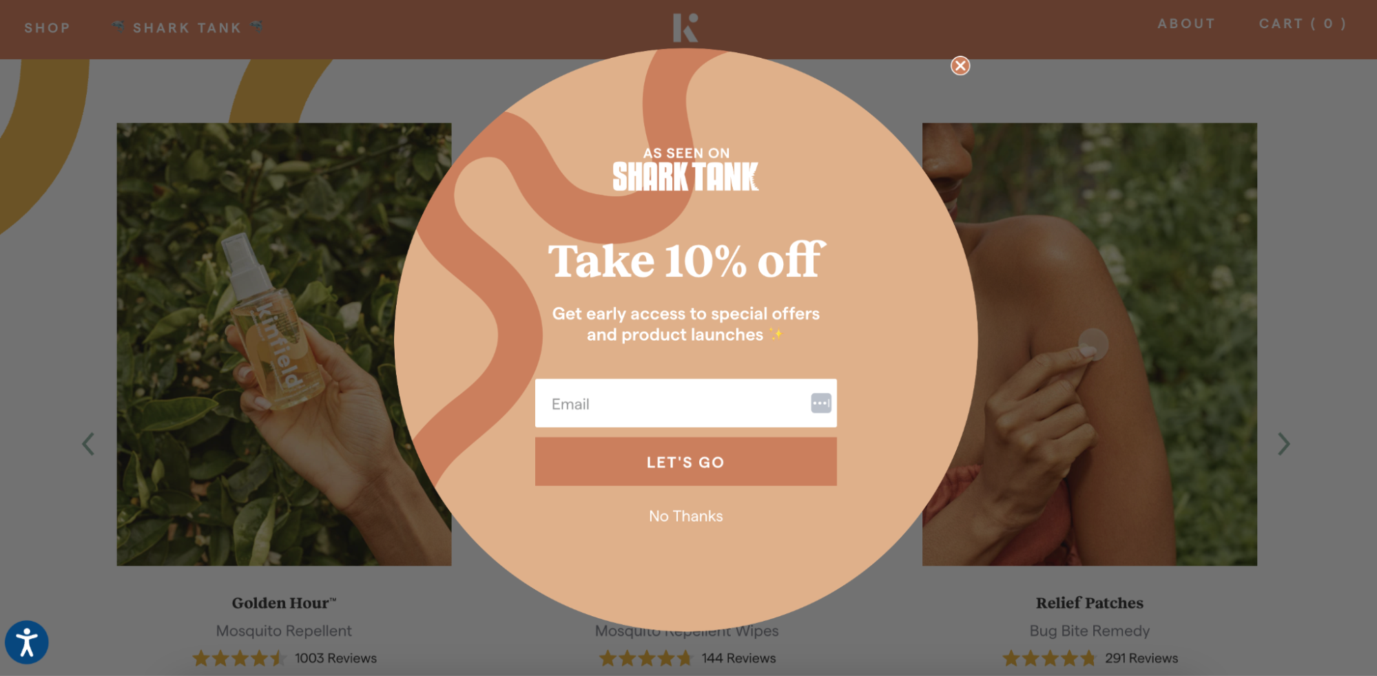
Social proof is a valuable tool to use in email subscription popups. Outdoor skincare brand Kinfield leans on their appearance in Shark Tank to add extra credibility when asking customers for their email addresses.
This simple logo helps the brand capitalize on the fact that consumers spend 56% more with brands they trust. While Kinfield may not yet have the long-term credibility of other brands, they’re showing the seal of approval from a brand (or TV show) their target audience already knows and trusts.
Victoria Beckham
Victoria Beckham doesn’t offer discount codes to visitors who’ve opted into marketing campaigns. Instead, they give people the chance to win a gift card—provided they consent to email and SMS marketing through the two-step newsletter popup.
While the £1,000 gift card might seem like a huge outlay for the brand, it could be more effective than a standard 10% welcome discount. A thousand euros is a huge prize for their audience to win, potentially influencing their decision to opt in. That prize fund could end up netting more profits for the luxury fashion label, especially considering 61% of gift card users actually ended up spending more than the value on their card.

Capture potential customers with impressive email popups
Email is an incredibly valuable channel to retarget potential customers after they leave your site, but the only way to achieve impressive results is to get explicit permission from your customers that you can meet them in their inbox. Popups are the perfect way to do that.
Use these tips to design email popups that not only gather data about your customers for future targeting, but also offer incentives that actually convince them to buy once they land on your list. That’s the best way to turn email popups into scalable revenue generators for your ecommerce store.
Read more
- Is Your Agency 'The One'? An Inside Scoop on Finding a True Partnership
- How 3 Brands Scaled Their Ecommerce Subscription Model 100-350%
- Ecommerce Site Search Best Practices: How to Sell More to the People Who Want to Buy Now
- How to Use a What-if Analysis to Measure the Effects of Your Decisions
- Multi-Channel Customer Acquisition: 7 Tips from $3.7M+ in Ad Spend
- The 4 Words at the Root of All Meaningful Client-Agency Relationships
- Black Friday Facebook Ads Guide from $6.8M in Ecommerce Holiday Spend
- An Omni-Channel Commerce Solution: The What, Why, and How of Retail’s Future
- The Secret Holiday Ecommerce Strategy to More Campaigns & Sales in 2021
- Cash Flow Management Strategies
FAQ on email popups
What is an email popup?
An email popup is a box that appears on a user’s screen when they visit your website. The goal is to convince someone to opt into marketing so that when they exit your site, you can retarget them through SMS or email.
How do I get my email to popup?
- Segment your audience.
- Offer an incentive.
- Capture attention with a strong headline.
- Add extra context for future personalization.
- Use an eye-catching design.
- Don’t take over the whole screen.
- Combine popups with SMS.
- Monitor performance.
Are email popups effective?
The average opt-in rate for an email pop-up is 4.01%, making them an incredibly effective way to build your email list and recoup customers that’d otherwise be lost forever.
How do I create a popup email?
- Give people an incentive.
- Use time-based triggers.
- Consider exit intent popups.
- Personalize the popup.
- Write an eye-catching headline.
- Experiment with size and placement.
- Monitor performance.


