2017 has just arrived and -- whether you closed out 2016 with a whimper or bang -- you’re already feeling the pressure to perform.
For some, 2016 was a struggle and even though you didn’t have to close up shop, sales growth was well below the worldwide ecommerce standard of 24%. For others, 2016 was a banner year. Kudos to you. Ironically, living up to past successes -- i.e., “saving” ourselves from them -- is far more difficult than overcoming past failures. The bigger 2016 was … the more daunting 2017 looks.
Regardless of which camp you fall into, the pressure is on. And the question isn’t just how are you going to meet that pressure, but how are you going to demolish it by carving out a piece of 2017’s projected ecommerce growth from $1.91 trillion to $2.35?
It all starts with vision … just not the kind you're thinking of.
Instead, knowing where to “look” in 2017 for your ecommerce vision has to be centered on where your visitors, leads, and customers “look.” In other words: eye tracking.
Why?
Because it turns out, what your audience sees -- often in the first few seconds of landing on your site -- is one of the most determinative factors of ecommerce success. Thankfully, knowing where to look doesn’t have to be guess work. Nor do you have to set up a complicated experiment right way. Plenty of research groups have conducted experiments to discover what draws viewers attention, and what they ignore.
So let's kick 2017 off with a detailed look at the science of “looking” itself -- the science of eye tracking -- along with a host of hidden gems your ecommerce site can’t afford to (ahem) overlook.
1. The Golden Rule of Ecommerce Eye Tracking
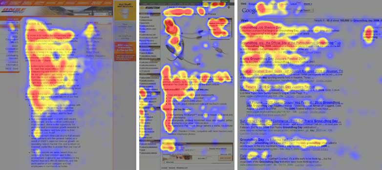
Back in 2006, the team over at Nielsen Norman Group did some homework and stumbled upon an interesting observation that changed web design forever. After an exhaustive study monitoring where people looked when they viewed a website, Nielsen discovered a pattern.
It’s known as the F-Pattern (or less commonly as the E-Pattern).
Basically, it means that when someone visits your website on a traditional screen, their first and longest look is at the upper-left corner -- the top, horizontal line of your page’s non-navigational content. After that, their eyes continue glancing down the left-hand side of the screen, pausing slightly to glance right after the first few lines and then less and less frequently the further down the page they proceed.
Image Source: Nielsen Norman Group
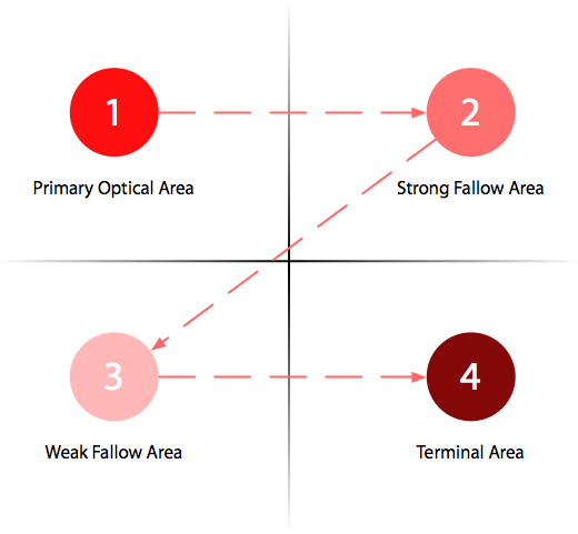
Further studies -- most notably, two academic works, “Not Quite the Average: An Empirical Study of Web Use” (2008) and “Eye Tracking and Web Experience” (2014) -- have reiterated Neilson’s core finding. From these and other sources, the Gutenberg Diagram emerged as the simplest overlay to guide the prioritization of information and especially the placement of calls-to-action (i.e., “4 Terminal Area”).
Image Source:ux movement
When combine with the F Pattern, the golden rule of eye tracking looks something like this:
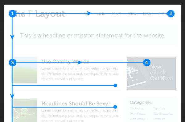
Image Source: Envato
For ecommerce in particular, eye tracking research among younger generations have only served to intensify this very same principle:
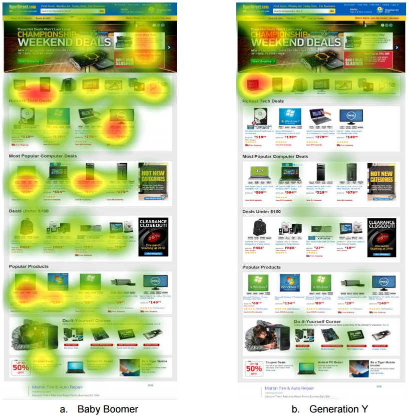
Image Source: Transactions on Human-Computer Interaction
While obvious, don’t let the golden rule go to waste.
The upper-left corner and entire top row -- including header navigation -- is your first and best chance to grab your visitor’s attention and communicate vital information.
Next week, my colleague Ott will dig into navigation in more detail, but as a quick example, look at how much information pop-culture retailer ThinkGeek gives you in the first 170 vertical pixels of their site.

By the time you reach the secondary navigation, everything from where to search to shipping policies, customer service contact information, and different ways to navigate item categories are made clear.
Their navigation is functional first and beautiful second.
Directly underneath their secondary nav, there are logos of the major licenses they carry -- such as Marvel, Star Trek, Dr. Who and Minecraft -- showing they work with major brands. It is no coincidence that each of these confidence building elements is in very visible and highly scanned areas, each contributing to the feeling this is a site you can trust.
Now, contrast the amount of rich information ThinkGeek gives in the first 200 or so pixels that to the first 255 vertical pixels of competitor Iwantoneofthose.com:

As the great Steve Krug wrote in Don't Make Me Think: A Common Sense Approach to Web Usability, “The fact that the people who built the site didn’t care enough to make things obvious—and easy—can erode our confidence in the site and the organization behind it.”
I’ll throw some caveats into this point shortly, but generally speaking to cultivate confidence -- rather than erode it -- design should be simple, clear, and, most importantly, attractive to your visitor’s perception. Incredibly, Google found that it only takes 50 milliseconds for your visitor to form an opinion about your website -- to decide whether they like it or not. That’s 6 times faster than the blink of an eye. What’s more, British researchers discovered that design elements -- e.g., visual complexity, color scheme, advertisements and pop-ups, print size, search options, and navigational aids -- account for 94% of a site’s “trust [or] mistrust.”
In other words, in the amount of time it takes for your visitor’s eye to zoom from left to right the moment they land, their synapses are firing trying to determine if you are trustworthy or not. By placing high-priority items in areas that cater to your visitor’s natural tendencies you’ll cultivate greater trust, lay the groundwork for longer and more frequent sessions, which will ultimately lead to more conversions.
Your shoppers don’t want to think, so make it easy since you already know where they are going to look.
2. The Failed Best Practices of Ecommerce Eye Tracking
Now that we established the golden rule of looking, let me say something counter-intuitive: beware of following “best practices.” Naturally, best practices are a fantastic jumping off point, but when strictly adhered to can easily result in the blind leading the blind.
So let’s debunk a few assumptions you probably have about where your visitors are looking.
First, faces do not always draw attention. While it’s true that we’re intrigued by faces and even enjoy the process of studying facial poise and posture, data reveals that faces are not the most interesting thing on your webpage.

Image Source: eyequant
Faces can create an emotional connection -- because, well, we’re all human -- it doesn’t mean it’s going to help you sell. A face or two won’t hurt, but don’t count on them to create more conversions.
Second, bigger isn’t better. Sure, headlines and subheadings matter, but don’t get obnoxious. Why? Because it doesn’t work.
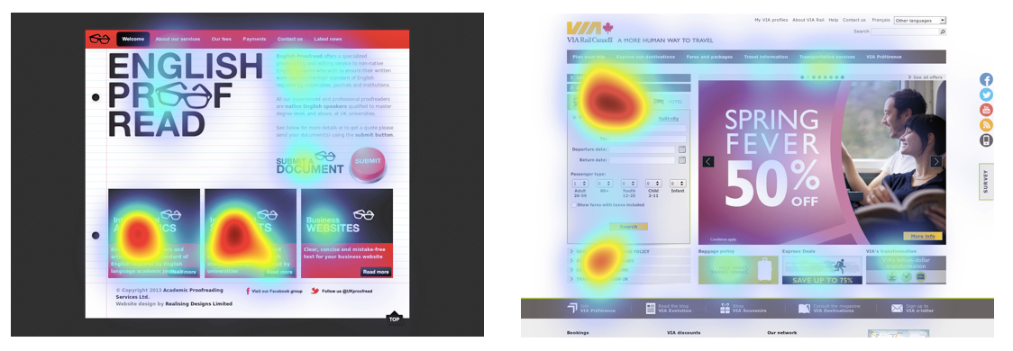
Like the obnoxious salesperson who gets in your face and tries to land a sale by being loud and pushy, absurdly large text has the same effect. In the end, you’re just taking up space that could be better used to guide your user through the process of conversion.
And third, the word “free” is not nearly as convincing as it portrays itself. People aren’t looking at your “free” gift when they contemplate making a purchase.
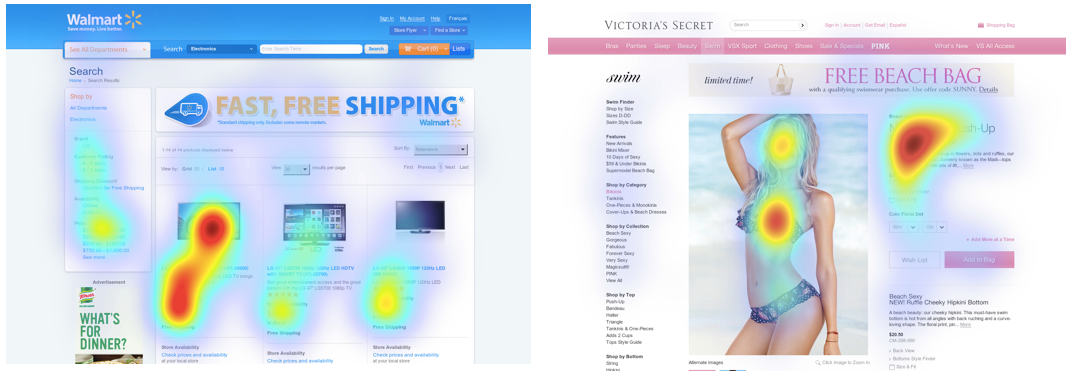
Of course, everyone likes free stuff, but onsite, the word has been so overused as to be visually irrelevant. If you have something for free that’s novel, extraordinary, and genuinely useful to your customer, put it on your site, but don’t mistakenly use it as the primary method to capture their eyes. Instead, free gifts work best via email to rescue abandoned carts or follow-up post-purchase.
3. The Hidden Gems of Ecommerce Eye Tracking
Take the above data as starting points, visitors normally follow a three-step looking process and this is where the hidden gems appear: (1) the hero, (2) the header, and (3) the hops.
First, your visitor is going to give disproportionate attention to your hero: the headline combined with the most-prominent image.
The hero needs to hook your visitor and instill immediate confidence that their visit is not in vain. Don’t make the mistake of having an inconsistent message between your headline and image. The two should seamlessly blend together and create for a simple and clear statement explaining why your customer should continue browsing.
Let your hero play the hero and save your visitor from the problem that brought them to your site. Take, for example, this heatmap of Pronto’s original homepage and notice where the activity -- both eye and mouse tracking -- isn’t.
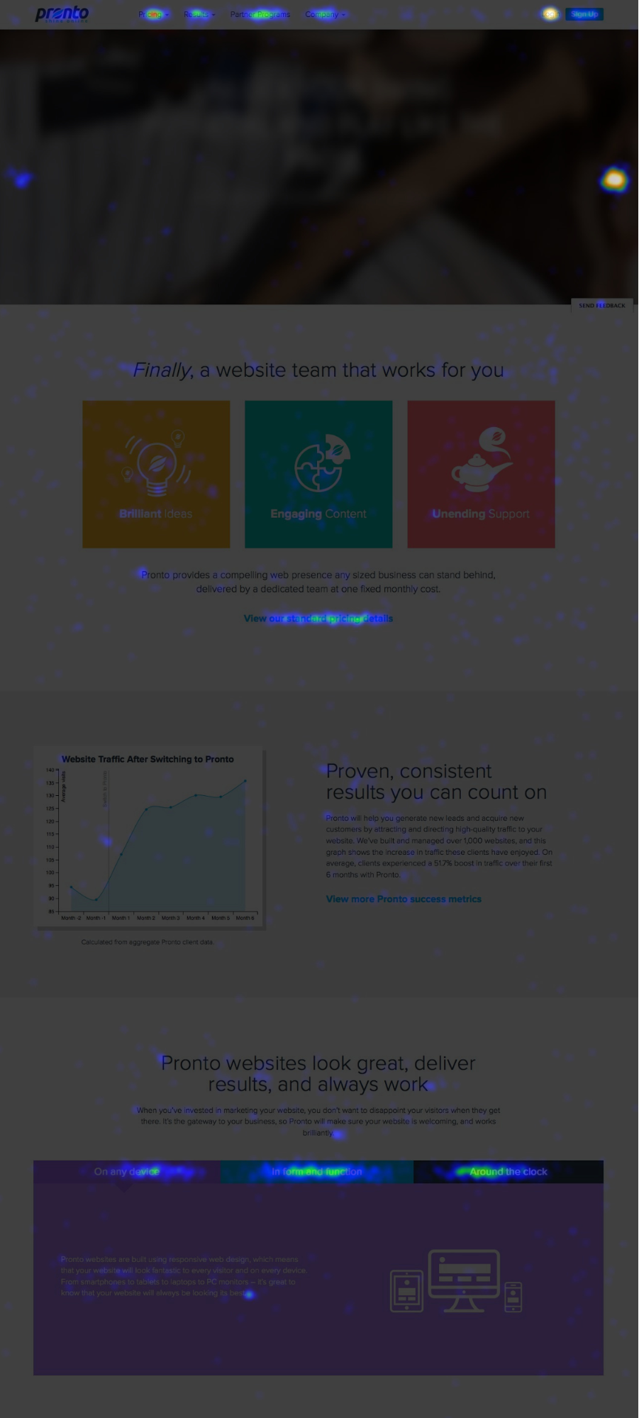
Image Source: Crazyegg
What Pronto discovered was that their hero wasn’t saving anyone from anything. It was basically fluff. Instead, their visitors were interested in getting immediate, one-on-one help as evidenced by the activity in the homepage’s footer.

So Pronto redesigned their homepage and majored on that need in their hero -- immediate and one-on-one help. The result was a 17% increase in click through to their contact page and a 24% increase in leads:
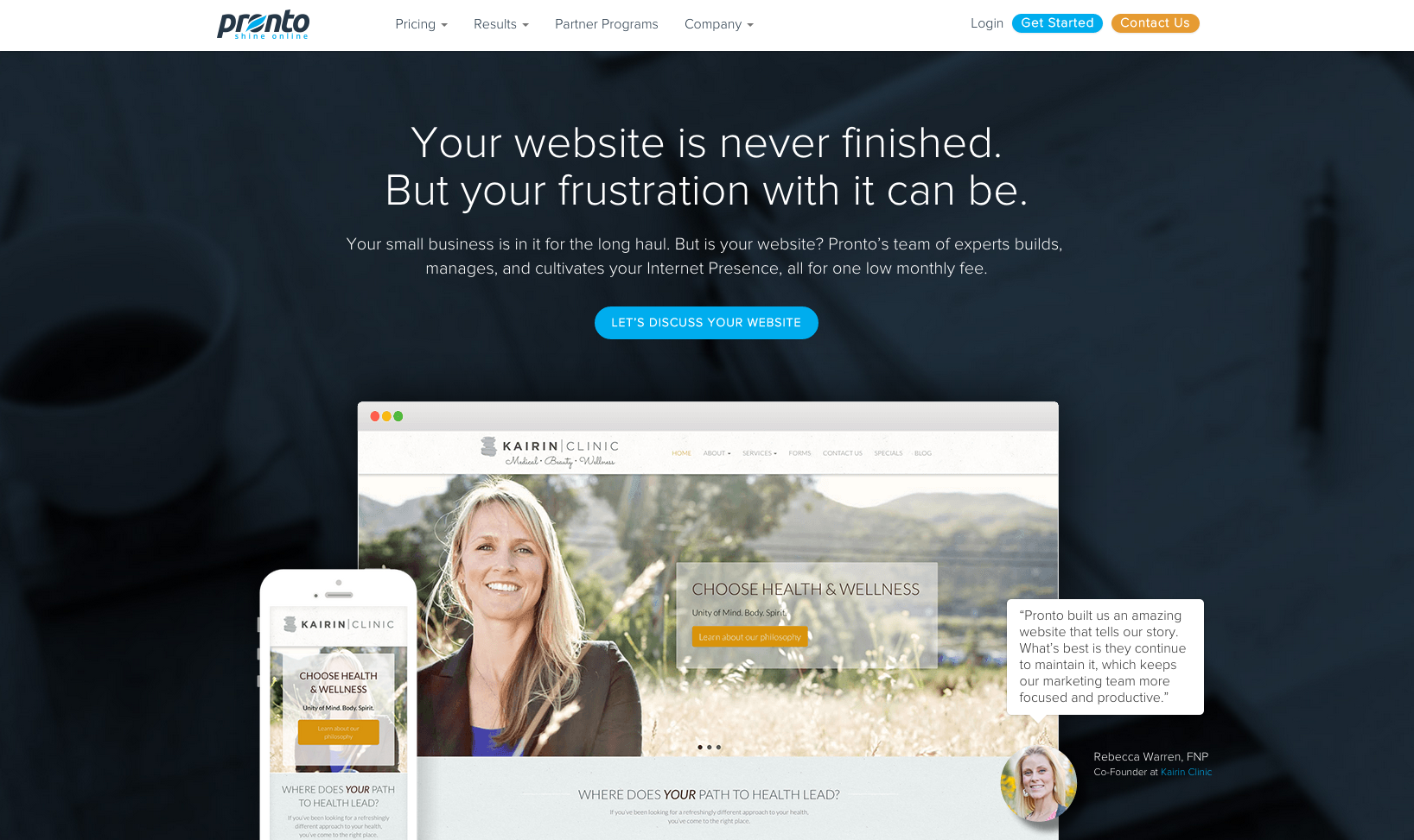
Your ecommerce hero should follow the same path: diagnose what your market’s real needs are and serve up a hero that saves.
The second place your visitor is likely going to look is the header -- i.e., your navigation bar. This can be demonstrated by cumulative data from “Eye Tracking and Web Experience” (2014), which places 23% of user’s attention immediately above the hero and 19% below.
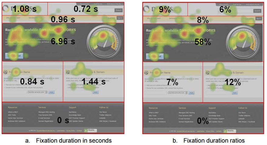
Image Source: Transactions on Human-Computer Interaction
Once again, simplicity, colors, and obvious titles are crucial. Short, crisp titles that tell the browser exactly where they are going if they click on it. Make sure to optimize your header because the easier your site is to navigate, the more comfortable your user will be and the more sales you’ll land.
For instance, without getting political, Michael Aagaard, Unbounce’s senior conversion optimizer, highlighted this lack of clarity in his commentary on Donald Trump’s online presidential marketing campaign: “Only negative thing is that there are quite a few navigation points in the burger menu, which makes it a bit overwhelming.”

Now compare that to the redesigned navigation bar the campaign used in the final months of the election where the clean design and stripped down color scheme make it obvious exactly what the primary CTA is:

Third, your visitor isn’t going to read your page in sequence. In fact, most aren’t going to read your page at all. Rather, they’re going to hop. Fortunately, these hops are predictable.
As your visitor seeks out information that is relevant to them, headers are the first obvious cues of what to look at followed by the first line of text directly under the header.
Visuals -- both images and videos -- are the number two hop, but perhaps the most surprising and underutilized element of visuals are captions. After conducting eye-tracking tests of 200 published images, the journalistic thinktank Poynter explains: “Captions were very well read and important to context and understanding. A well-written—or even just lengthier—caption increased the likelihood that a photograph received attention.” And the same is true for video captions:


Image Source: Refractory
And as for the last hop, place your CTA where it counts: at the end. Whether that’s at the end of the landing page or product description page, once your visitor is confident of your product -- reinforced by headers and visuals -- then ask them to click. And make sure your CTA isn’t crowded. When you ask, it should be the only thing they see.
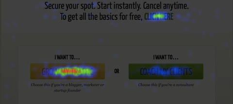
Image Source: Quicksprout
The Right 2017 Ecommerce Vision
Deciding where to look so you can take hold of the $1.91 trillion to $2.35 trillion growth in ecommerce sales expected this year … is easy.
Look where your customers are looking.
People visit ecommerce sites either because they’re curious or they want to make a purchase. We’re all looking for something. Don’t waste their time -- or your time -- by making what they want harder to find than it needs to be.
For the rest of January, we’re going to be looking even more closely at how to optimize for where the eye is naturally going to look. Make sure you don’t miss out by signing up below.
Read more
- Strategies to Prepare Your Online Store for Increased Holiday Traffic
- 21 Ecommerce Personalization Examples & 7 Scalable Tactics
- What is 3PL: How to Select a Third-Party Logistics Partner
- What Is a Warehouse Management System? Definition and Software Review
- How to Choose An Enterprise Ecommerce Platform
- What is Headless Commerce: A Complete Guide for 2022
- What are the retail trends for 2023?
- Wholesale Ecommerce: What is It and How to Start?
- Omnichannel vs Multichannel: What is the Difference and Why Does It Matter?
