


Selling products online is tricky. Potential customers can’t touch, smell, or see the item in the flesh. Instead, they rely on images and copy—the text marketers write to describe a product’s features, the problems it solves, and how it can make buyers feel.
Ecommerce copywriting is a skill most business owners haven’t spent time refining. However, strong copywriting skills have the power to convince more readers to click, sign up, or buy.
Great copy also can change the way people think about a specific problem, and tell them what role a product can play in the solution.
So, what does good ecommerce writing look like? And how do you write with your potential customer in mind? This guide shares the process for copywriting text for ecommerce stores.
What is ecommerce copywriting?
Ecommerce copywriting is the process of crafting text that convinces your target audience to take an action. For example, you could convince your audience to visit your ecommerce store, join your email list, or purchase a product. It’s often referred to as direct response copywriting or sales copy for this reason.
Benefits of ecommerce copywriting
Persuasive, fluff-free ecommerce copy is the key to boosting sales without investing more in acquisition, hence why having good copywriting across every touchpoint is one of the most effective ways to move prospects or buyers through the sales funnel.
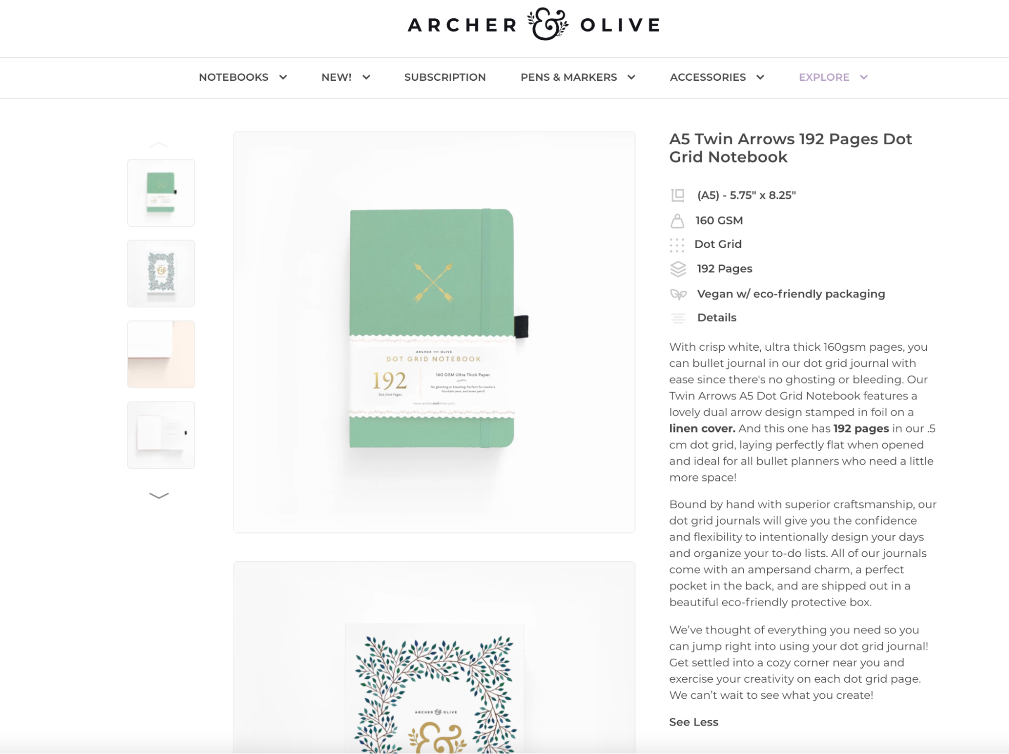
“I helped Archer and Olive, a bullet-planner-style ecommerce shop, grow its profits from $72,000 to $1.9 million in the first year of our website copywriting being live," says Kayla Hollatz, freelance copywriter.
“We tweaked the headline to highlight the eco-friendliness of [the brand’s] products. We reminded visitors of the brand’s differentiators on product pages. While this growth can’t only be attributed to copywriting, it played a large role in their growth.”
Where is ecommerce copywriting used?
Regardless of where you’re placing this text, ecommerce copy is a critical ingredient to your entire digital marketing strategy.
Ecommerce websites
You never get a second chance to make a first impression. Strong copy on your homepage will communicate quickly and clearly what you sell and why it’s different, so users don’t bounce.
Similarly, website visitors want to see information about the company behind the site they’re viewing. Make people fall in love with the brand behind the website through the copy on your About page.
Landing pages
Really great brands make every word matter, even on something like their shipping policy page.
“Any time I want to evaluate how seriously a brand takes their customer experience, I check the pages in their footer,” says freelance copywriter Samar Owais. “FAQ, Contact Us, Shipping and Returns—these are the pages customers who’re super interested in your brand will check out.
“Most brands treat these pages as an afterthought. Yes, very few website visitors will visit them, but the ones that do will have a much higher chance of becoming a long-term customer or a brand evangelist.”
The bottom line? If you’re losing ideal customers on your website’s landing pages, it won’t matter if you have the most amazing ecommerce copy on product pages.
Category pages
Sometimes website visitors hop on your site hoping to solve a problem, but are unsure which product will help them do so. They’ll visit category pages or collections to filter products that fit what they’re looking for.
On these category pages, explain the grouping of products and offer guiding snippets about individual products.
Product pages
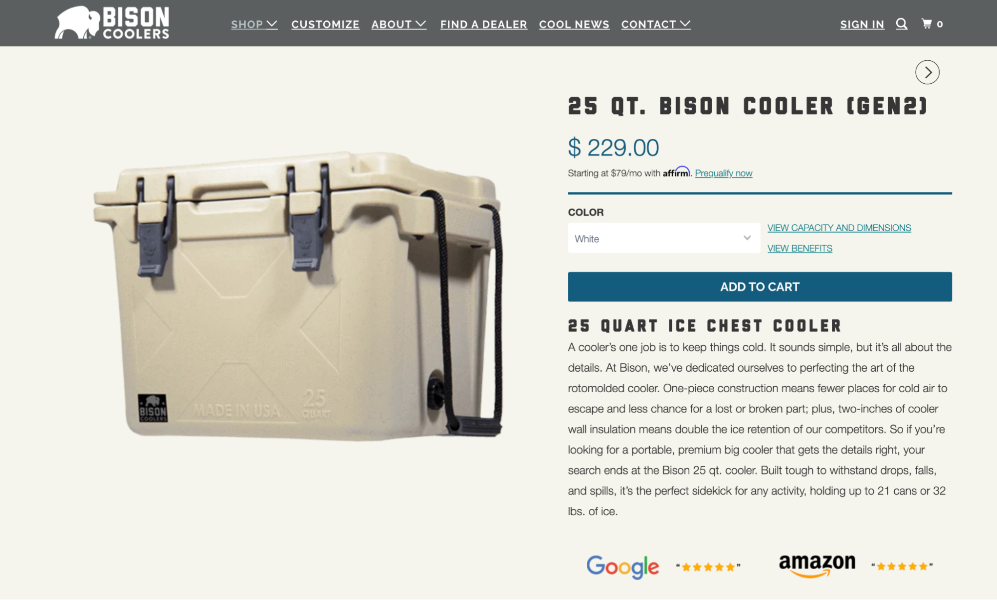
Why should people buy the product you’re selling? Help your ideal customer base visualize owning, touching, or using it through your product descriptions. Bison Coolers’ product description, for example, uses persuasive copywriting to make a boring product (a cooling box) seem more exciting.
Social media content
The average person spends about 2.5 hours browsing social media every day. By focusing on the copy in your social media posts, you can drive them away from social media and toward your online business.
Other marketing materials
It’s not just your website that needs top-notch copy. Every interaction you have with potential customers should be optimized. Oftentimes, that starts long before they visit your online store. Here are some other areas to focus on:
- Meta titles and descriptions. Search engines pull these snippets of copy and show them on the search page. Copy is the only medium here—there are no images or videos to influence a decision. Intriguing SEO copywriting, which sprinkles in related keywords, could be the difference between a potential customer clicking your website or on a competitor’s.
- Direct mail. Write leaflets and postcards that get customers in your local area to visit your brick-and-mortar store.
- Advertising. Be it a Google ad, a Facebook campaign, or a billboard, advertising is really about the intersection of copy and creative. Pair eye-catching visuals with ad copy that makes your target audience stick around long enough to influence a sale.
- Emails. Every type of email marketing campaign (including promotions, abandoned cart campaigns, and purchase confirmations) need to be written with the customer in mind. Reflecting their language in your email copywriting takes them out of their inbox and onto your site through a call to action (CTA).
7 proven ecommerce copywriting tips
- 1. Replicate your customer’s tone of voice
- 2. Sell the benefits, not the features
- 3. Sprinkle unbiased copy
- 4. Avoid meaningless drivel
- 5. Limit adjectives
- 6. Tell stories, not facts
- 7. Have a strong point of view
1. Replicate your customer’s tone of voice
What good is your copywriting research if you don’t use it to write your copy?
Head back to your research spreadsheet and pull terminology your customers have used in reviews, interviews, or surveys. You’ll likely find each demographic or persona has a specific vocabulary. Including that same vocabulary on your online store builds rapport. Customers land there thinking, “This brand gets me.”
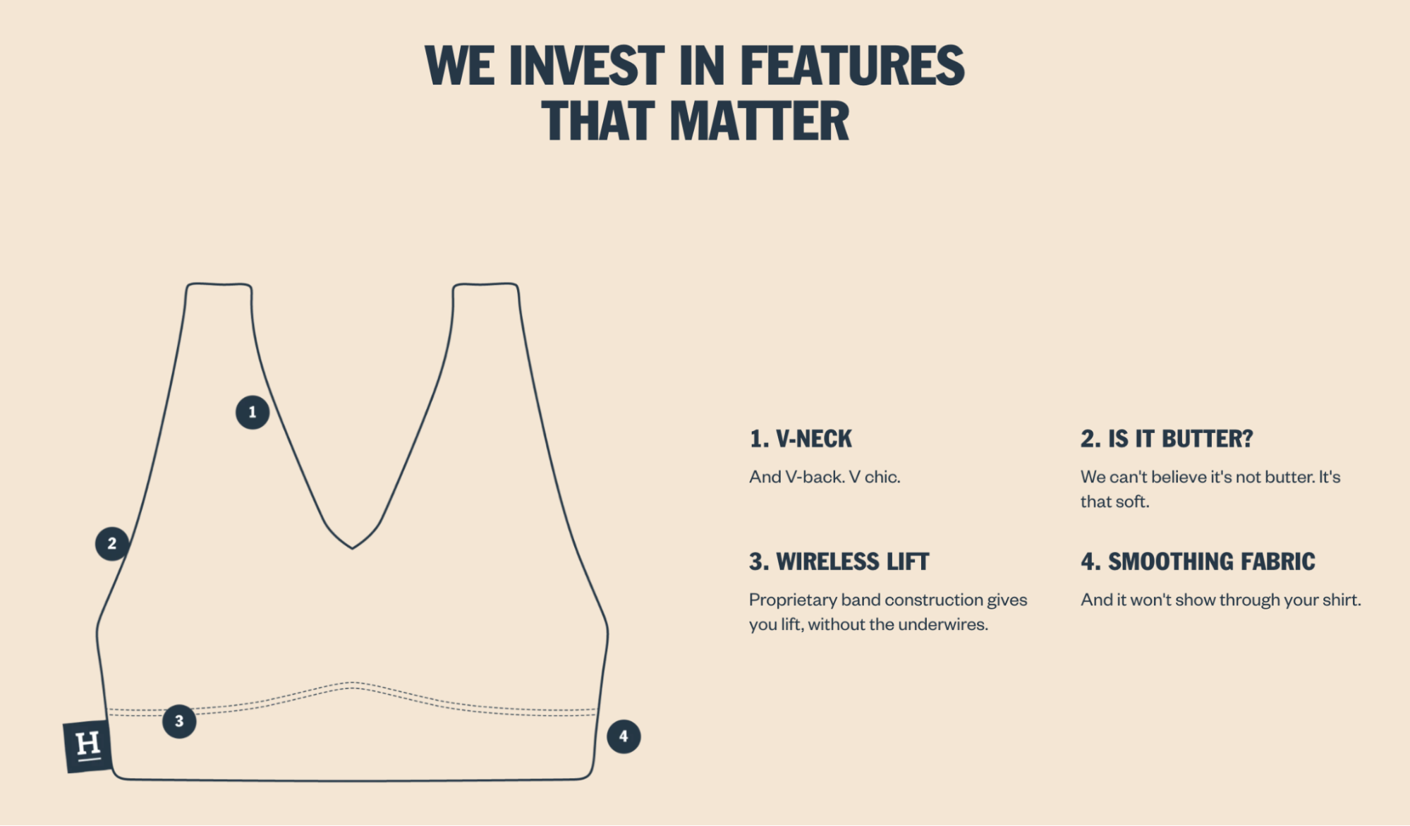
Harper Wilde is a great example of this. All over its ecommerce website, you’ll find sentences its target audience likely use (or are at least familiar with)—like the idea that its bra is so comfortable “we can’t believe it’s not butter.”
2. Sell the benefits, not the features
While you may think it showcases your products in their best light, the truth is that most purchases are emotionally driven.
The fact your duvet linen has a 400 thread count doesn’t spark those “I need to purchase this!” emotions. A luxurious, comfortable duvet cover that makes you fall asleep instantly? That does.
Each time you list a feature, follow it with a benefit. That leaves you more space to use valuable real estate, particularly a catchy headline and product descriptions, to sell rather than tell.
Copy and user experience should work together. There are so many ways to distill quick facts that customers care about—using icons, badges, or bullet points—without boring people with product specs.
There are many benefits to pull on in your copywriting; each depends on the reason why customers are buying the product. Does it solve a problem? Increase pleasure and happiness? Make people feel like they’re part of a community?
For example, your oven might have a fast preheat system. This feature makes you more relaxed about getting dinner ready on time. The benefit is an increase in pleasure (feeling more relaxed), and it makes cooking less stressful (taking away the pain of stress). These feelings of joy and anticipation are proven to increase performance on ecommerce landing pages.

3. Sprinkle unbiased copy
Imagine you’re browsing two websites. The first is written by a copywriter who raves about how great a product is. The second website does the same, only some of the text is written by happy customers who can vouch for what the website says.
Which one are you more likely to engage with? Chances are, it’s the second. It uses social proof—reviews from other happy customers—to make you trust the product more.
Social proof is a type of content that makes copy feel less biased. Testimonials, reviews, and user-generated content are your most influential ecommerce marketing assets, proven to increase sales page conversion rates by 34%.
For example, Surely creates social proof with its “Over 20,000+ Wine Loving Customers” headline above a carousel of positive customer reviews.

4. Avoid meaningless drivel
Top-shelf words like “world class,” “market-leading,” and “innovative” are used so frequently they’ve lost much of their impact. Now they’re just filler—taking up space without adding meaning.
Put on your devil’s advocate hat and, for each word, ask yourself: What does this mean? If you can’t come up with a specific answer immediately, cut or rephrase until your text is concrete and meaningful.
❌ Meaningless drivel: Innovative office chairs from a world-leading manufacturer.
✅ Try instead: Office chairs with lumbar support used in more than 150,000 offices in the US.
Meaningless drivel distracts and wears your reader down. In contrast, facts and figures increase your credibility. Where possible, include numbers and write them as digits (7) rather than words (seven) because numerals stop wandering eyes.
5. Limit adjectives
Adjectives help us to explain what our products look like (appearance), what they do (features), and how they make our buyers feel (benefits).
In moderation, adjectives are useful. They help customers visualize what a product looks, feels, or smells like—most often your unique selling point. But an overdose gives your reader a headache, because it makes your content hard to read. Take this sentence for example:
This relaxed, romantic collection of beautiful cookware has a unique look, up-to-date yet completely classic, with a result that’s perfect for your kitchen.
The problem with so many adjectives is that it slows your reader down and confuses them. What about simply saying:
This romantic cookware collection suits most kitchen styles.
When using adjectives, follow these essential best practices:
- Use only one adjective before a noun. Rather than “relaxed, romantic collection,” go for "romantic collection."
- Don’t use adjectives to state the obvious. Don’t describe what a product looks like if you’re showing it in a picture.
- Choose sensory or emotional words. They make your reader feel something. Words like “nice,” “good,” or “effective” are rather bland. Opt for delightful, dazzling, or tantalizing instead.

6. Tell stories, not facts
Facts increase the credibility of your product description, but facts on their own don’t make your content persuasive. Facts are cold. Facts don’t have soul or brand personality.
The most persuasive product descriptions include both story and fact. Stories engage your reader, while facts help justify their purchase. Our brains are wired to think in stories. It’s why helping a customer visualize the product in their life is the hidden gem in crafting direct response copywriting that nudges them toward a sale.
A simple story can help potential buyers visualize the benefits of your products—especially if they’re complicated; but stories also add brand personality. You can tell stories about the development, testing, or sourcing of your products to make them more fascinating or to increase the perception of high quality.
Imagine you’re selling an office chair with lumbar support. You can tell a simple story about a customer who tries different chairs and continues to suffer from back pain—until they bought yours.
So, how do you inject these mini-stories into your online store? Here are three quick tips:
- Learn from investigative journalists. Dig deeper to uncover fascinating product details. Talk to your suppliers and existing customers. The more you listen and learn, the more stories you have to tell in your product descriptions and landing pages.
- Keep your stories concise and concrete. Focus your story on just one simple idea.
- Avoid the obvious. Tell unexpected stories to engage, entertain, and sell.
When potential buyers read stories, they forget they’re being sold something. Any pre-existing barriers to your sales messages go down, and your content becomes more engaging and persuasive.
Meow Meow Tweet, for example, gives new subscribers a brief backstory of the brand in its welcome email. It doesn’t come across as overly salesly, but it still helps new subscribers connect with the brand.
Sometimes, things need to be mentioned on an ecommerce product page to meet laws or compliance. In a 1978 Harvard study, researchers found that using the word “because” increases compliance from 60% to 94%. So, when listing need-to-know facts, tell people why they’re important. For example, “This adhesive type is great because it’s required by law.”
7. Have a strong point of view
Many big-box ecommerce sites sound like what they are: big corporations without a soul. They don’t connect; they don’t engage; they hardly sell the value of the products they offer. They simply provide bread, butter, beer, and toothpaste.
But nobody likes chatting with a faceless company. Nobody likes ringing a soulless call center. So why create text that sounds like a dull corporation?
To connect with your readers, you need a dash of personality on your ecommerce site. Think about your brand voice—if your website was a real salesperson talking to a customer, how would you like them to sound? What stories would they tell? What jokes would they crack? Which words would they choose?
Remember to visualize one buyer and write as you’d talk to them in real life. Ditch the corporate jargon in favor of copy that sounds more like a conversation.
The footer of GREATS’ product page uses phrases its ideal customer knows, including “Friends with benefits,” “Drop us a line,” and “Get first dibs.”

Common ecommerce copywriting mistakes
Lack of variation in sentence structure
Copy can get monotonous when readers know what to expect. Mixing longer sentences with shorter ones creates variety.
Interrupting patterns work wonders in ecommerce copywriting. If you have a few long sentences in a row, people fall into the rhythm. But if you follow that up with a short one-liner, it throws people off from what they’d expect to read. This can reclaim a visitor’s attention and make them laser focused on the words you’re saying because they can’t preempt it.
Appealing to everyone
Great copywriting is like a crossword puzzle where the answer key consists of the words your ideal customers use to describe their problem. In order to write performant copy, you need research—you need to know your paying customers’ motivations and hurdles.
That’s a far cry from how most ecommerce business owners and online retailers view copywriting, which often is built on the belief that the most creative copy wins.
“The most powerful research tool I use to write conversion copy, a.k.a. sales emails and landing pages, is as basic as a 20-minute phone interview,” says Kira Hug, cofounder of The Copywriter Club.
“While I find a lot of value in surveys—because you can collect a ton of data from hundreds (or even thousands) of people—I find nothing beats two people chatting.”
“Typically, I follow every survey with at least eight to 10 customer interviews. This gives me a chance to go deeper into an individual’s story, challenges, desires, goals, objections, and more. It’s amazing what a stranger will share with you in only 20 minutes when you ask the right questions.”
Never refreshing your website copy
Markets are constantly changing—as is your ideal customer. The phrases they used in 2015 wouldn’t be relevant now, which proves that your website copy needs refreshing regularly.
Set a reminder to dive through ecommerce reviews, customer interviews, and support tickets. Add the information to your user research repository, such as your Google Sheet template, to spot emerging themes.
This doesn’t just help your website copy connect with your target market as it evolves; it also can serve as a competitive advantage. If you’ve got your finger on the pulse and know exactly what your customers need to hear before buying something online, you’ll beat your competitors and help potential customers think, “This brand knows exactly what I need.”
Going for quantity over quality
Word count isn’t the single most important factor when writing ecommerce copy. Some of the most effective landing pages and product descriptions have just a few sentences—but those sentences pack a punch.
The fewer words, the better. Punchy sentences are easier to read and show a sense of confidence, so cut any fluff and make a direct impact with the copy on your site.
How to conduct ecommerce copywriting research
There’s a four-step process that professional ecommerce copywriters use to write copy and increase conversions—one that you can steal and use for yourself. For the sake of simplicity, for the remainder of this article we’re going to imagine you’re trying to understand how you can increase initial purchases on your site.
1. Define your audience and segments
High-converting copy meets the right person, with the right message, in the right place, at the right time. There’s a vast difference between converting a new user on your homepage versus reengaging someone who added a product and abandoned their cart.
Here are some common segments you might want to explore:
- Abandoned carts. Identify pre-conversion friction (anxieties, fears, frustrations, etc.) that prevent visitors from buying. Remember, cart abandonment isn’t normal, just normalized. People don’t leave full carts for no reason.
- New customers. You’ll identify more of that pre-conversion friction. What almost prevented them from buying? Why did they choose you over competitors? What was frustrating during checkout? You’ll learn about product quality and understand how well you deliver on your value proposition by answering these questions.
- Repeat customers. Get to the heart of what products pair well together, how long the buying cycle is, and what the customer lifecycle looks like.
- Inactive customers. Calculate your lifetime value (which can help with paid ad spend planning) and retention. How many purchases did they make in total? Why did they stop purchasing from you? What could you have done better?
These are general segments that could apply to any store. However, you might want to get more specific. For example, isolate customers based on product categories or new customers who purchased from you twice in six months.
💡 PRO TOOL: Organize your copywriting research with this free template.

2. Research who you’re writing for
When you know what you want to know and the segments that can help you find out, you’re ready to start diving into qualitative research.
“If there’s one thing most companies miss, overlook, or ignore, it’s that every single ecommerce conversion is the result of a conversation your lead is having with your copy,” says Joel Klettke of Business Casual Copywriting and Case Study Buddy.
“I know of no other factor that makes a bigger difference to the results of your copy than the quality and depth of research you conduct.”
This type of copywriting research can be done using these four methods:
- Internal interviews. Talk to sales and support staff (if you have them) and gather existing data from internal sources, like your CRM. Go over the logs from the past three to six months. Highlight recurring questions, pains, benefits, objections, and frustrations.
- Customer interviews. Stay within the segments you’ve selected and screen for specifics (e.g., purchases, purchase frequency, demographic). Reach out to these people with a simple email that politely asks for their time in exchange for something. This could be anything from a $20 voucher or free product to behind-the-scenes HQ visits for die-hard fans.
- Surveys. There are two types of surveys you can use to uncover which copywriting styles your target audience best responds to: on-site and customer surveys. Both can help you better understand that initial purchase decision.
- Review mining. Third-party sites are full of customer testimonials, reviews, complaints, etc., that you can tap into. They’re usually less biased than if they were solicited. But even on sites where only happy customers post reviews, it’s useful to see which things people continually mentioned as the reason they loved a product so much.
3. Identify patterns
By this point, you’ve collected your audience research. Next, you’ll need to dive into the data and begin identifying patterns. At this stage you’re looking for:
- Words and phrases that stand out to you, that were particularly memorable, or that were often repeated
- Objections, products, benefits, questions, pain points, points of friction on the site, etc., that were often repeated
Of course, you’re also looking to understand the language your segment uses, along with the words and phrases they use. This will help you write the way the audience speaks.
It can be helpful to take data from the spreadsheet and organize it based on the exact page you’re writing copy for. Here’s what that might look like for a product page:

4. Define the messaging hierarchy and wireframe
You’re now better equipped to write data-informed, customer-driven copy that converts. Next, we need to turn the data into solutions.
Rely on a messaging hierarchy for this—a graph that helps visualize the importance of each message. The more frequently a pain point, benefit, or question comes up during your research, the higher it should be on your messaging hierarchy.
Once you have that high-level concept, you can start building a wireframe using tools like Figma or Sketch. This is another graph that shows the design of the page, including spaces available for copy.
“I audit any of my client’s current messaging and determine what’s working and what’s not,” says freelance copywriter Kayla Hollatz. “From there, I create simple wireframes, with formatting and layout in mind, but without the design, so I am able to craft a copywriting strategy that’s easy for visual thinkers to process.”
Do this even if you already have your design nailed. Chances are, you might see certain elements that could be moved around on your website, depending on the benefits and features you’re communicating.
Ecommerce copy can make or break your online store
Good ecommerce copywriting is relatively easy to learn, but hard to master. Great copywriters test and measure their copy to ensure it is driving results.
Outstanding copywriting involves great research and great editing—more so than clever writing. So, ditch the assumptions and get your hands dirty with the research process. Survey potential customers, interview existing ones and mine competitor reviews.
It’s only when you reflect existing customer stories and provoke emotions in your copy that you create words that do their job: Sell.
Read more
- Product Research in 2024 - How to Find Product Ideas
- What Is a Unique Selling Proposition? (Plus 10 Examples)
- How To Write a Return Policy (+ Free Template) (2024)
- How to Build Your Own Brand From Scratch in 7 Steps
- How to Start a Candle Business (with Examples)
- DIY Guide To the Perfect Product Photography Setup (2024)
- Why Online Reviews Are Essential (and How to Get Them)
- How to Dramatically Improve Your Conversion Rates in 2015 Using These 3 Analytics Reports
- The Hidden Potential of On-Site Personalization (And 3 Ways to Get Started)
Ecommerce copywriting FAQ
What is an ecommerce copywriter?
An ecommerce writer creates written content for online stores or websites. They produce product descriptions, blog posts, marketing copy, and other written materials. Optimization is a key aspect of their work, as they must craft content that appeals to both human readers and organic search engine algorithms to improve the store’s visibility and drive sales.
What are the 6 core copywriting skills?
- Research: Knowing your audience, product, and competition
- Clarity: Being able to craft a clear, concise, and memorable message
- Creativity: Developing unique and compelling copy
- Storytelling: Crafting stories and narratives to engage readers
- Persuasion: Understanding how to influence and convince readers
- SEO: Optimizing copy for search engine algorithms
How much does an ecommerce copywriter make?
According to Ziprecruiter, the annual pay for an ecommerce copywriter in the United States is $76,000 per year. The highest earners can make in excess of $120,000.
What are the 4 Cs of copywriting?
The four Cs of great copywriting are clear, concise, compelling, and credible. If the copy on your ecommerce website meets this criteria, you’ll have better chances of converting the people who read it into customers.
What are examples of ecommerce copywriting?
Content marketing is the process of creating and distributing content (such as blogs, social media posts, videos, etc.) to attract and engage potential customers with the goal of driving profitable customer action. Landing pages, ads, and product copy are other examples of ecommerce copywriting.


