Is it just me, or does adding legacy browser support always seem to result in frustration?
The benefits of legacy browser support can often be overshadowed by the burden on product teams, resulting in slower feature rollouts and increased technical debt. More likely than not, it’s probably taking away from the experience you could be providing your client’s customers on modern browsers.
Choosing whether or not to support a browser isn’t straightforward and is often accompanied with the fear of cutting off a market of potential customers. But what if I told you that there is one way of achieving legacy browser support that doesn't have to feel like a chore—that is, if you can live without JavaScript.
Chances are, you can probably provide a pretty decent experience with well-crafted HTML and CSS. Let's explore why dropping support for non-evergreen browsers like Internet Explorer 11 (IE11) doesn’t mean you have to abandon an audience with an unusable website. Creating modern experiences for modern browsers with modern standards is just plain fun. What can you do to make a successful move away from legacy browser support?
What does dropping legacy browser support mean?

As of June 2020, global usage of IE11 on the web is sitting at 1.9 percent and accounts for approximately 0.69 percent of all Shopify checkout revenue, which as a percentage of Shopify’s total Q2 GMV, would be approximately $69 million dollars a month.
"As of June 2020, global usage of IE11 on the web is sitting at 1.9 percent."
In March 2020, the Shopify Themes team decided that it will drop support for IE11 in all future theme releases and updates. Does that mean that the decision was made to not serve 1.9 percent of the web?
When you hear “dropping support” or “unsupported”, what kind of experience comes to mind? Is it synonymous with “unusable”?
What dropping support should be synonymous with is “not fully-featured but still usable!” Let’s be honest—chances are that you can probably provide a pretty decent online store UX for your client’s customers without all the development woes of polyfilling and transpiling modern JavaScript (JS) to ES5.
I believe that by providing a “baseline experience” of well-crafted HTML and CSS, we can minimize any loss of revenue from all legacy browser users for our clients, while also opening the doors to designing and developing fully featured experiences for modern, evergreen browsers.
The baseline experience: built for unsupported browsers
At their core, Shopify Online Stores are fundamentally static documents consisting of HTML generated on our servers. They are styled using CSS and are equipped with additional interactivity via JavaScript. This approach to building websites has been around for decades and is hardly anything new, even for older browsers.
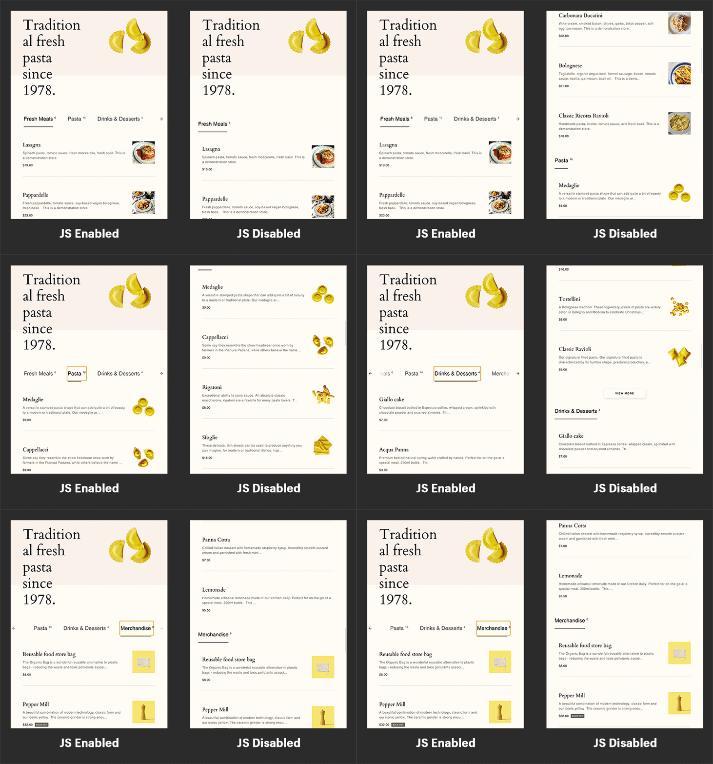
In addition to the themes typically being built with a more traditional architecture, themes in the Shopify Theme Store have always been held to a variety of alternative usability standards and requirements, such as being able to make a purchase with JS disabled and being accessible to people with a variety of mobility and visual impairments (such as keyboard accessibility). These usability standards require theme developers to follow fundamental development practices with HTML and CSS, which ultimately results in a more resilient website that is less reliant on JS.

For example, a common accessibility practice when building websites that are screen reader and non-JS friendly is to use HTML anchor nodes (<a>) for links, rather than JS event handlers:
<a href=”my-new-page.com”>My Link</a>
NOT:
element.addEventListener(‘click’, () => { window.location.href = 'my-new-page.com' }
The same practice lends itself to being more resilient to legacy browsers by not relying on JS. Even if it can’t run, the user is still able to navigate through the online store and make a purchase.
What we’re describing above is fundamentally progressive enhancement. We start with the baseline experience of HTML and CSS for all browsers, supported and unsupported, and serve a fully-featured experience to users using our designated supported browsers.
You might also like: How to Use Product Media on Your Custom Shopify Themes.
The fully-featured experience: designed and built for supported browsers
When I hear “supported browsers” I think of a specific group of browsers that we design a fully-featured experience for based on their overlapping capabilities. For us to ship a particular user interface, the experience should be the same across all supported browsers. This means that if there is a drastic difference in experience from one supported browser to another, we need to either rethink our approach or not move forward.
Supporting a variety of browsers does not mean that the feature needs to be implemented the same way across all browsers. More often than not, legacy browser support requires tweaks and polyfills to achieve a comparable experience to modern browsers.
For example, the Fetch API can execute on all modern browsers natively, but for legacy browsers, needs to be polyfilled to use XHR for the request and callbacks instead of promises.
var promise = fetch(url,[options])
The greater the variety of feature support there is between your supported browsers, the more you need to adjust your implementation and add polyfills, which ultimately leads to more complexity in your store's development.
Unsupported does not mean inaccessible
Using our definitions of “baseline experience” and “supported browser,” we can derive that “dropping support” for a browser means that we are no longer considering this browser that serves a fully-featured experience, and instead serves the baseline experience.
If “unsupported” continues to be synonymous with “unusable,” then we are accepting the practice of producing a less inclusive web experience and losing sales for our clients. Instead, we need “unsupported” to be synonymous with “not fully-featured but still usable!”
"If 'unsupported' continues to be synonymous with 'unusable,' then we are accepting the practice of producing a less inclusive web experience and losing sales for our clients. Instead, we need 'unsupported' to be synonymous with 'not fully-featured but still usable!'"
As mentioned above, our themes are already built with a baseline experience that can be expanded and fine-tuned for legacy browser support. The resulting experience, while not as rich as the fully-featured experience, is still usable and prevents the user from feeling completely abandoned by the online store.
How to build experiences for modern, evergreen browsers

Building your fully-featured experience exclusively for modern, evergreen browsers opens the doors to a huge suite of modern web development features. Woohoo!
Create faster online stores with less JavaScript
Evergreen browsers have, and hopefully will continue to have (thank you, standards), more capabilities in common than they do with non-evergreen browsers. Trying to serve a fully-featured experience to both evergreen and legacy browsers is frustrating and ultimately results in additional complexity in our clients’ websites and build tools (bad). By treating all JS as a progressive enhancement on top of your HTML and CSS baseline experience, you can craft your fully-featured experience purely for modern browsers. This lets you do stuff like:
- Remove jQuery and accompanying plugin libraries from our themes in favor of ES6+ Vanilla JS
- Remove lots of common JS polyfills for legacy browsers, e.g. Fetch, Promise, Async/Await
- Remove browser “equalizers” like Modernizr
- Freedom to use new Web APIs like Font Load API, Web Animation API, Beacon API, URL API, Fetch API, Intersection Observer, Resize Observer
- Build experiences that harness the speed of WebAssembly
- Compose your JS as modules and import via
script type=’module’anddynamic import()
You might also like: How to Refactor a Shopify Site for Javascript Performance.
Watch out for modern HTML and CSS that might break the baseline experience
It is important to keep in mind that with our baseline experience that we are building for our client’s users, we are considering JS as a progressive enhancement and not expecting it to run in unsupported browsers. This gives us the freedom to write JS using all the features described above.
The same does not apply to HTML and CSS. You need to be conscious of how you’re using modern HTML and CSS features, otherwise you might create an unusable baseline experience. Some features to watch out for that are only available in modern browsers include:
CSS
- #rrggbbaa hex color notation
- Math functions
min(),max()andclamp() ::placeholder- Logical Properties and Values
- CSS Initial
- Font Display
:focus-withinpseudo-class- default pseudo-class
- Case-insensitive CSS attribute selectors
caret-color- Blend Modes
- CSS
:any-link - CSS Custom Properties (Variables)
- CSS Grid
HTML
- Responsive Images using
srcsetandsizesattributes -
<input>form attribute -
<details>and<summary>elements -
<picture>: The Picture element -
<template>: The Content Template element
Some of these HTML and CSS features will fail in non-critical ways that won’t really change much in the baseline experiences (e.g. the <details> and <summary> elements), others (e.g. CSS variables) need some kind of fallback planned out. Ultimately, the only way of knowing is to do some testing and fine-tuning.
Defining your baseline experience, testing, and fine-tuning
In this section, we’ll examine the steps you can take to establish what experience should be available to all browsers, how to test your client’s users’ experience across different use-cases, such as with JS disabled or a legacy browser, and how to apply overrides for those experiences.
1. Establish what a client’s customer can do in your baseline experience
The first step in building your baseline experience is defining what it is. What is the absolute minimum functionality you want to provide to all users that access your client’s online store? For the Shopify Themes team, it’s the following:
- The customer should be able to navigate to all pages of the online store, e.g. from Home, and then to Collection pages, and then to Product pages
- The customer should be able to add and remove products from their cart
- The customer should be able to access the cart page and proceed to checkout
With these basic requirements, we can go about testing our baseline experience and fine-tuning it with overrides as needed.
2. Disable JavaScript
Open your browser of choice, disable JavaScript, and start testing your client’s store. Are there any parts of this experience that are blocked by not having JS? For example, is your client’s site’s navigation hidden and revealed using JS? How can you make it visible to users without JS?
If you encounter a problem with styles, such as elements that are hidden by default and revealed with JS, it’s easy to apply CSS overrides that will make them visible only when JS is disabled. Simply include a class in your <html> node that you can define override styles on, but gets removed when JS is enabled by a single line of JS in the <head> (to avoid potentially visible style changes after first render).
3. Test using Internet Explorer
Next, test your client’s store with some non-evergreen browsers like Internet Explorer (IE) 11. You can use a VirtualMachine with IE11 or a service like BrowserStack.
Proceed as before for testing with no-JS: test and apply overrides where needed. To do this, we can detect IE on page load, add a class to the <html> node, and write styling overrides with dependencies on that class:
You might also like: 5 Ways to Improve Store Loading Times with Minification.
4. Apply best practices for accessibility
The bonus of following accessibility (a11y) best practices that make your website more accessible to persons with disabilities and impairments, is that they often improve the baseline experience of your store. There are a lot of people, better than I, that teach accessibility best practices. Below are few posts I was referred to and dug up that you can refer to:
- 7 Tips to Increase the Accessibility of Your Debut Theme Shopify Store
- 5 Steps to Design Apps with Keyboard Accessibility in Mind
- Universal Design: 11 Tips to Make Your Sites and Apps More Accessible
- Inclusive Design: 12 Ways to Design for Everyone
Bonus: Use Lynx text browser

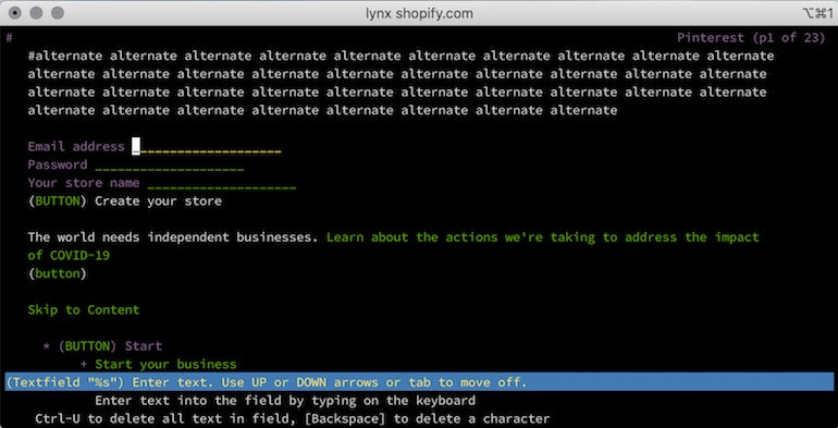
Install the Lynx browser and see what your client’s store looks like as only text! Not only is it cool to see your store without any JS and CSS, but it’s also a good way to check if your HTML is in a good state to provide a usable baseline experience and legacy browser support.
Successfully moving forward without non-evergreen browsers
By building a baseline experience with pure HTML and CSS, you focus on building rich user experiences in modern browsers. Testing and fine-tuning that baseline experience to work with legacy browsers ensures your client’s online store remains usable to all.
What features have you been holding back on because of the requirement for legacy browser support in your fully-featured experience? What are some other best practices to look out for when crafting your baseline experience? Has anyone automated testing a baseline experience with something like Selenium?
Read more
- Introducing Online Store 2.0: What it Means For Developers
- Shopify Tutorial: The product.liquid template
- Shopify’s Buy Button 101: How to Use BuyButton.js in a WordPress Theme
- How to Improve Conversions with Dynamic Checkout Buttons
- How to Work With Shopify Theme Blocks
- How Safe As Milk Grew a Successful Theme Partner Business
- How to use Liquid to Customize Shopify Theme Blog Templates
- Build Forms on Shopify: How to Use Liquid to Build Robust Forms for Shopify Themes
- Tips for an Efficient Shopify Theme Review Process
- Understanding Progressive JPEG and WebP Formats
If you have feedback to share, please let us know in the comments below.


