Most companies these days have a website, whether for ecommerce or just brand presence. These sites are a great opportunity to build traffic, share brand values, showcase products, and earn customers.
What happens, though, when a company wants to launch something totally experimental; something that might not fit within the structure of their current website? What if they want to try out a whole new look and feel, or experiment with a vertical they’ve never previously tried?
Enter the microsite.
What is a microsite?
Definitions vary, but the general consensus is that a microsite is a single landing page, or a small cluster of pages, that live entirely outside of the brand’s core domain name. It has its own URL structure, its own look and feel, and focuses on one or a small handful of products.
"A microsite is a single landing page, or a small cluster of pages, that live entirely outside of the brand’s core domain."
(Fun fact: I discovered a microsite…about microsites. If you’re curious, here’s the link to learn All About Microsites.)
Microsites can be used for many purposes, which we’ll dive into below. But I thought I’d start by asking the first question I had on the topic, which was...
How is a microsite different from a landing page?
Great question. 😏 There are certainly similarities between the two. Both are generally made for a specific campaign, are much simpler than a regular website, and can be temporary — seasonal or for a limited time.
Landing pages, however, consist of only one page, whereas a microsite can include multiple pages. The largest difference is that while a landing page is published on its parent’s branded website, a microsite will most often be found on an entirely different domain. This is what makes it so interesting — it’s like the brand has taken a magical trip to a destination where it can keep everything it loves, throw away everything it doesn’t, and add some entirely new elements.
To really illustrate the value, potential, and feasibility of building a microsite for yourself or your clients, I’ve collected a bunch of case studies from Shopify Partners who have launched campaigns with major brands to help achieve specific goals through the use of microsites.
We’ll start by taking a trip to the Big Apple.
Simplistic: A microsite agency
Simplistic, a New York-based agency and a Shopify Plus Partner, got its start by building microsites. I had a conversation with Managing Partner Andrew Gordon about how it all began.
Good Morning America has a weekly segment called Deals and Steals, where featured brands showcase their products at a steep discount exclusively for the show’s viewers. Simplistic recognized an opportunity to support these high-traffic flash sale events, and built a full-service program around Shopify — including optimized microsite design, consulting, and inventory management.
Whether or not featured brands have a full website, they’re required to build a microsite with Simplistic that’s live 48 hours before the sale, and 48 hours afterward. Fifteen people now work on Simplistic’s team, which builds between 10 to 15 of these sites per week — all of them on Shopify Plus, bringing in between $1 to $5 million total on each deal day.
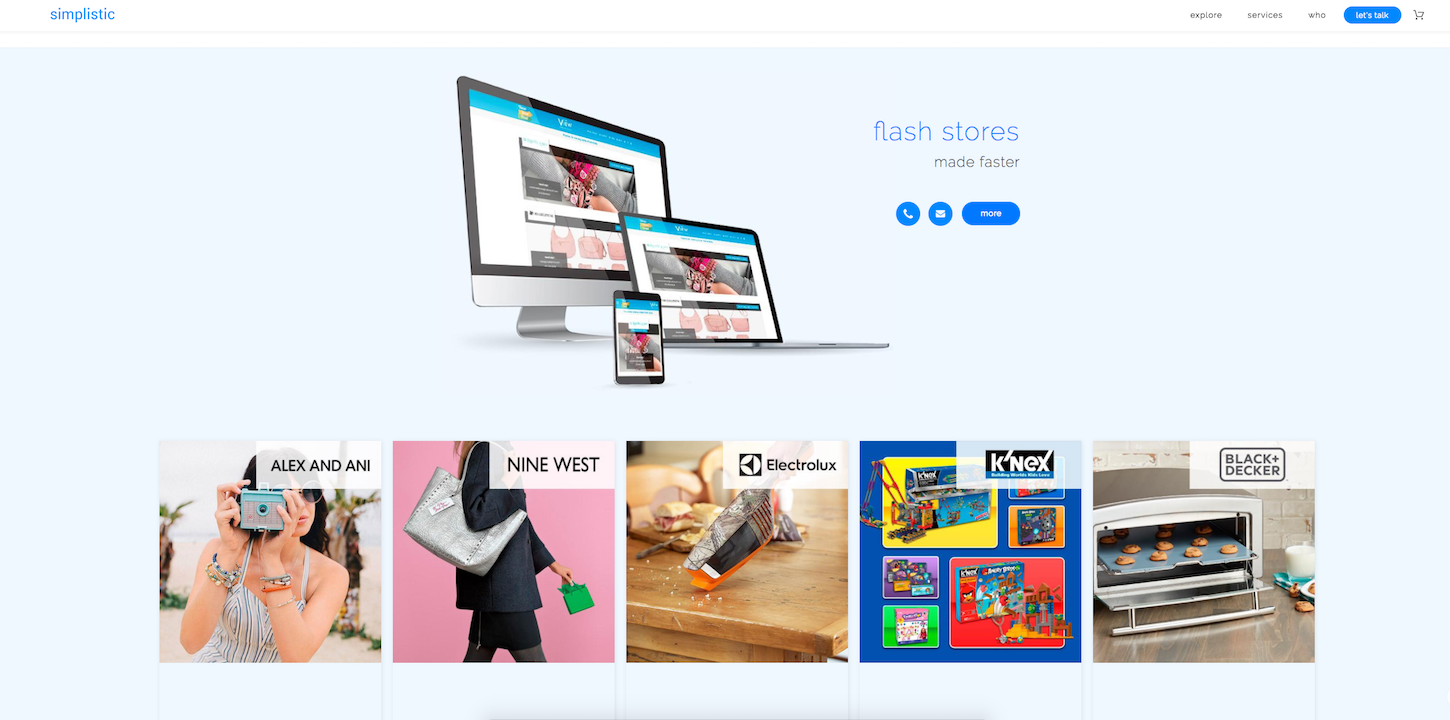
Because the microsites are so simple, and because people are coming to the site after watching the deal’s segment, they’re able to achieve ridiculous conversion rates of between 15 to 20 percent.
“These people are watching every week for this reason,” Andrew says. “They’re not going to the site to browse. They’re going to buy.”
Other microsite examples
Simplistic has built a reputation around creating microsites for various brands. Here are a few additional examples of microsites they’ve worked on.
Elizabeth and James
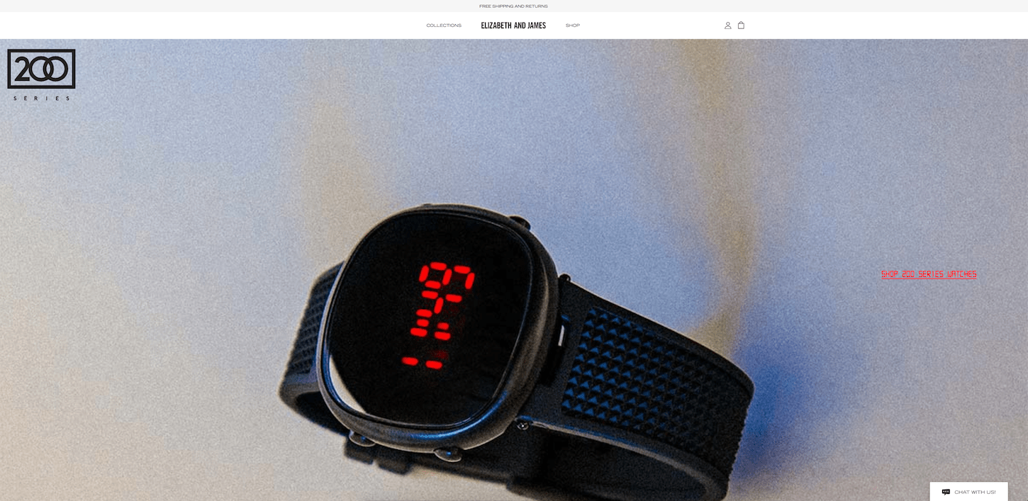 Ashley and Mary Kate Olson’s fashion company has a website built on a custom CMS without any ecommerce functionality. To experiment with ecommerce, Simplistic recently built them a microsite featuring only two products (a watch and a perfume) to limit their initial investment and test the waters.
Shark Tank
Often companies featured on the show Shark Tank have only a basic Squarespace site or Kickstarter page. They’ll often turn to Simplistic for help launching a microsite in advance of their appearance.
“They’re like, ‘Oh crap, this is a big opportunity for sales,’” Andrew says. “So they come to us at the last minute to take advantage of all those eyeballs on Shark Tank.”
Alex & Ani
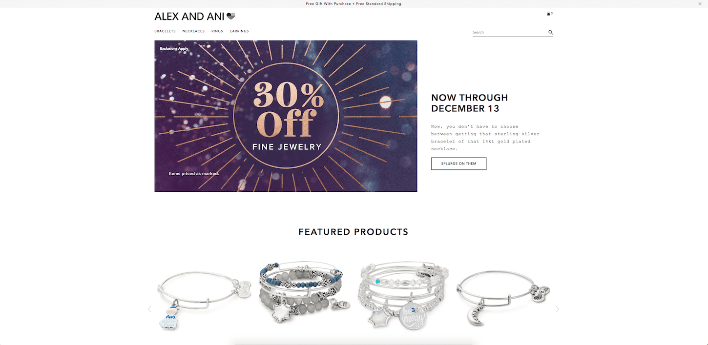 This big costume jewelry brand has their main website on Magento. Simplistic built them a failover microsite on Shopify so that when the Magento site crashes, they are able to port visitors over to the microsite, which is able to handle the traffic.
Sample sales
Many fashion retailers, especially in NYC, rent out warehouses to allow employees, friends, and family to buy samples of their products on sale. But real estate ain’t cheap, and remote employees can’t always make it to an NYC warehouse. Many fashion brands are opting for microsites to offer private sample sales instead, and Simplistic has helped build many of these.
Simplistic’s microsite tips
- Keep it simple. There should be very few steps to checkout, and you shouldn’t flood visitors with information. Focus on only what they need to know. Say, for example, a pair of jeans is featured on GMA. Viewers have already gotten the sales pitch on TV; they understand the product and price. But maybe they need to know the jeans are machine washable. “Only give them the information that’s essential for them to make the purchase,” Andrew says.
- Use it as an opportunity for bigger contracts. Many of Simplistic’s clients had their first exposure to Shopify through their GMA microsite. After seeing what the platform could do, many of them decided to migrate their full website over to Shopify. Simplistic has built an entire new business arm to focus on these ecommerce migration opportunities. One example is NineWest Canada, which moved to Shopify after first experiencing the platform during their GMA appearance.
SOVI Creative: Unique campaign specialists
Simplistic isn’t the only agency that has found a niche with microsite builds for clients. Stephan Peralta, Creative Lead of Toronto-based SOVI Creative, shared two recent brand campaigns his agency worked on that take advantage of microsites to tell a specific story about a niche product.
Doritos Ketchup Roses

"If you’re reading this from outside Canada, you may not realize the love affair that Canadians have with ketchup chips."
If you’re reading this from outside Canada, you may not realize the love affair that Canadians have with ketchup chips. In my personal opinion, they are the greatest of all the chip flavors, but I’ll try not to let this bias interfere with my storytelling.
Doritos Canada was looking for a direct-to-consumer opportunity to gain ecommerce-specific information about their customers that they previously couldn’t access, because of their B2B business model.
The company decided to bring back a limited ketchup edition of their tortilla chip, and launched a Valentine’s Day campaign where they, no joke, took the chips and assembled them into the shape of a rose by hand. They targeted Vancouver, Toronto, and Montreal, and offered the product for free. (“Doritos® Ketchup Roses | Yes. They’re real,” their SEO title tag reads.)
Doritos hired SOVI Creative as their Shopify implementation partner, and worked with another Toronto-based agency called BBDO on the campaign.
“We wanted to allow customers to purchase in a hyper-local situation, so that Doritos could find out who specifically wanted to obtain this product,” Stephan says. “Direct to consumer is hard to get a hold of for big brands. Ecommerce is the perfect channel for them to experiment without having to invest a lot.”
"Ecommerce is the perfect channel for them to experiment without having to invest a lot."
The 70’s-style theme of the website was strategically designed to be cheesy (pardon the pun), and to remind people of an older generation, where purchasing a materialistic good was a special event. It was a massive sellout, with those roses flying off the digital shelves.
You can still find the website online — no more roses, but there’s a DIY guide for you to try it yourself, along with a coupon to buy the chips in store for a discount.
“Why lose the ability to gain such good organic SEO?” Stephan says of the decision to keep the website live. “All a user has to do is search for ‘ketchup roses’ because it’s been indexed so many times. This gives (Doritos) the opportunity to continue this campaign year-over-year.”
Turtles Share the Love
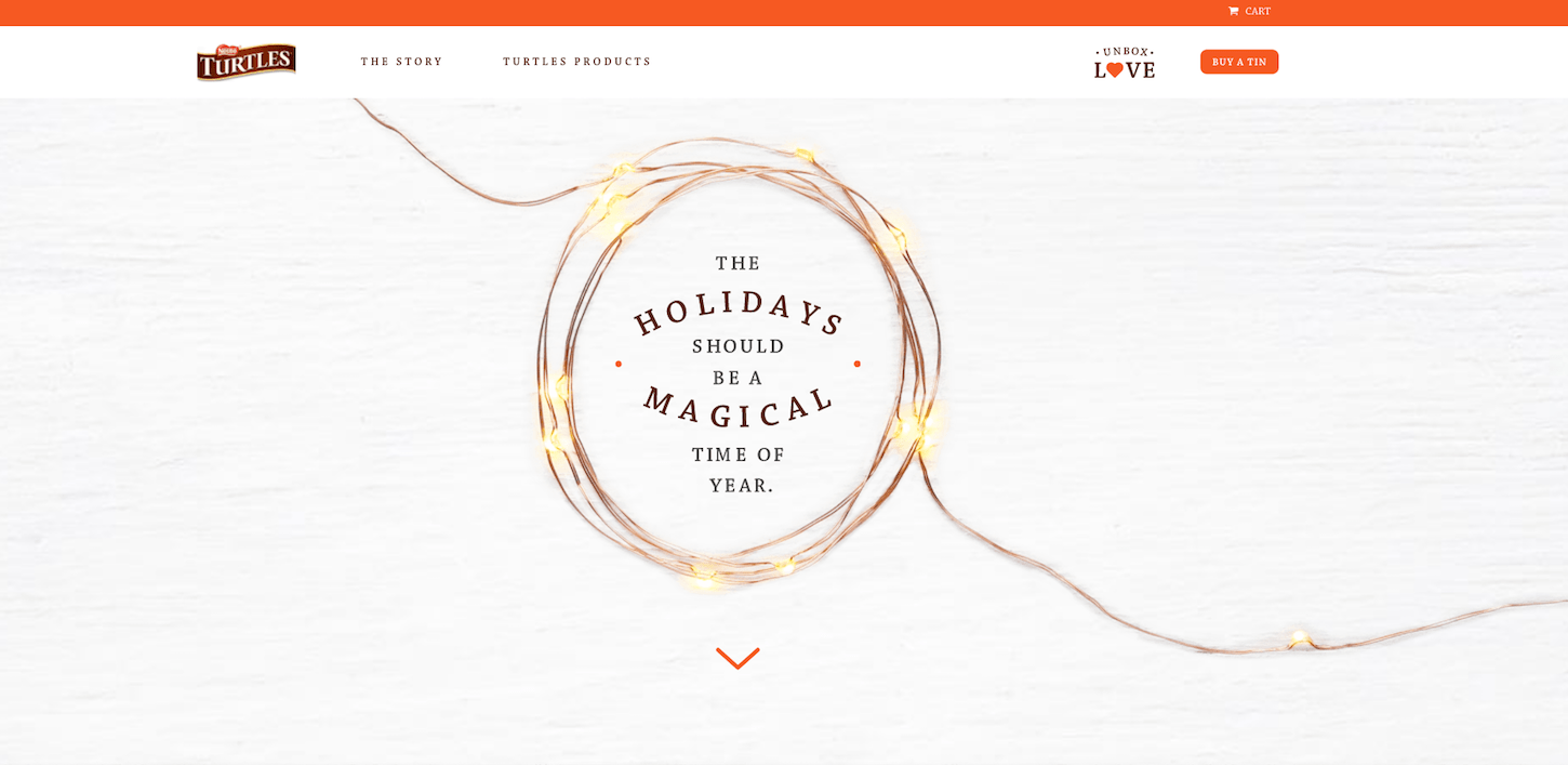 This holiday season, Turtles (that classic nutty chocolate treat with a shape that loosely resembles a turtle) launched their first-ever direct to consumer opportunity in Canada.
Their Share the Love campaign consists of limited edition holiday tins that include a $100 donation from Turtles to Canadian families in need, with every tin purchased. Typically, Nestle (Turtles’ parent company) would have its own internal webpage for this campaign, but with the help of SOVI Creative, Turtles made a brand new microsite to tell the full story.
“A great microsite really comes down to the content ,” says Stephan. “This is a great opportunity to allow customers to engage with a site that tells a story and provides a unique user experience, to really allow your brand to stand out in a saturated market.”
The Turtles microsite content strategy includes clearly sharing the narrative behind the campaign, and explaining what $100 could mean for a family in need — bringing a loved one home, paying a hydro bill, providing a family dinner. Essentially, the campaign provides a charitable opportunity for the visitor, and allows Turtle to build goodwill while upholding corporate social responsibility.
VaynerMedia: Sharing microsite best practices
I also had the opportunity to chat with Sabir Semerkant, SVP of Ecommerce, and Billy Galanko, Ecommerce Strategist, of digital agency VaynerMedia about their experiences building microsites for clients. To maintain client confidentiality, we didn’t talk about specific brands, but they had plenty of lessons learned and best practices to share.
Microsite best practices
1. Tell a story unique to your target audience(s)
Microsites allow you to target different types of people — say you were selling a food product and were looking to target home cooks, restaurant chefs, and food truck vendors — each of which would use the product in a different, nuanced way. You could launch siloed microsites to tell each of those audiences a unique story, based on their needs.
“When someone comes to that relevant page for that relevant audience, you’re telling a story that’s related to them specifically,” Sabir says. “What does that do? It increases your conversion and makes it worth the investment.”
2. A/B test effectively
When building out a microsite, the goal is to keep it simple . That means that if you tweak one small feature (whether it’s a promotion, a CTA, or a slight alteration of the shopping cart), you can A/B test to accurately measure its impact on performance and conversion.
You Might Also Like: How to Choose the Right A/B Testing Strategy for Your Clients.
3. Leverage applicable reviews
Sabir tells his clients to collect as many reviews as possible about the microsite’s featured product. Dig through those reviews to find the ones coming from the specific audience you’re looking to address on the microsite (for example, a testimonial from a teacher on a teacher-targeted microsite), and put all those relevant reviews at the top of the list. That way, people read the reviews most applicable to them, which will help push them towards conversion.
4. Make special offers based on audience
Not everyone is going to be enticed by the same special offer. Sabir, who formerly worked at Canon, gave a great example to illustrate this point.
Let’s say you’re a small business and you’re looking for a printer. This is a big investment for you — so you might like the option to finance the printer and pay in installments. But if you’re a bigger business, maybe you don’t need a payment plan — maybe you need a rental offer, with a maintenance package to keep it operating well under heavy use.
“If you create a generic path, then you’re defeating the purpose of the site,” Sabir says.
Pitching microsites to clients
So when is it a good time to suggest a microsite to your client? Sabir and Billy outlined a few use cases where a microsite could be the perfect solution for your client.
You Might Also Like: Best Practices for Designing High Converting Landing Pages.
1. Old product
If your client has a product or product line that is losing market share or relevance, a microsite is a great way to revitalize the brand.
“You might want to retell that story, in a siloed way,” says Sabir. This could mean introducing a special holiday flavor of a well-loved product, or a limited edition of a cherished apparel line.
2. New product
The opposite extreme is for a product that is brand new, especially for retailers who already have many existing products.
"Build a shrine around the product."
“When you’re taking a new item and putting it in with 10,000 other products, you’re not going to be able to tell a great story around it,” Sabir says. “Create a microsite to tell an exclusive story. Build a shrine around the product.”
Once the product gains momentum and becomes well-known, you can add it back into the company’s original website, but until then, “give them that tunnel vision,” as Sabir puts it.
3. New vertical
If your client is working on a product outside of their core product offering, but still part of their brand, it’s a good idea to launch a microsite for it. They might ask for it to be listed within their main web page, but Billy challenges you to push back and make a unique experience for a unique product.
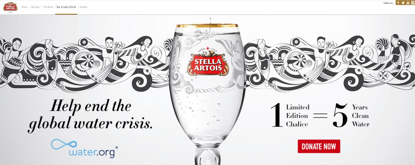
He gave a good example — Stella Artois has a page within their core website for their campaign called “Buy A Lady A Drink,” where you can buy a branded beer glass. For each one sold, Stella Artois will donate the equivalent of five years’ worth of clean water for one person. This fits within their core website because it directly has to do with their core product — you can drink their beer in their beer glass. If they were to experiment with something entirely different, like a branded sports product, it would be better served on a microsite of its own, so as not to confuse those who head to the main site.
Potential drawbacks
What are some of the reasons you should be wary of building a microsite? A few things come to mind.
- Maintenance: If the microsite contains seasonal or temporary offers, they can quickly become outdated and require updates if you decide to keep the website live.
- Customer confusion: If visitors arrive at the site expecting to see the traditional brand and its products, they might be put off by the entirely different user experience.
- Potential for failure: The best microsites are the ones with the ability to go viral. If your campaign never catches on, and you don’t get the traffic you had hoped for, it could be a waste of resources.
To recap…
There are many different reasons why microsites could be a good fit for your clients. Here are a few of them:
- Flexibility: They’re quicker to ship than full websites, and generally more cost-efficient.
- Conversion: CTAs are limited and explicit, leaving no doubt as to the action you’re hoping the visitor will take.
- Storytelling: If you want to focus on a unique user experience or convey a complex story, a microsite is a great way to do so.
- Experimentation: Not only can you A/B test quickly and efficiently, but it’s a blank slate from a branding perspective. You can try a totally different look and feel than the company’s core website.
- SEO advantage: If you give the site a unique URL that’s easy to remember, focus on one product (or a small handful), and use strategic keywords, the site can show up higher and/or more frequently in search results than the main website.
- Trendy: Microsites are making a comeback. They fizzled out for awhile there, as people focused more of their efforts on creating social media pages. Now that social is more “pay to play,” and branded pages aren’t as easily accessible, companies are recognizing the discoverability microsites can offer.
Read more
Have you worked on a microsite for a client? What benefits or drawbacks did you find when building one? Share your thoughts in the comments below.


