A/B testing is one tool in the arsenal of a conversion rate optimizer, and its primary purpose is to measure the economic impact of a change. While you might know the basics of A/B testing, it’s not always clear where to start. The number one question I often hear is, “what should I test?”
Creating an A/B test isn’t so hard, and most frameworks have a toolkit for analyzing and acting on findings. But without good ideas, you have no reason to test in the first place.
We all want to know what works, but it’s not as easy as changing your headline and watching the numbers go up. Fortunately, there is a surefire winning strategy: research.
Good testing ideas take time and effort to generate, and researching your client’s customers is the most effective way to find those good ideas. There are always unsolved questions about how people behave when they encounter a store. Once you start to get some answers, you can translate those insights into testable design decisions — by crafting a different pitch, fixing usability errors with the store, or finding a more appropriate time to pitch accessories and upsells to a prospective customer.
Using research can result in a larger share of winning tests that can improve a store’s conversion rate, which means more revenue for your clients. And for ecommerce in particular, off-the-shelf themes often need to be optimized in order to perform as well as they possibly can.
With all this in mind, I’ll present the best ways to quickly and cheaply conduct research — so you can figure out what to test, and run A/B tests that improve your client’s conversion rates.
You might also like: How A/B Testing Will Make You a Better Web Designer.
What do we mean by research?
First, let’s get on the same page. What is research? Regardless of how you choose to use the results of your research, I define it as any information-collecting process that requires direct communication with people who use — or could use — your client’s product.
Research can take many forms, including:
- Calling and interviewing customers. Recruit people on your client’s website and get on the phone with them. Ask them about the challenges they might have dealt with when purchasing the product, ask them about their experience with the product once it arrived, and try to assess how the product fits into the broader context of their lives.
- Tracking people. Heat maps, analytics, scroll maps, and referral tracking are all forms of tracking people. If you have looked at data and acted on it, that’s a form of research.
- Surveying people. Throw something on Wufoo or Typeform, call it an annual survey, and ask questions about a user's’ use, demographics, and desires.
- Usability testing. Your client has a prototype or an existing product. You want to see how people use it. So you sit someone down at a computer, ask them to complete a predetermined set of tasks, and assess how successful (or unsuccessful) they were. This can take a few different forms, such as a contextual inquiry. I use UserTesting to run usability tests.
What to do first
Research as much or as little as you’d like, but you should always use research to support your testing decisions. Why? Several reasons:
- Research is cheaper and easier than you think. Tools like Google Analytics, Hotjar, and VWO cost little to nothing for most stores.
- “Best practices” aren’t universal. Instead, they’re a good starting point — and no store ever implemented every single best practice for infinite profits.
- Taking a stab in the dark may not meet a customer’s needs — and making a store that wows customers is the key to improving conversion rates.
There are a few research methods that will help anyone figure out what to test, and you can put these into practice today.
You might also like: Split-Testing: How to Run a Revenue-Driven Test in Shopify.
1. Heat and scroll maps
You should always run heat and scroll maps on key pages in a funnel, in order to understand where people are clicking and how many of them are scrolling. I typically use Hotjar to do this, although VWO, Clicktale, antd Mouseflow do roughly the same thing.
Heat maps teach you where people click, and scroll maps help for long pages — to show whether you’re actually capturing a customer’s attention. If people are clicking frequently on an element that isn’t pliant, you probably need to link it somewhere. If people stop scrolling after a given section, you probably need to rework or remove it. Here’s what one of them looks like; this is from a former client of mine, KeySmart:
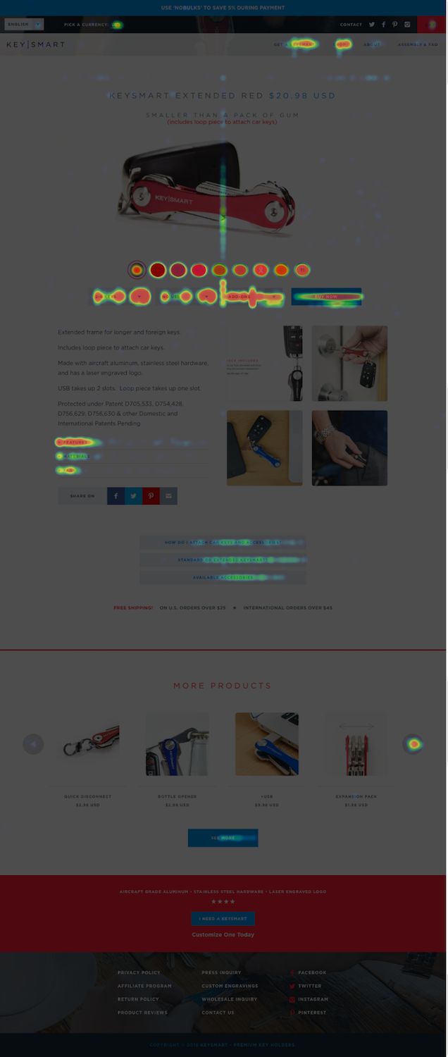
All elements on the page should support conversion and revenue generation, period. Heat maps often support what we already know: that customers simply don’t care about the bells and whistles we add to make ourselves feel good about features. We should instead focus on the benefits and outcomes that our client’s product can provide.
Customers simply don’t care about the bells and whistles we add to make ourselves feel good about features.
I can’t tell you how many times I’ve stared at a heat map, where the product’s big new marquee feature was a huge dark spot on the page. Most visitors favor visiting a product page and vetting the price; they don’t do much beyond skimming the page. Heat maps teach us that pages needs to be as tight and conversion-focused as humanly possible.
Pay attention to what’s lighting up on heat maps, as well as what’s being ignored. You’re looking for broad-scale trends that show a clear path forward. Avoid reading into the tea leaves of random clicks that don’t make any sense. Instead, focus on buttons that see zero activity, and try to figure out why.
If most of your customers are ignoring a given call to action, it may be that they can’t find it — or they simply don’t care. In that case, you can run a test that either makes the call to action more prominent, reword it to convey a bit more urgency, or both.
If people are beelining to a specific page, it may be worth exploring their motivations further. Does the page help move them further down the funnel? Then you can test making it easier for the customer, with a more prominent version of the page. But if page encourages any anticipated behaviors that you don’t want, test downplaying or removing it.
2. Google Analytics
No matter what, you need to spend some time fine-tuning Google Analytics to help make it clear how people are really behaving . ConversionXL has excellent resources on Google Analytics: how to configure it and how to set up goals, segments, and events.
First, and at minimum, you need to set up goals for conversion rate and raw sales. Go to Admin in the header navigation, and then go to Goals in the right-hand column. If you haven’t configured any goals, you’ll see a page like the one below.

Hit + NEW GOAL and create a new goal for the store’s thank you page. Next, create a goal for revenue. Go through the same process to create a goal, using the checkout thank you page as your destination.
You’ll also need to configure ecommerce settings for your site. Go to Ecommerce settings in the same admin column as your goals and view settings, and turn the switch on for Enable Ecommerce.
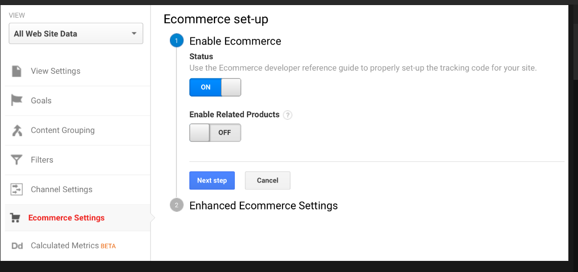
Then, turn the switch on for Enable Enhanced Ecommerce Reporting, and hit Submit.
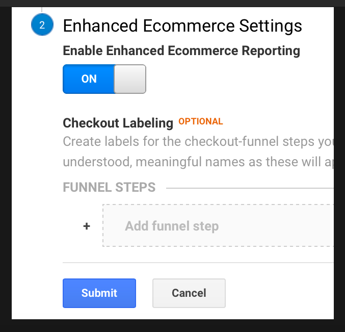
Next, you need to update your tracking snippet. Before the last line of your tracking snippet, add the following:
ga('require', 'ec');
Shopify maintains their own resource for creating goals in Google Analytics, which should be helpful as well.
Once you have Google Analytics configured, you can use it to learn:
- What people are doing. Where are they going? How do they typically interact with the store’s funnel? Go to Behavior → Site Content → All Pages in Google Analytics, and you’ll see what share of traffic each page gets. Go to Behavior → Behavior Flow and you’ll see a customer’s individual path as they move from page to page, including the proportion of customers that drop off at each step.
- The impact of every feature on every page. How focused are each of the store’s funnel features around conversion and revenue generation?
- Whether specific browsers are hurting conversion. Go to Audience → Technology → Browser & OS report in Google Analytics. This tells you whether a specific browser or operating system is leaking revenue. Now, you have a development problem on your hands.
- Whether pages are too slow. Speed absolutely matters, especially as mobile becomes more dominant. Go to Behavior → Site Speed → Page Timings and check if there are any outliers. Fix them. You will make money online.
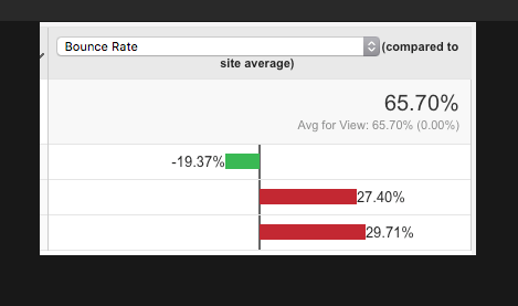
- Mobile performance. Go to Audience → Mobile → Overview, and switch your view to show relative performance again. This view,picturedbelow, shows the broad-stroke performance of mobile devices and tablets. The top row is for desktop, second is tablets, third is smartphones. Here, I’m using bounce rate — but you can always switch that pull-down to reflect other goals. Note that the bounce rate is much higher for mobile browsers, especially in-app browsers. There could be an opportunity to test a callout that captures the customer’s email in these circumstances, so you can begin a customer relationship more easily.
- If any part of your funnel is leaking revenue. Go to Conversions → Goals → Funnel Visualization. You should see something like what’s pictured below (without all identifying information blurred out on the sides, of course). This shows you the different steps of your funnel, and how many people are faring at each point. This funnel is not configured correctly. Why? There should be a slight drop-off between the first and the second step: one hundred percent or zero percent retention indicates that the funnel’s events are not configured properly. If your funnel looks like this, you need to go back into your goal and reconfigure it to reflect the concrete changes that happen from step-to-step. You can go broad (form submission, page navigation) or granular (tabbing across form fields, etc.) — just do what works best for your business. If you want to learn more, check out Kissmetrics tutorial on troubleshooting issues with your funnel.
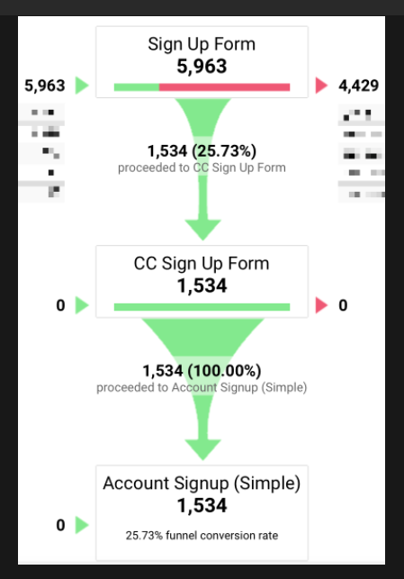
Most analytics teach us about overall performance (site-wide conversion rate, average order value, etc.) or where to make one-off fixes (mobile improvements, browser testing, etc.).
For one example of how analytics can inform our A/B testing strategy, let’s look at the behavior flow from a flagship product. If more people are going back to the store’s product listing after viewing a given product — and not adding it to their cart — then it’s likely that they’re either uninterested in the offering, or they’re comparison shopping between multiple products. If our behavior flow shows this to be the case, I’d consider adding a product comparison chart on the product page that teaches customers about the differences between each product the store offers.
Analytics matter when optimizing a site because they give us the most accurate approximation of detailed, real-world customer behavior. You can mine analytics for demographic insight to create new landing pages and rework your marketing pitch; you can pick apart site speed to isolate page weight and client-side issues; and you can figure out the customer’s most likely conversion funnel, and streamline it with future tests.
3. Heuristic evaluations
Heuristic evaluation sounds like something you pay a doctor to do, but it’s not that hard. It essentially means you create a checklist of criteria that a website should have in order to support best practices in conversion, and you evaluate whether your client’s site succeeds or fails in each of these criteria.
The notion of heuristic evaluation goes back to the early days of usability research in the mid-1980s. It’s likely that you have a practice quite similar to it in your own organization: think of it as unit testing, KPIs, or brand guidelines, and you’re on the right track.
Check out some of the oldest criteria for heuristic evaluation by Jakob Nielsen; that article is so old it can drink. UXmatters has published another great example of a more modern methodology.
Below, you’ll find the heuristics that I often use with my own clients. You can use these as a jumping-off point to craft a list that best fits your client’s revenue goals.
When performing a heuristic evaluation on your site, you’ll need a series of heuristics to go by. Here’s a good starter list for your site, all focused on keeping the customer moving towards conversion.
Bugs and Rendering
1. Does checkout work materially the same in every browser on every major platform?
2. Are there any significant rendering errors from platform-to-platform? From browser-to-browser? (Hint: check Google Analytics to figure out which browsers are leaking the most revenue!)
3. Does the layout work well across a variety of screen sizes?
4. Is the site equally fast among every browser on every major platform?
5. Have you minimized the number of form fields that are necessary to complete a revenue-generating transaction?
Mobile (Tablet and Smartphone)
1. If hover states are employed on the desktop layout, is there a proper fallback for touchscreen?
2. Is there a responsive layout for mobile devices?
3. Are input keyboards properly accounted for in checkout?
Value Prop, Pitch, and Contextualization
1. Does your value proposition match your business’ positioning and overall goals?
2. Do you speak directly to the customer, using a minimum of “I”-focused language and a maximum of “you”-focused language?
3. Do you allude to the customer’s pain, and then offer your product as a solution to those pains?
4. Does your product’s marketing best reflect its job-to-be-done?
5. Do you have landing pages to pitch to alternate market segments?
6. Do you have lifecycle emails configured to upsell people to other products (or higher-paid plans) in your ecosystem?
Research Insights
1. Are people clicking and scrolling where you expect them to?
2. When you interview paying customers, have you apprised yourself as to all of their objections before the sale?
3. When you survey paying customers, do you have a clear sense of what they represent demographically?
4. Are there any uncaptured markets that you want to move into? If so, is your site doing a good job addressing those markets?
5. In user testing, did any significant issues come up with the navigability of the site, or ability for people to successfully complete a revenue generating transaction?
Once you have your list, get at least two others to evaluate the site alongside you. By doing so, you’ll be isolating all sorts of usability issues, while coming up with prototypes that better address the way customers are likely to behave.
If both of you end up isolating the same problem with a store, it’s either something that should be fixed (if it’s clearly a bug or major usability issue, like a page taking too long to load, or an error message not being worded clearly); or tested(such as navigation not matching how you want to browse a site, or filtering and sorting mechanisms having poor defaults). Take the rest of the issues that you’ve encountered and prioritize them by how likely each issue is to impact conversions, and how feasible each issue is to fix.
4. Surveys
Finally, run a survey of prospective customers and get post-purchase surveys set up for all future orders. Why? Because any research-driven process should provide a mixture of quantitative (analytics, heat maps, A/B testing results, etc.) and qualitative (stories, interviews, etc.) information. Gathering qualitative insights can teach you about your client’s customers in ways you couldn’t even imagine.
You can use Typeform or Wufoo to configure the survey and collect the responses. Include a survey callout at the top of your home page, and put respondents in a contest to win a free product or month of services.
Some interesting questions include:
- Why did you choose us?
- What do you use us for?
- What value have you gotten out of our product lately?
- Did you take a look at any of our competitors?
- Are there any aspects to our service that you find frustrating, or which you’d be likely to change?
- How easy was it to check out? (This is a great one to put on the “thank you” page!)
- What new things would you like to see from us?
- How were you recommended to use the service?
- On a scale from 0 to 10, how likely are you to recommend us to a friend or colleague?
All of these should give you ample information for crafting the right pitch, addressing the right concerns in a marketing page, and shepherding people through the checkout process.
With my client KeySmart, we ran post-purchase surveys for each customer and found a consistent issue: once they took them apart and added their keys, people didn’t know how to reassemble their new KeySmart. After adding an assembly guide to the site, linking it prominently from the product page, and emailing it to customers shortly after purchase, we dramatically reduced the number of issues that people felt, which increased customer satisfaction and catalyzed further sales.
This resulted in a one-off change, but there are tons of other examples where qualitative surveys influence A/B tests. One common result: using surveys to audit objections. First, ask someone what the last thing was that held them back from purchasing, or whether they felt any hesitations before they bought the product. Then, take the most common three to four responses and address them head-on with your marketing page.
Why is this valuable? Because stores are always engaging in a passive relationship with their customers, and you have to ensure the marketing copy addresses what users are thinking. As a result, good marketing pages audit and dismantle all of the most common objections that a customer has.
For example, let’s imagine that a store’s customers said the high price of a premium product held them back a bit from purchasing. In that case, test some copy on the product page that speaks to the product as a lifelong investment piece, anchoring the high price against cheaper-priced alternatives.
Synthesis
Now that you have some research, you need to make sense of it. Synthesis is the process of generating insights from your research. In doing so, you’re examining the information gathered, making an informed guess as to customer motivation, and deciding how to respond.
When making sense of research, ask two questions:
- Am I observing a trend? One interview is well and good, but it may be an outlier. Better to confirm your findings with other sources first — even if it’s just a couple.
- Does this represent a lost revenue opportunity for my client’s store? If you find any revenue leaks in your research, you need to plug them. Some of these mean fixing bugs (a page loading slowly on mobile, say). Others mean running a test to hedge risk (such as revising a pitch, or creating a totally new value proposition).
Let’s take an earlier example with heat maps: say you have a heat map where people seem to be ignoring a given call to action. You’ve decided that it’s probably being ignored because it’s three-quarters of the way down the page, and you’re armed with scroll maps that indicate most people aren’t getting that far. As a result, you propose a test that moves the call to action above the fold.
This involves three steps:
- You notice something problematic happening with the research you’ve gathered: in this case, people are ignoring a call to action.
- You isolate a probable cause using other research: in this case, it’s because hardly anyone is even viewing the call to action, because it’s so far down the page.
- Finally, you create an action that should address the problem: moving the call to action to the top of the page.
Once you’ve gone through this process, it’s worth spending some time vetting each testable idea to ensure that it’s justified by research, and likely to impact conversions. Here are a few questions that you should ask of each idea:
- What research backs up this change?
- What does this change have to do with the business’ overarching goals?
- What is the next step on this page?
- In what ways is the next step clear to the customer?
- Does the page appear credible? How?
- Does the change we’re trying to make aid in credibility?
- Does the change improve usability? How?
These questions largely reflect the ones that ConversionXL and the Baymard Institute both use when analyzing various ecommerce sites for what works and what doesn’t.
You might also like: A Short Tutorial for Running A/B Tests in Shopify with Optimizely.
Learning from tests
Once you get the testing process going, you can even mine past tests for research insights. How do A/B tests themselves give us more research data?
- Most testing frameworks offer heat and scroll maps of both the control and the variant — so even if you get a winning variant that changes customer behavior significantly, you’re able to maintain an up-to-date heat map.
- All testing frameworks integrate with analytics software in order to provide greater insight into the economic impact of your design decisions.
- And finally, every test you run should go into a database of past test results that you maintain for record-keeping purposes. This allows you to understand what’s worked and what hasn’t in the past — which gives you greater insight into what to test next. If you need some help getting organized, check out my guide to maintaining a Trello board of test ideas.
And don’t forget, you should always be gathering research insights while tests run. Why? Doing so lets you come up with the next set of tests, from idea to prototype. And maximizing the amount of time that a test is actively running will make testing maximally valuable for your store.
Final thoughts
If you have enough traffic to get statistically significant results, you should be doing what you can to optimize your store now. (Better to start now than two weeks before the holidays!)
Testing is daunting for many — not because it’s hard (it isn’t!) , but because it requires a mindset shift: one which focuses on customer inquiry and careful, incremental improvement. If you have any other questions on where to start, please reach out, I’d love to help!
Read more
- Working With Technology Clients: Strategies, Apps, and Themes to Consider
- Free Webinar] Dirty Little Tricks From the Dark Corners of Front-End
- Top 5 Features to Include When Building a Successful Fitness Site
- How to Integrate Shopify into your Client's WordPress Website with Zillacommerce
- Minimalist Web Design: How To Achieve More With Less
- Top 13 Web Design Conferences You Should Attend in 2016
- Top Ecommerce Resources for July
- Top Ecommerce Resources for November
- 14 Image Tools for Web Developers in 2017
- Why Fonts Matter: How Fonts Help You Build a Better Shopping Experience
What kind of research do you perform to inform your A/B testing? Tell us in the comments section below!

