


Every layout begins with a blank page. Then come elements—a logo, menus, text sections, photographs, illustrations, etc. The placement of elements can determine how successful the design will be. That’s why one of the first things designers do when they start working on a new page is to decide what the arrangement of elements will be on that page. There are two basic approaches to space elements on a page—designers can either lean toward a more symmetrical arrangement of elements, or an asymmetrical one.
In this guide, we’ll see how symmetry and asymmetry work for design. We’ll cover the basic techniques, tips, and best practices for each approach.
Symmetry vs. asymmetry
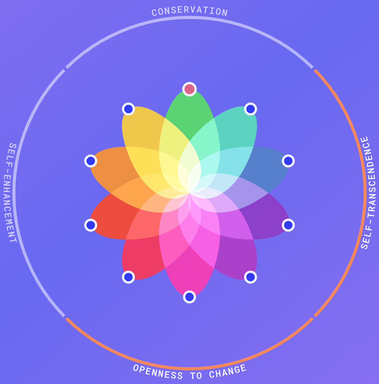
Symmetry is best when you are seeking a more serious aesthetic, want to enhance recognition and recall, and want to achieve more order and structure. Use asymmetry ready to spend extra time arranging elements to find unique ways of achieving balance or are seeking a more playful layout to convey user interest.
What is symmetry design?
For a long time, symmetry was thought of as the gold standard of design. The preference for selecting a symmetrical layout is especially noticeable in architecture. Take a look at one of the most beautiful buildings in the world—the Taj Mahal. The Taj Mahal has a lot of properties that make it so aesthetically-pleasing, but its symmetrical balance is one of the main ones.
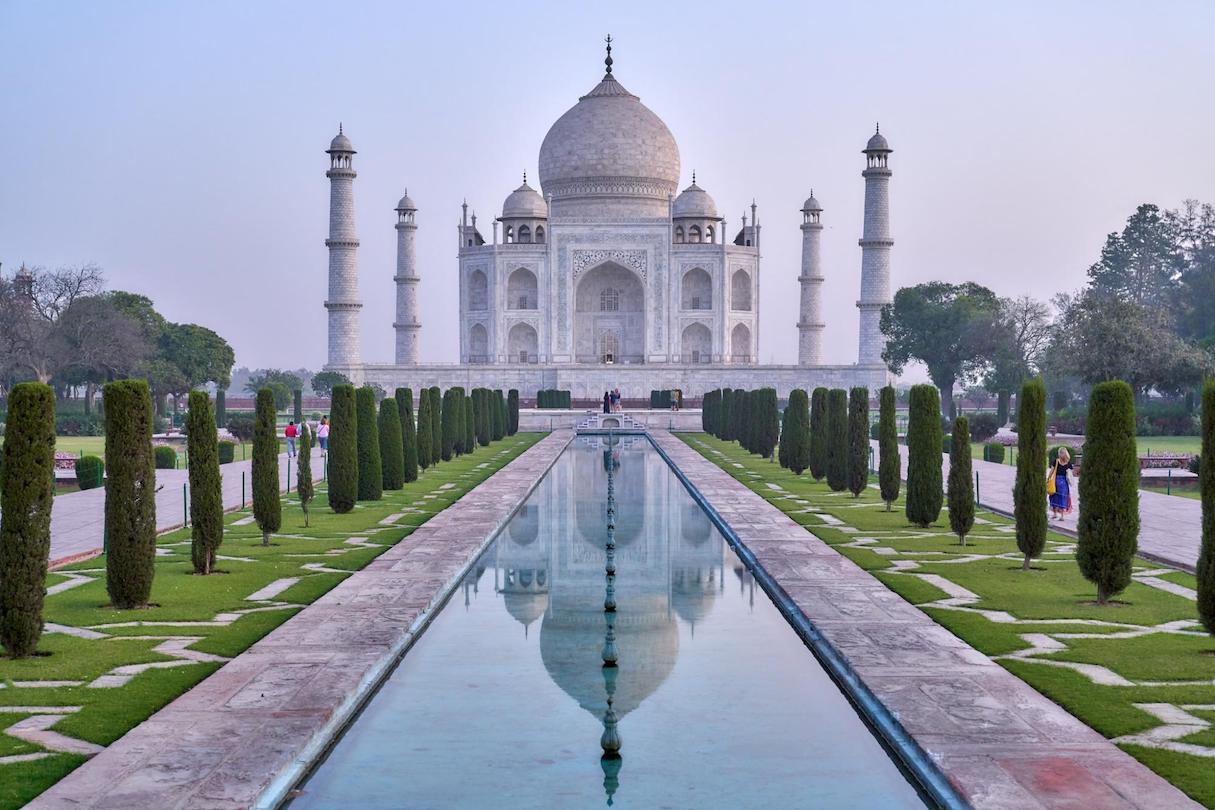
The benefits of using symmetry in design didn’t arise out of thin air; same as many design principles, it emerged from the Gestalt Principles, a human behavior theory that describes how the human mind structures and arranges visual data. Our mind naturally creates order out of the things we see. That’s why symmetry is so powerful—symmetrical design is a design that has order and stability, and is therefore easy on the eyes.
Learn how to write a great design brief to keep your projects on track.
Types of symmetry
There are three types of symmetry: reflection, rotational, and translational symmetry.
Reflection symmetry
This is probably the first thing people think of when they hear the word “symmetry.” Also known as the mirror effect, reflection symmetry occurs when everything is mirrored around a central axis. The axis can be in any orientation—it can be horizontal, vertical, diagonal, and anything in between, as long as what’s on one side of the axis is mirrored or reflected on the other.
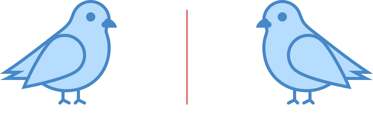

Designers often use reflection symmetry to give equal weight to either side, or to create an interesting visual effect.
Rotational symmetry
Also known as radial symmetry, this type of symmetry occurs when everything rotates around a common center. Rotational symmetry can occur at any angle/frequency as long as there’s a common center around which everything is rotated, and elements are equally spaced around a central point.
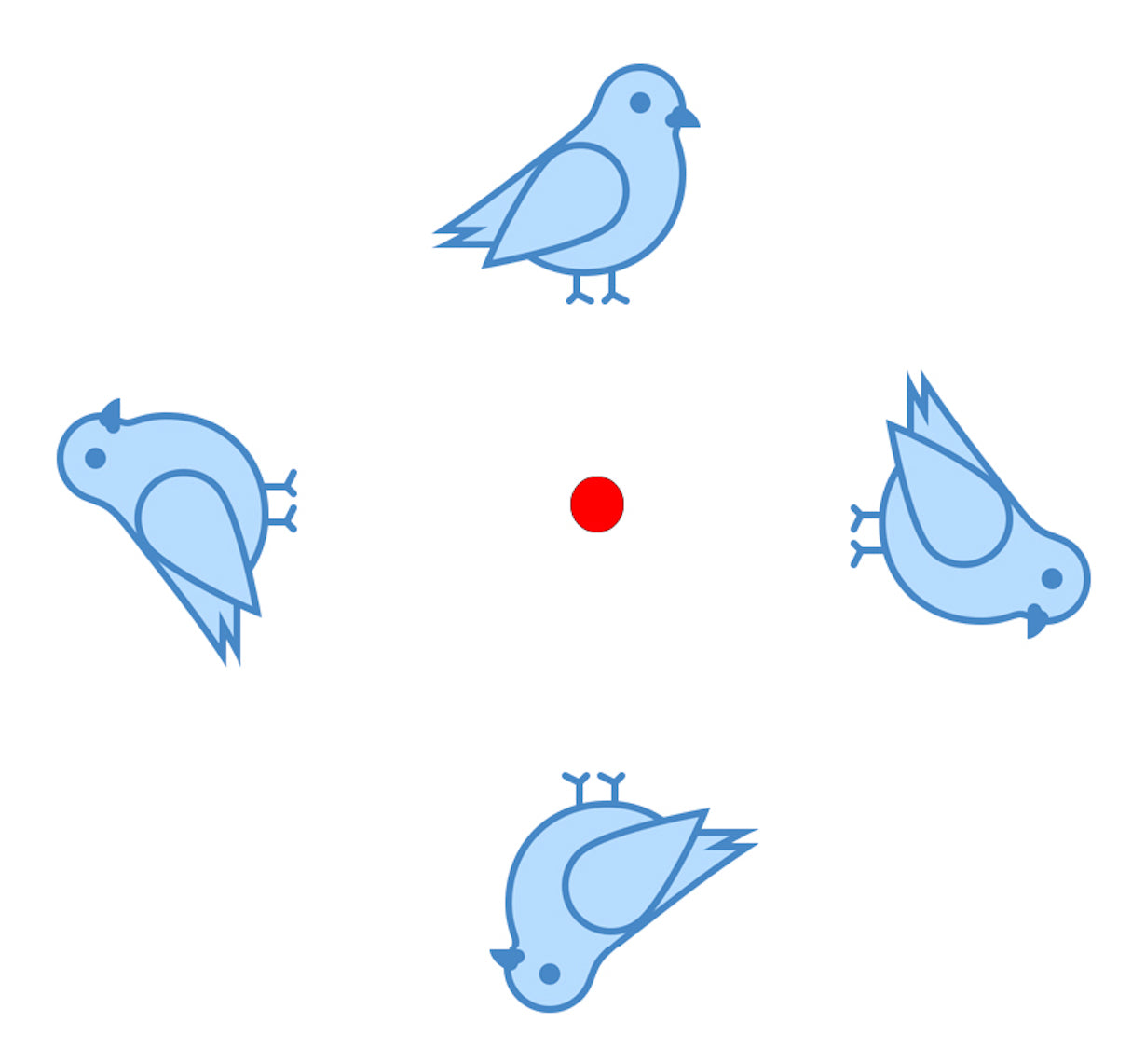
Rotational symmetry is quite common in real life. For example, the arms of a starfish radiate out from the center.

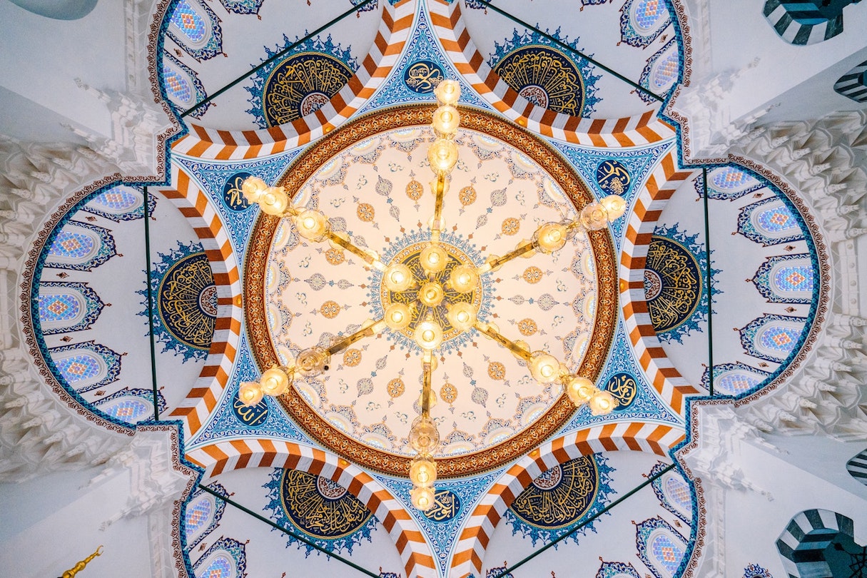
Web designers incorporate rotation symmetry in their work to portray motion (such as to infer progress or movement) or to visualize data in an interesting way.
Translational symmetry
This type of symmetry occurs when an element is repeated over different locations in space while maintaining its general or exact orientation. Translational symmetry can happen in any direction as long as the element's orientation is maintained.
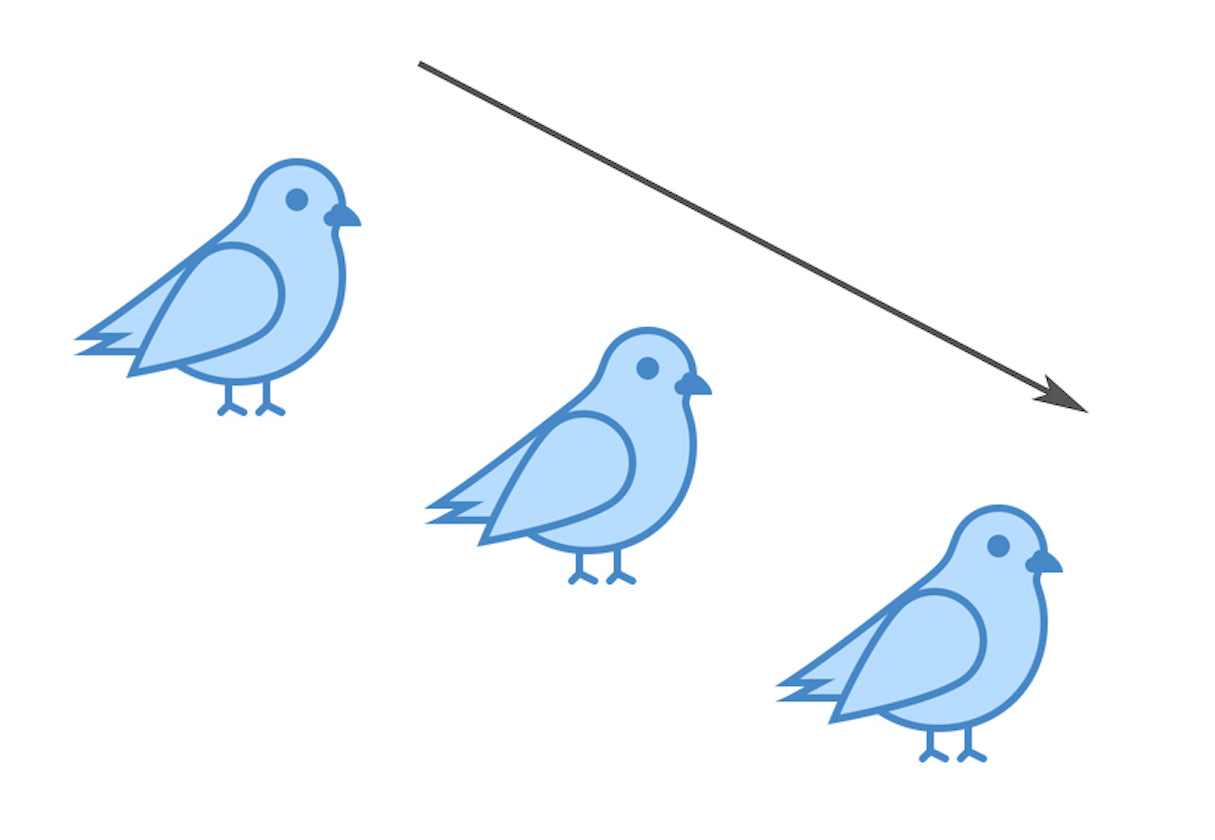
Proper use of translational symmetry can create rhythm in design. Web designers often use translational symmetry as a passive element to create background patterns. But in some cases, it’s possible to use translational symmetry as an active element that conveys a message. NINX’s website uses simple geometries to deliver the primary message—as the music starts to play, the objects move around in time.
Don’t try to achieve perfect symmetry
Perfect symmetry is when elements are mirrored over the axis and precisely the same on both sides. Look at the mirror, and you’ll see your reflection—the two mirrored sides are exactly the same.
But when it comes to design, symmetry is not the same as identical mirroring. Perfect symmetry is rare both in web design and in real life. When we think about our environment, most natural objects and creations around us are not absolutely symmetrical. For example, we are used to thinking of our face and body as two mirroring parts. However, the left side of the face is not absolutely identical to the right side.
Designers can create a symmetry by playing with the user’s perception of layout, and it’s totally okay to have slight variations on each side as long as viewers get a sense of symmetry from the finished product.
You might also like: Working With a Grid Layout: How Breaking the Grid Can Create Memorable Experiences for Clients.
What is asymmetry design?
Asymmetry is naturally the absence of symmetry. In nature, we can see asymmetry almost everywhere—such as in the branches of a tree, or the shapes of clouds, to name a few.

In design, asymmetry if often used to create visual tension. At the same time, asymmetry can be a difficult concept to master, since the relationships between elements in an asymmetrical design become more complex, it might be hard to create a whole, cohesive design. This is why many designers go for predictable symmetrical layouts. But designers who master asymmetry have greater freedom of expression.
Symmetry and balance
Many designers believe that balance is something can be achieved only in symmetrical layouts. It happens because the term ‘asymmetry’ implies a lack of balance. While the definition of asymmetry is the lack of symmetry, it is not a lack of balance, as some wrongly assume—designs that lack symmetry still need to be balanced. In other words, no matter what layout you create—whether it’s symmetrical or asymmetrical — it’s vital to achieve balance, because an unbalanced composition feels uncomfortable for the viewer.
A proper technique for mastering balance (both symmetrical and asymmetrical) is to think of each element on a page as having a visual weight to it. Visual weight depends on a size of element (smaller objects might weigh less than larger objects) and visual properties such as contrast (contrasting elements might weigh more than neutral elements). Designers need to play with the weight of elements until they reach an efficient equilibrium.
Of course, it’s fairly easy to achieve a balance in symmetrical layout—all you need to do is put the same weight on the right and left parts of a page.
When it comes to asymmetrical design, the task might be harder—you might need to have a several small items on one side to balance a large object on the other side.
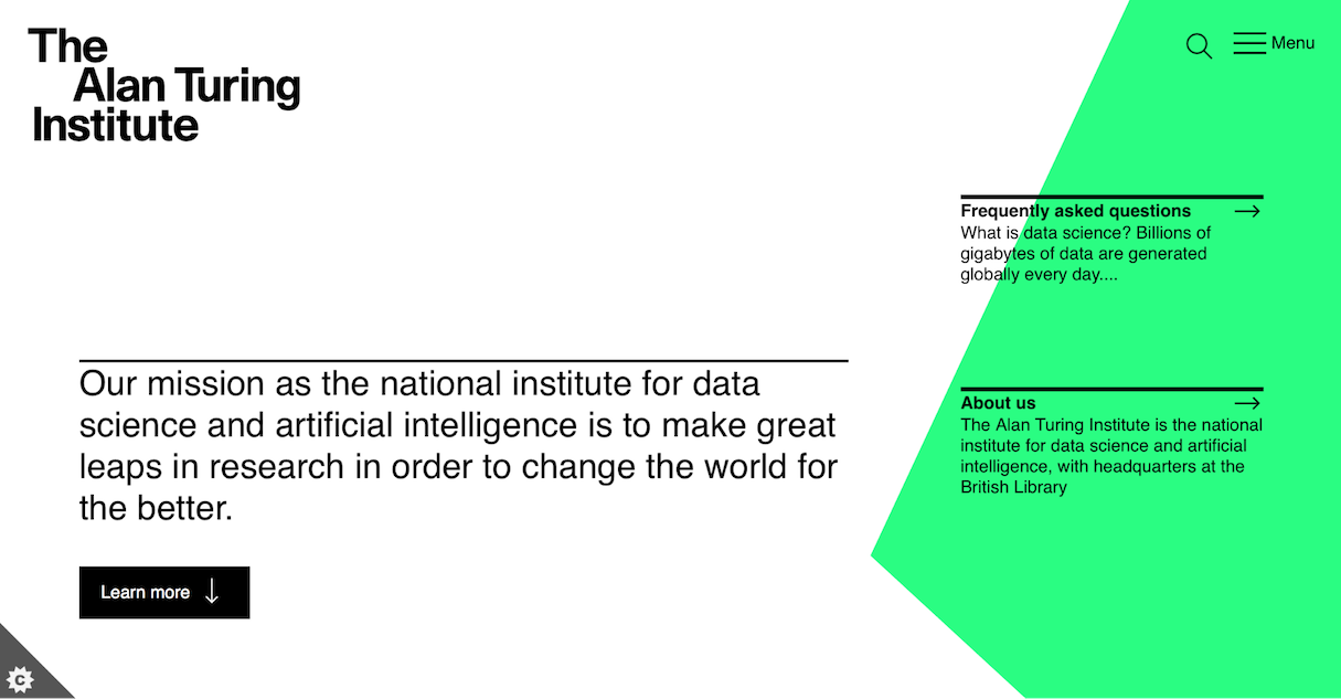
The same principles of balance that we have in paintings apply to web design. Below is a screenshot from The Alan Turing Institute website, which is an excellent example of asymmetrical balance. The left side of a page has more content than the right part, but designers achieve balance by adding a contrasting element to the right part of the page.
A formula of a perfect balance
“Can I measure balance?” is a fairly common question among designers. In the attempt to find an answer to this question, many designers search for a specific formula that allows them to calculate whether everything is in balance. Bad news: there’s no formula for calculating balance. Good news: we can use a powerful tool to determine whether a composition is balanced or not—our own eyes.
Experienced designers are able to notice unbalanced layouts in a glance. But to reach this goal you need to train your eye, by working on practical projects and by being inspired by the work of other designers. The more you do that, the more you'll trust your own judgment when it comes to any design decision you have to make.
You might also like: How Theme Developers Can Learn From Brutalist Web Design.
Symmetry vs. asymmetry in design
Ultimately, when it comes to designing a layout, you need to decide whether you want to create a symmetrical or an asymmetrical design. There’s no universal answer to this question—the choice depends on the project’s specifics. Let’s see how symmetry and asymmetry can be used in designs.
When symmetry works best
Here are a few general cases when it’s better to follow a symmetrical approach for layout design:
- You are seeking a more serious aesthetic (you want to convey classicism)
- You want to enhance recognition and recall (symmetrical forms make it easier to recall information)
- You want to achieve more order and structure
- You don’t want to put a lot of thought into the arrangement of elements, but still want to achieve a balance (symmetrical layouts are inherently stable and balanced)
Now let’s review how these cases look in real life.
Conveying a sense of trust
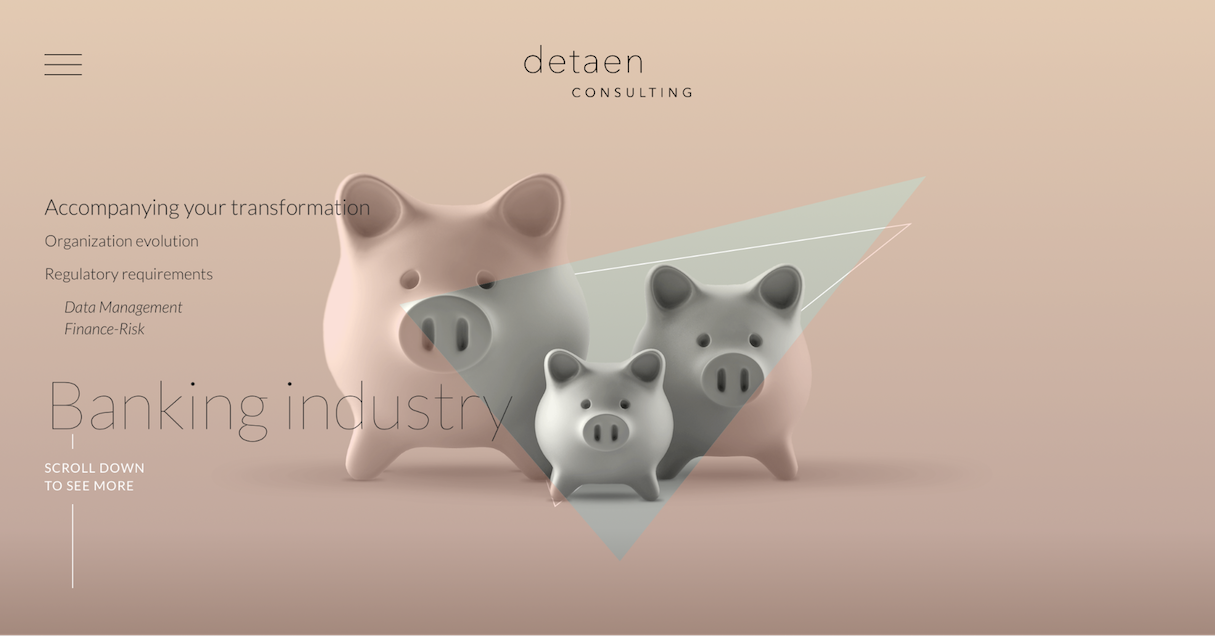
Symmetrical layouts work well for designs that want to portray an aura of trust. Not surprisingly, many companies that prioritize trust use symmetry in their design.
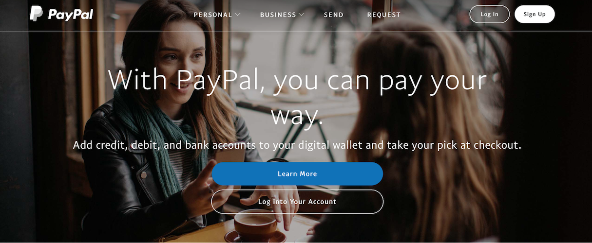
Symmetrical design is predictable. Thus, if you’re designing a website that calls for stability (e.g., a site for a bank or an insurance company), a symmetrical design may be a right choice for you.
The design of the PayPal homepage is symmetrically balanced. Everything reflects around a vertical axis — the navigation bar is centered, the featured images are centered, and the heading is centered.
A page has a single interaction object
Symmetry works well for pages that have a single interaction object. The typical example is the login/signup page. By placing a key interaction object or critical message in the center, you have a focal point centered in the page.
A page has two (or more) equally important options
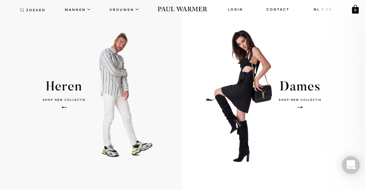
Symmetrical design allows you to draw attention to all areas of a page equally. One typical example is an online store that sells products both for women and men. Symmetry helps designers deliver two equally important messages in the same space.
When asymmetry works the best
Symmetry is usually seen as stable and harmonized; however, for some people, stability might be predictable and boring. Asymmetrical layout tends to be more interesting and dynamic.
Go for asymmetry when:
- You’re ready to spend extra time arranging elements to find unique ways of achieving balance
- You are seeking a more playful layout to convey user interest
To make the layout stand out
Today, when users have so many different options to choose from, a site needs to be something special to stand out from all the others and reduce bounce rate. When designers master asymmetry, they create more memorable products.
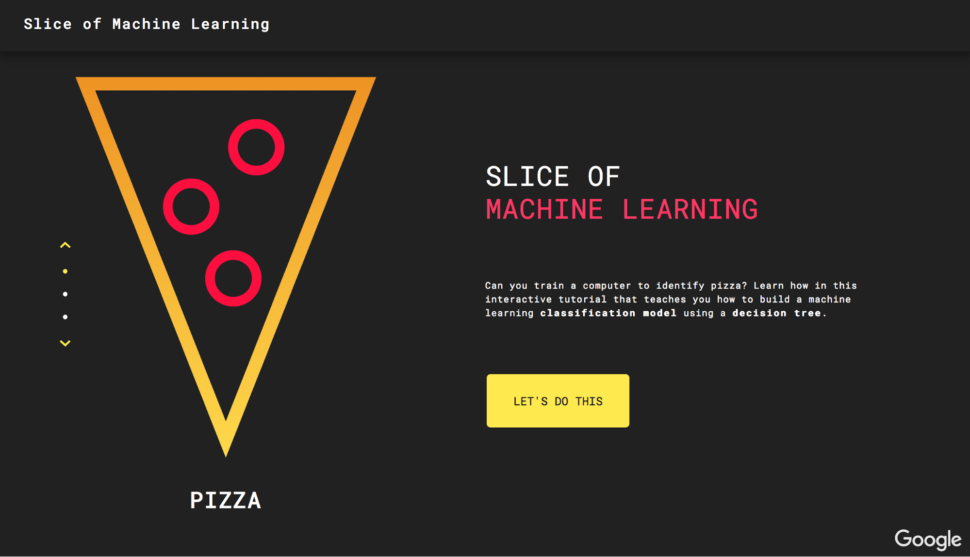
Slice of Machine Learning, a tutorial created by Google that teaches you how to build a machine learning classification models, uses asymmetrical design to create a memorable experience for their visitors.
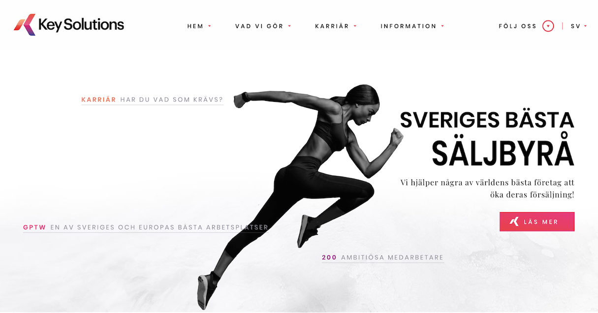
To convey dynamism
When web designers use the term ‘dynamic’, what they are referring to is a design in which the viewer’s eye is moved around and through the design. Asymmetrical designs can evoke feelings of movement. That’s why so many sports brand uses asymmetrical layouts and asymmetry in individual elements (such as the logo).
To draw attention
Asymmetry grabs attention. A proper asymmetrical layout automatically brings the viewer’s eye to the focal points—the gaze naturally settles on the critical pieces of the design first. By positioning and adjusting elements on a page, you can direct the eye to the different areas.
When choosing focal points, remember that the primary goal of any design is communication. With each webpage you design, you tell a story to your visitors, so be sure to choose focal points that help you tell this story in the most effective way.
Here are a few things that allow you to draw attention:
- Contrast. Contrast can be used both to highlight a particular element or to hide it. By increasing the contrast of a particular element you make it stand out. Conversely, by lowering the contrast, you can make an element fade into the background.
- Whitespace. Use white space to isolate one element from another.
- Movement. The human eye is hardwired to pay attention to moving objects.
- Directional cues. The eye will follow directional cues (for example, a directional cue might be an arrow that points in a particular direction).
- Human faces. The eye will follow the path of eyes in the photo, so a site’s visitor will look in the same direction as a person in the design.
Combine symmetry and asymmetry in design
Symmetry is not always an either/or decision. It’s possible to create the most interesting and aesthetically pleasing designs by combining symmetry and asymmetry.
You can break the layout into smaller sections and try to achieve a symmetrical or asymmetrical balance in each section. For example, you can have a symmetrical layout in which asymmetry is used to create points of interest and organize visual hierarchy within a group of similar elements.
Mastering symmetry and asymmetry
Symmetry (or lack thereof) can be a powerful tool in the designer’s toolbox. Symmetry naturally evokes a sense of orderliness and stability while asymmetry, on the other hand, can help designers achieve uniqueness and character in design. Combining the two helps create designs that are unique and memorable to viewers.
How do you use symmetry and asymmetry in your designs? Tell us in the comments below!
Read more
- Everything You Need to Know About Development Stores
- 13 Web Design Trends to Watch in 2020
- Strategy Meets Technology: 4 Prime Targets for Conversion Rate Optimization
- How to Integrate Shopify into your Client's WordPress Website with Zillacommerce
- Designing With Customer Service In Mind Above All Else
- How to Win the 2016 Ecommerce Design Awards - Part 2 with Verne Ho
- Top Ecommerce Web Design Trends from January
- Top Ecommerce Resources for September
- Working With Technology Clients: Strategies, Apps, and Themes to Consider
- Top Ecommerce Web Design Trends for March

