You can improve your online sales by focusing on two key factors: increasing your website traffic and boosting your conversion rate. While many marketers prioritize website visitors (through social media or email marketing campaigns), the most effective way to drive sales is to grow your average conversion rate, which is the percentage of visitors that convert.
Boosting your website’s conversion rate can generate more sales from the same amount of traffic and lead to a higher return on investment (ROI). By streamlining user journeys toward conversion you can also build a better experience for your visitors.
The average conversion rate is 2.5% to 3%, but varies depending on the industry. Even if you fall into that range, there can be room for improvement. The more you increase conversion rate, the more revenue you bring in. Think of the process of increasing conversions as blending the scientific and creative sides of digital marketing. The first step is to gather data—the scientific part. The second step is to use this information to generate ideas for improvement—the creative part. The goal is to create a seamless experience for your potential customers.
Ahead, learn the best ways to gather information about your ecommerce site experience and how this can help you increase your conversion rate.
1. Talk to your customers
Many marketers assume that increasing conversions starts with quantitative data. However, some of the best insight comes from speaking directly with your customers.
You can conduct formal customer interviews by asking your customers questions such as:
-
Why did you buy this product?
-
What was the most important feature?
-
Did you have any hesitations or issues when buying?
You can also obtain insights from customers and other site visitors by implementing and reviewing on-site surveys or chat tools. These tend to provide:
-
Questions about your product that your site may not answer. For example, if you sell a food product, visitors may wonder if they need to refrigerate it, which your product or FAQ page should clarify.
-
Insight about your value proposition. You might learn, for example, that while your website focuses on your product’s health benefits, your customers are buying it because it’s cheaper than your competitors, which can inform your copywriting.
2. Define your website’s goals
It’s difficult to know if your conversion rate is improving if you don’t track and measure your success. Start by deciding what you want people to do on your site and what counts as a conversion. For example, you might decide that a conversion is when someone buys something or when someone signs up for your newsletter.
Be realistic with your goals. Check how many conversions you got over the past month, three months, and six months to get an idea of past performance, but don’t be afraid to push your goals. Once you’ve decided on your goals, regularly assess how you’re doing against them through your measurement of site analytics.
Here are some example goals you might use to increase conversion rate:
-
Increase website conversions by 10% in six months
-
Increase conversion rate from 1.5% to 2% by the end of Q4
-
Generate 500 more conversions a month
3. Analyze your website’s data
Concrete data can provide user behavior insights and allow you to make informed decisions without selection or memory bias. A customer might say they like a product page’s design, but if the data indicates that a different product page drove 20% more conversions, you can confirm that one page performs better than the other, despite the customer’s feedback.
The most important data point is your conversion rate (i.e., the percentage of visitors who convert). The best way to gain insight from your conversion rate is to segment and compare by page and by traffic channel. Many analytics tools can produce this data, but one of the most popular is Google Analytics. Here are two ways to segment and compare your data:
Pages
Segmenting data by page helps reveal which ones perform best. That information can lead you to theorize about why they perform better. Analyzing user behavior can help you establish the stages of an ecommerce conversion funnel. By examining factors such as whether users are more likely to convert after visiting a collection or a product page, you can learn how to structure your site’s navigation to guide them.
Traffic channels
Traffic channels help you understand what type of web traffic is most likely to convert. For example, you might find that your Google Ads convert more than your Instagram Ads. Although you may have to dig deeper to see if the ad platforms are sending visitors to the same landing pages, this data can inform your overall traffic strategy, boosting conversions by sending you more high-quality traffic.
4. Review your site’s friction points
Every website has key friction points that aren’t as smooth as they could be for visitors. You can measure whether your site has a seamless experience. Here are a few ways to quantify it:
Measure which FAQ are viewed most on your website
Frequently asked questions (FAQ) are an essential component of many websites, mainly for research-oriented visitors. However, they can sometimes be overwhelming and dense, making them less effective in supporting an ideal conversion journey. A frequently asked question can be an opportunity to integrate the answer or solution into the core site experience. You can track FAQ interaction with apps like HelpLab.
Review scroll depth and heat map reports
Scroll depth and heat map reports tell you exactly where users are dropping off on the page. If you find that the heat (the relative number of people viewing a part of your page) falls off at a specific section, it likely has high friction. Heatmap.com provides a free ecommerce-focused option for both these reports.
Review purchase funnel drop offs
By comparing your funnel’s stage-by-stage drop-off performance to benchmarks like those provided by Littledata, you can see where your conversion funnel may have extra friction. One of the most common friction points is the payment info page, where visitors tend to ask themselves if the purchase is worth it. This is an excellent opportunity to add social proof, such as a testimonial or a money-back guarantee.
5. Test and enhance your value proposition
A website’s value proposition is one of its most important drivers of conversions. If your audience is genuinely interested in your product’s value, they may be more tolerant of technical issues or friction.
Conducting an A/B test is the best way to understand if you can improve your value proposition. If you’re running digital advertising campaigns, you can test different versions of your taglines in your ad copy, and then use the winning version on your site. You can also use tools like Google Optimize to test copy changes directly on your site to see which version drives more conversions.
6. Audit your technical setup
Faulty technical setups can hold back website conversion rates. Common issues include slow page loading times (also known as site speed), poor mobile optimization, and broken links.
The good news is that these elements are easily testable using various tools. GTMetrix provides actionable page speed reviews for ecommerce sites. Google offers a free compatibility test for your mobile site, and Screaming Frog can check your pages for broken links.
Capitalizing on these types of analyses can increase your conversions. To take it further, you can A/B test your ideas to prove they work.
7. Add social proof with reviews and testimonials
Almost half of surveyed consumers trust customer reviews just as much as they trust a recommendation from a friend. Seeing that someone else had a good experience with your brand can give on-the-fence shoppers the nudge they need to purchase and provide reassurance to first-time buyers who are weighing up their options.
Here are some ways you can add reviews to your site:
-
Product-relevant reviews: Add a selection of relevant reviews to each product page, making sure the reviews are about the exact product in question.
-
Video reviews: Encourage customers to share video reviews of your products for extra clout and to add an additional layer of trust.
-
Reviews page: Create an entire page on your website dedicated to reviews.
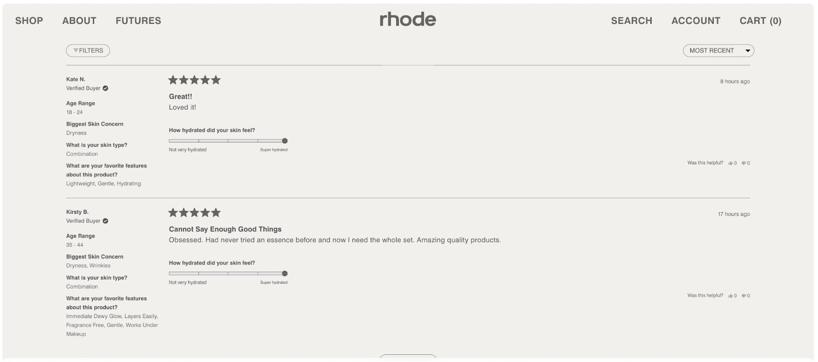
Skin care brand Rhode allows shoppers to filter reviews based on age, skin type, and product features.
8. Make it easy for customers to find what they’re looking for
Shoppers don’t want to search for hours trying to find what they’re looking for, especially if they’re ready to buy. People who know the product they want to buy have a much higher purchase intent than those who are just browsing and they’ll often head to the search bar to find their desired products. In fact, 69% of shoppers go straight to the search bar and 80% will actually leave your site if they have a bad search experience.
Adding an easy-to-use search feature to your site can help shoppers find exactly what they’re looking for and boost conversion rates. You can experiment with rich features here, such as image-based search, recommended products, and suggestions when a search doesn’t have any relevant results.
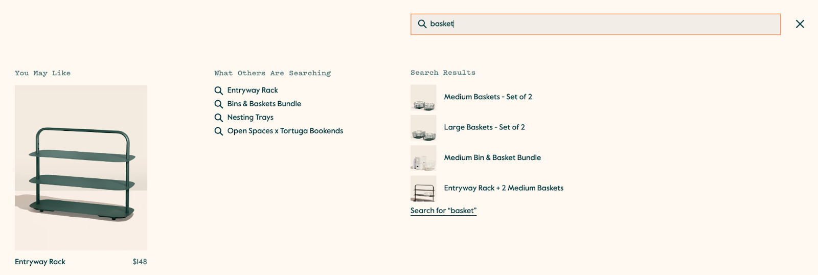
Open Spaces includes images and recommended products in its search feature to enhance the experience.
9. Add a live chat element
Even the smallest bit of friction can throw a shopper off track. But implementing a real-person or automated live chat feature to answer in-the-moment questions can help. You can use the live chat feature to keep shoppers on your site, provide extra information, and direct them toward the products they want the most.
10. A/B test the buying journey
You can A/B test various parts of the buying journey to optimize conversion rates. Consider where your biggest friction points are and experiment with different colors, layouts, and copy to try to improve conversions. This gives you real-life proof of what elements your customers prefer.
Here are a few things to test:
-
Photographs: Add more product photos to product pages, add interactive elements, and use 360-degree photo tools to let customers build an image of your product in their minds.
-
Calls-to-action (CTAs): Play around with the color of your CTAs, change the copy, and test their placement on each page. Try a floating Add to Basket button instead of a static one to see if it impacts your conversion rates.
-
Guest checkout: Try out a guest checkout option to minimize the hurdles shoppers have to jump through to make a purchase.
-
Review positioning: Move elements, such as reviews, around on your product page to give them more prominence and see in which position they work best.
-
Product descriptions: Alter the format of your product descriptions to make them scannable. Add bullet points, inject personality, and use emojis if it suits your brand.
11. Send abandoned cart emails
More than two-thirds of shoppers abandon their carts before they get to checkout. This doesn’t mean they will never convert, though. These are shoppers who have shown an interest in your products but did not finish the purchase process.
Sending an abandoned cart email can remind these visitors what they liked about your products in the first place and encourage them to come back and finish their purchase. You can increase the chances of conversion by adding social proof to your abandoned cart emails or by offering a discount as an incentive for coming back.

Paro reminds shoppers that they have items in their cart with a message describing the benefits of its product.
12. Shorten checkout form fields
No one wants to fill out a form with too many fields. The more information you collect from shoppers, the more time they have to back out of the purchase or buy from a business that doesn’t ask for as much information. Keep your checkout form as simple and as short as possible by collecting only the information you need, like the shopper’s name, address, and payment information. You can also add a progress bar to the checkout so that shoppers know exactly where they are in the process. There are also options for one-click checkouts, which use a platform such as Shop Pay to have users’ data automatically saved and used for purchases.
13. Offer an incentive
Shoppers are often on the hunt for a bargain and an added incentive such as free shipping or a free gift. More than 60% of shoppers won’t consider buying from a retailer that doesn’t offer free shipping. While you might not be able to justify free shipping all the time, you can offer free shipping on a customer’s first purchase, when they reach a certain cart value, or if they purchase within a limited timeframe.
If you’re looking to convert more first-time shoppers, you can also try offering a discount code for money off their first purchase.
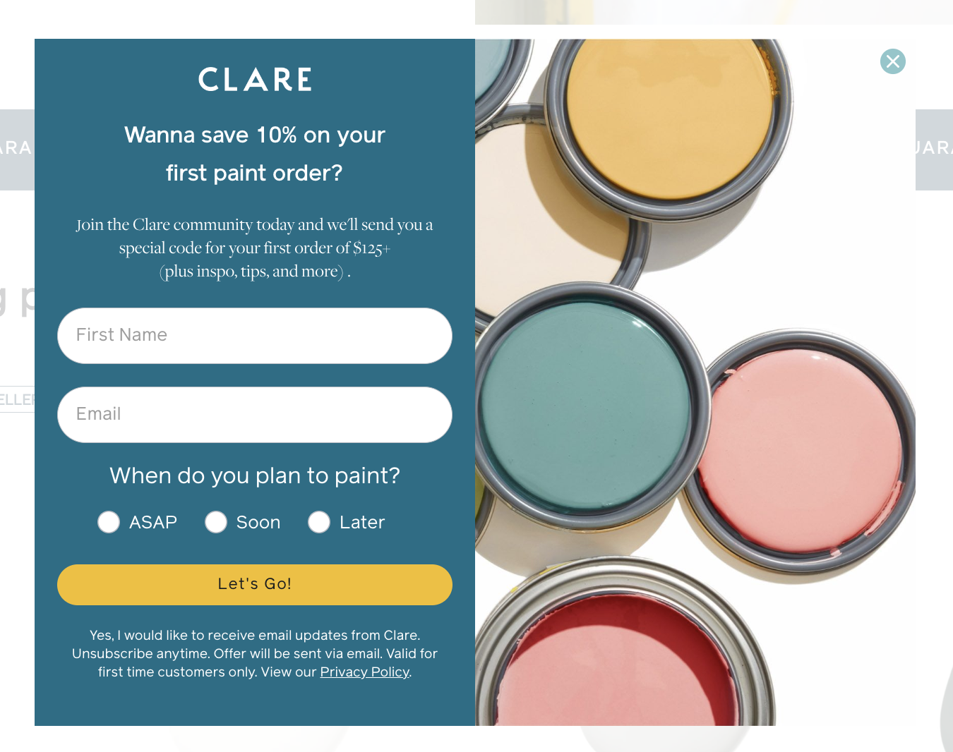
Paint brand Clare offers new shoppers 10% off their first order.
14. Have a reassuring returns policy
The downside of buying online is that shoppers may not see a product in person before they buy. Having a clear returns policy can reassure shoppers that they can send back a product if it’s not what they expected. It can give shoppers peace of mind, which can ultimately improve conversion rate.
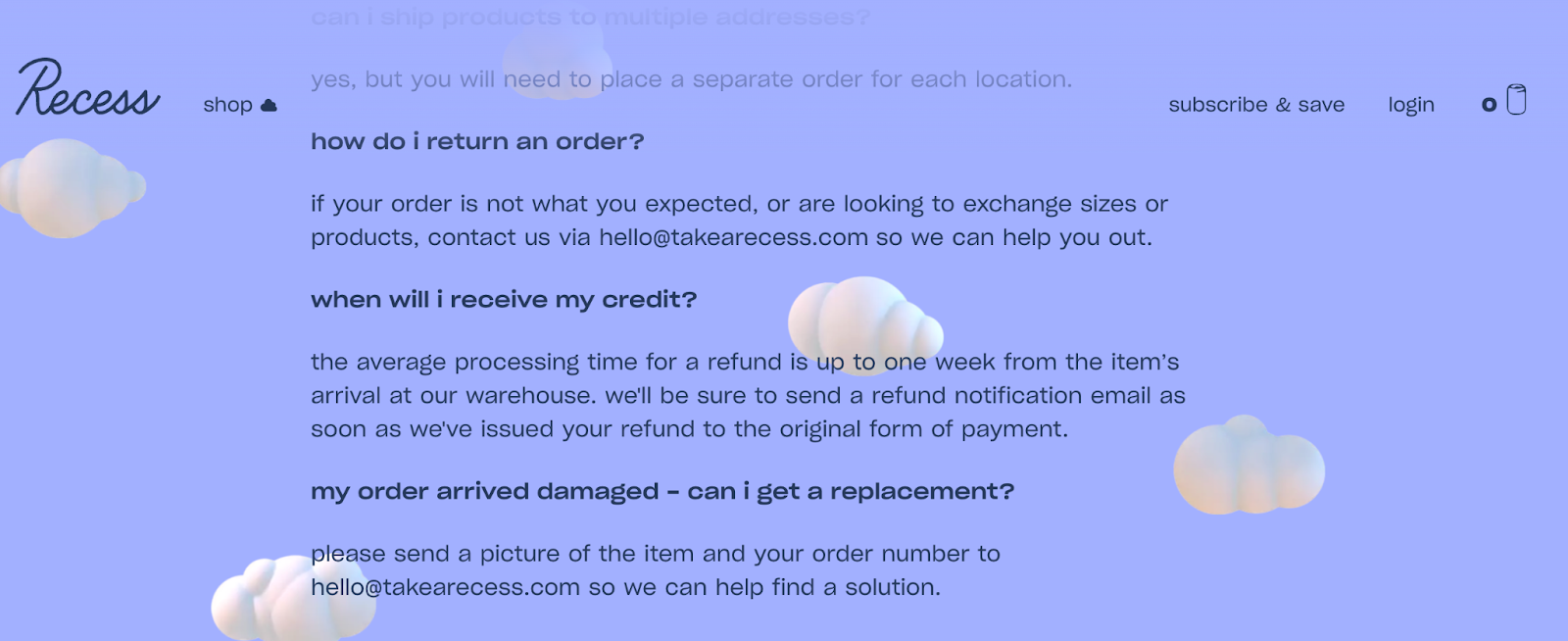
Drinks brand Recess allows customers to get a refund and return their products if they’re not happy.
How to increase conversion rate FAQ
What are the long-term methods to boost your conversion rate?
There are many ways to boost conversion rates. They rely on a cycle of gathering information, and creating ideas for improvement based on this information and testing them. Examples of these methods include talking to your customers, analyzing your website data, identifying your site’s friction points, and auditing your technical setup.
What are the best practices for creating calls to action?
Great calls to action complete the sentence that begins with “I want to …” for the user while remaining short and understandable. They also avoid being self-referential. “Click here” is used widely, whereas “Add to Cart” and “Learn about the (product name)” can be more likely to increase conversion rate.
What are some common mistakes to avoid when trying to boost conversions?
The most common mistakes to avoid in boosting conversions include focusing too heavily on the homepage (as opposed to product pages or checkout pages), not gathering enough information (for example, making a change based on one angry customer), and ignoring the importance of communicating your value proposition.
What are the two types of conversions?
The two main types of conversions are macro conversions, which are the primary goal of a website, and micro conversions, which are secondary goals that help move the visitor toward the primary goals. For example, a site might have a macro conversion of a purchase and a micro conversion of filling out a pop-up form to get a discount code.


